There are a variety of digital trading card games that contain any mixture of favorable and unfavorable user interface (UI) designs. More specifically, if there is not an intuitive system in place for the card-collecting and deck-building portions of these games, it can be a laborious process that places unnecessary effort on trivial tasks that could be focused on building an awesome deck. Since this can be one of the most enjoyable aspects of trading card games, this process could ultimately hinder the player’s experience. With the recent release of Whispers of the Old Gods, we will all be spending a lot of time with the collection and deck-building interface in Hearthstone, so let’s see how it stacks up according to well-established usability heuristics for UI design.
Brief overview
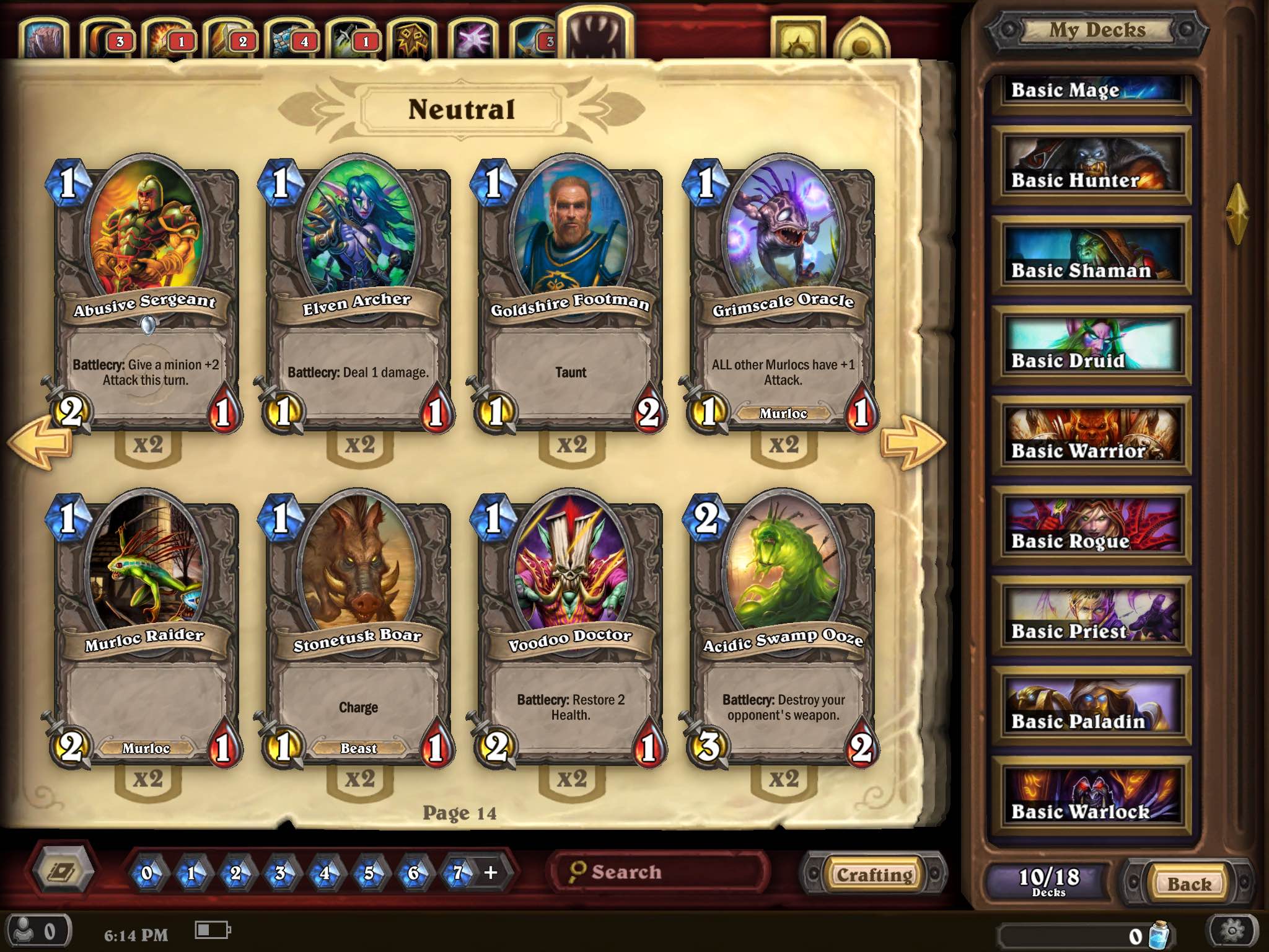
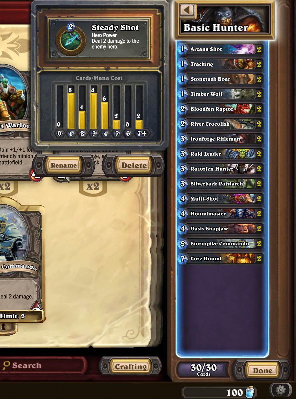
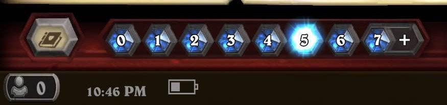
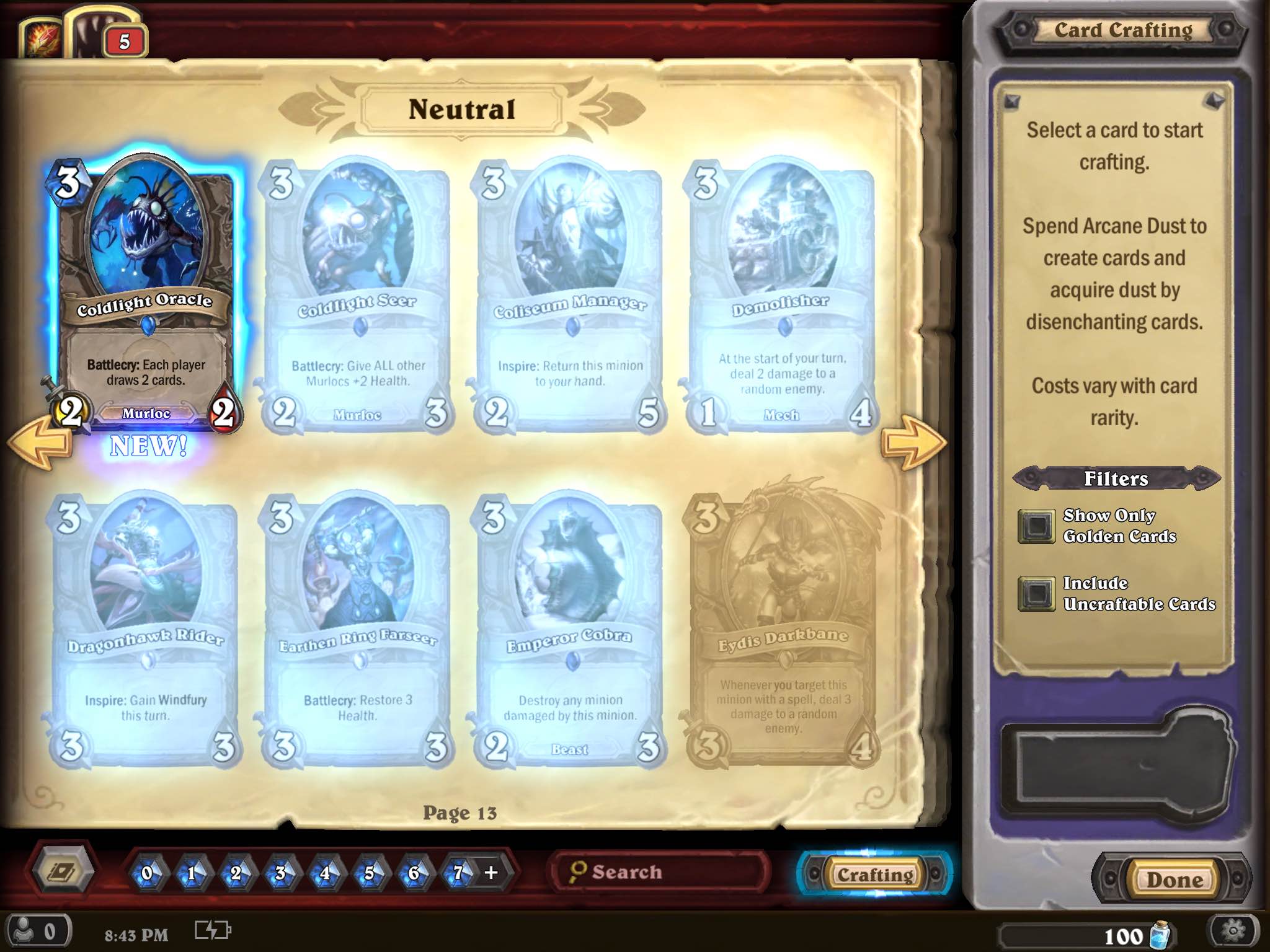
Below is a screenshot of the collection and deck-building screen for Hearthstone on iPad. It is setup like a virtual card binder with numerous different filters, all while maintaining aesthetic appeal and a minimalist design. Starting in the top left, there are tabs that let the player filter cards by the nine hero types and neutral cards. The two gold icons to the right of these tabs allow the player to view collected card backs and heroes. The bulk of the screen is comprised of the cards currently chosen, which includes the hero name at the top along with relevant artwork, the cards, as well as the quantity in the collection. On the far right is the second-largest portion of the screen, which is a scroll bar where the player can select from any of the basic hero decks and custom-built decks. Once a deck is selected, the player can tap again to see an overlay of the mana distribution, the hero’s power, and options to rename or delete it. The bottom-left portion of the screen allows the player to filter by different card sets and mana crystal costs. Additionally, there is an indicator of online friends, a clock and a battery indicator (much-welcomed inclusions). Moving from the center to the bottom-right of the screen, there is a search bar, a crafting button that opens the card-crafting pane, the current number of decks, amount of arcane dust, and back and menu buttons.
Match between system and the real world
Upon initial navigation of Hearthstone’s menus and card-collecting and deck-building interface, it is immediately obvious how well-expressed the targeted theme and identity of Warcraft is. This, along with the virtual-binder design, which is similar to how the backpack is utilized as the menu system in the Pokemon games or how the player slices menu buttons in Fruit Ninja, can allow for deeper immersion and enhance the overall experience.
Hearthstone also makes the screen intelligible from left to right, both logically and intuitively as if the player is flipping through a card binder. There are arrows to navigate forward or back and, if no filters are selected, the cards are presented in order of mana cost, as if reading a book. Additionally, the tabs at the top of the screen that allow the player to filter cards by hero type are represented by intuitive icons easily recognized by players, such as knives for a Rogue and a sword for a Warrior.

Visibility of system status
Hearthstone’s collection UI remains the same throughout the process of searching your collection and building a deck, with a couple subtle changes introduced when card crafting. This consistency makes it easy to keep track of multiple things, such as what card types and mana costs are currently filtered. Hearthstone achieves this by utilizing pulsing and glowing visual cues, such as a blue outline around the crafting button and lighting up the currently-filtered mana cost.
Also, when in card crafting, cards you currently have and can afford to craft are shown and outlined in blue, whereas cards you do not have, but can craft, are faded but highlighted in a similar glow. Cards you do not have and cannot currently afford to craft are grayed out to closely match the background, clearly indicating that this option is unobtainable at the moment.
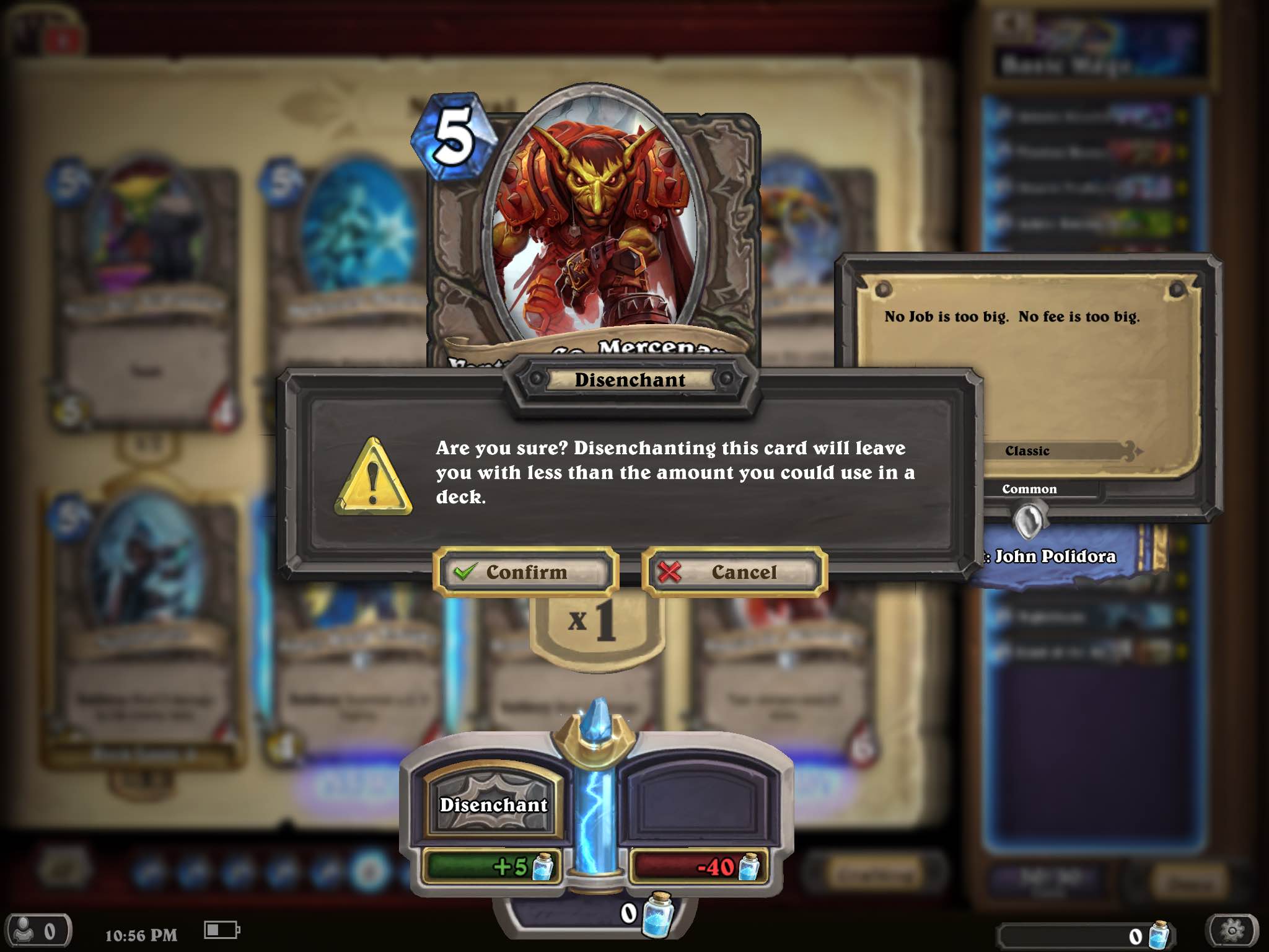
Error prevention in card crafting
Confirmation messages can be a great option for UI design to prevent errors. Hearthstone introduces error prevention during card crafting by presenting the player with a confirmation dialog box when attempting to disenchant a card that would leave them with less than 2 of said card, which is the maximum allowed per deck for certain cards. This message gives players a moment to reflect on their current action and potentially prevent them from accidentally disenchanting a super-powerful legendary card.
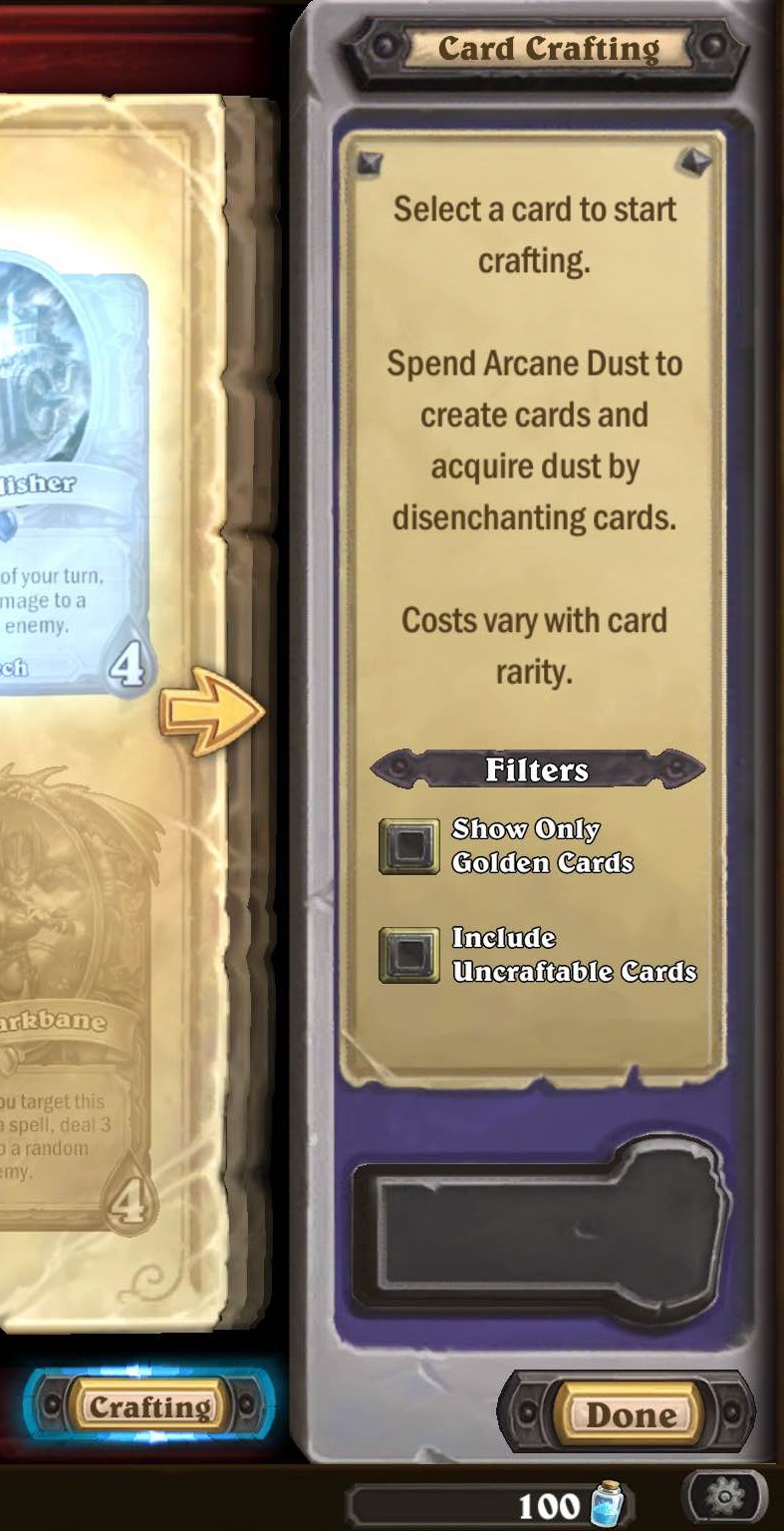
Recognition rather than recall in card crafting
The card-crafting screen is the only slight deviation from the main collection screen. Here, players are presented with a pane with instructions and additional filters for card crafting. The inclusion of this pane in place of the deck pane on the main screen presents players with a well-located reminder about the general idea behind card crafting, which is ultimately more beneficial than accessing decks during this portion.
Other UI usability features worth noting:
- The interactive UI stands out from the background, as evidenced by the design of the buttons, as well as using concepts that players can relate to real life, such as searching through an organized physical card collection.
- Throughout, there is consistency in font sizes, colors, styles, and icons, which can be read clearly even though they are small.
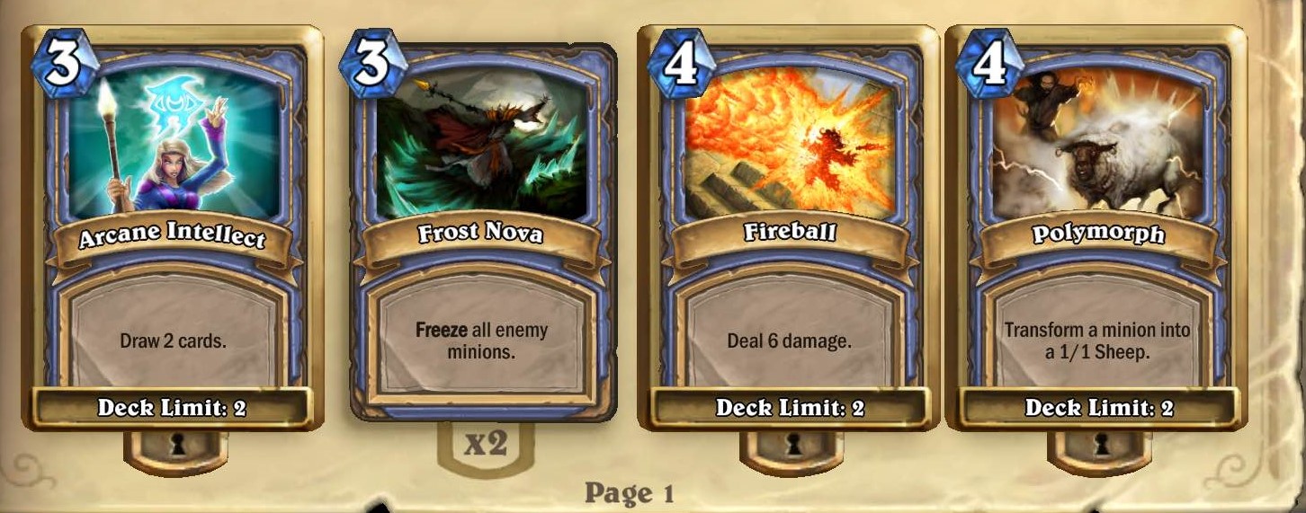
- There are subtle aspects of the UI that help keep the player informed during the entire collection/deck-building process, such as indicators on cards in your collection when you have the max amount of that card allowed in the deck or if you have none left. Again, this allows the player to recognize rather than recall what cards are in the deck.
Final thoughts
Not only does Hearthstone have deep, yet simplistic and accessible gameplay, it also seems to have implemented that philosophy into its UI design. This is an incredibly important inclusion, as it results in a more complete package that is not only accessible to younger players, inexperienced card game players, and inexperienced Warcraft players, but also the most hardcore card game, such as Magic: The Gathering, players. Ultimately, regardless of experience, the UI is not a (usability) barrier to entry and is very intuitive and easy to use throughout. However, building dominant decks on a budget and remaining competitively ranked is another story. 🙂