Tips for writing video game usability and user experience research findings

Have a standardized format for reporting issues. I have found it to be a good practice to write issues in a way that explains the full picture, such that, for example, an executive who is not closely involved with the game or product can have a full understanding. This may include a brief explanation of the current design and intent, followed by the behavior exhibited by participants, and finally the outcome of how participants interacted with design. It is important to make it clear how the intent is misaligned with how users actually perceived or interacted with the design.

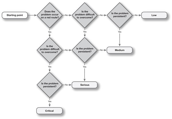
Have a system for addressing and labeling the severity of issues. This allows you and your team to clearly establish the difference between an issue that needs to be fixed as soon as possible and something that was a minor nuisance. This may be some sort of labeling system, such as A, B, C, D, with A being the most critical issue, whereas D is a low priority. Similarly, you may use “Critical, Medium, and Low” or “1, 2, 3” to the same effect. For a visual example, see the picture below, which uses a “Critical, Serious, Medium, Low” severity scale (source: User Focus).

Use consistent language to communicate issues. Using a consistent language to communicate issues benefits the development team in terms of knowing what to expect and not needing to re-learn report language every time. It’s also beneficial to the research team as it helps report delivery become faster as there may be less debate about how to best communicate issues. Some useful additions I’ve found include heuristics (e.g.,
https://www.nngroup.com/articles/usability-heuristics-applied-video-games/) and AXP & Accessibility pattern language (https://accessible.games/accessible-player-experiences/).

Use mindful terminology for suggestions/recommendations. If the development team(s) you work with is receptive to recommendations or fixes, use terminology like “consider” and “might be beneficial” when communicating issues. This emphasizes that they are the design experts and you, as the researcher, are simply suggesting a solution and not saying “this is how it should be fixed and it’s the only possible way.” Generally, your main objective is to find and identify problems, and this can reiterate that.

Blame the design, not the participant. I think it’s important to emphasize that user research reports are aiming to improve the game design and that should be reflected through your writing. I’ve encountered numerous instances where developers would question whether an issue written in a report was actually an issue or if we simply had an outlier as a participant. With video games being enjoyed by so many people all over the world, one person encountering a usability issue in a lab setting translates to thousands, maybe even millions out in the wild. Therefore, try to avoid issue titles such as “participants did not understand,” but instead title it “feature X is not clearly communicated.” Not only is the former title seemingly placing blame on the participants as if they did not interact with the game correctly (spoiler: there is no wrong way to play a game), but people quickly reading through the report who only see titles will be left asking “why?” rather than knowing there is an issue with feature X. Additionally, not only is it not glance-able, but “participants did not understand” is the outcome, not the issue.

Incorporate further evidence of the issue. In addition to your written explanation, things such as a screenshot, video clip, or gif can paint a clearer picture of what the issue is and help provide more context. Which leads to the next tip…

Humanize your reporting. If your data collection allows for the recording of participants while they interact with your game or product, including some relevant clips can help development teams further visualize actual humans struggling with their design, which can help motivate them to find a solution to fix it.

Provide summaries that address how the experience is affecting the player rather than what features are not working well. Researchers generally have a good idea of the design intent before testing but, depending on the scale of the game, you may have a lot of stakeholders who have differing ideas of the intended experience should be. Further humanizing your reports by stating how participants’ motivations, behaviors, and perceptions are affected can help developers think more about it as an experience that’s impacting someone rather than a product with a set of features. It’s rarely as simple as “fixing feature X will help players feel more competent during gameplay” and a more holistic, rather than reductionist, view of the user experience can help get that point across.

Differentiate between participants in the study and the proverbial player. If you are speaking specifically about something observed during a study, make it clear that you are doing so by referring to them as “participants.” For example, “Several participants were observed struggling to navigate the mission menu.” If you are speaking hypothetically about a specific interaction or experience, use the proverbial player. For example, “Players may have difficulty navigating the mission menu due to the low discoverability of the [Continue] button.”

Implement a system to indicate if an issue has been observed and/or reported during a previous study. This may be an additional text tag, such as “reoccurring”, or some sort of iconography indicating that something has been an issue that has been observed before. This not only further validates findings from previous research but might also motivate the development team to more quickly take action if they become tired of seeing participants encounter the same issues. It’s also additional evidence that can be referenced over time to build a case for elevating the severity of an issue.

Incorporate iconography for greater legibility. Using different icons to indicate different severity levels or types of issues written in reports can help your team more quickly read through a report. For example, if you want to make the team aware of something that was not necessarily an issue but something worth noting, you might label it “Note” and/or include a pencil or notepad icon to indicate as such. Therefore, if someone is short on time and needs to skim the report for important information that is only relevant to them, they can use the icons as reference points.

Days Gone: solid core gameplay, lackluster story and characters

Days Gone is a AAA open-world post-apocalyptic game from Sony’s Bend Studio. It feels like is a blend of The Last of Us (i.e., character movement, melee, shooting, crafting), Red Dead Redemption 2 (open world, bike management instead of a horse, long travel time between missions, and storytelling during these sections), and Far Cry (i.e., outposts, random animal encounters, enemy scouting/marking).

You play as Deacon St. John, a drifter trying to survive the harsh post-apocalyptic Pacific Northwest by managing tasks for various camps, all while searching for information about his missing wife, Sarah. The world is full of humans and wildlife, both of which can be encountered as infected. The most common enemies are “Freakers,” the Days Gone version of zombies.

This post is more subjective than many of my posts and I’ll begin by pointing out the things I liked most about the game, followed by things that I felt could have been better.

TL;DR version down below “Final Thoughts!”

Main positives

  • Riding the bike is satisfying and gets even better over time with upgrades as you can feel the evolution in its performance. Similar to Spider-Man, the moment-to-moment traversal was so good that I rarely fast traveled, unless it was a very long distance, then it was a nice option to have. After I finished the story and was trophy-hunting, exploring the world on the upgraded bike made seeking collectibles much more tolerable.
  • Visceral, weighty melee combat with a variety of weapons. There is a satisfying “thunk” when Deacon lands a blow into a human enemy’s neck or when chopping off Freaker limbs. A great usability addition is the ability to press [R2] at any point to take out a melee weapon. It allows the player to quickly swap between shooting and melee when Freakers close in rapidly in large numbers.
  • Horde encounters. The varying locations and sizes of these encounters keep them feeling fresh. There are a variety of ways incorporated into the level design that give the player numerous environmental options, in addition to shooting and crafting, to deal with them. However, the tuning of these encounters can impair the feeling of intensity and despair. If the player lures the horde away too far from its origin point, only a subset of the horde will continue to chase the player, whereas the rest will slowly stumble back. This results in the player being able to fairly easily deal with the subset of Freakers, pick off stragglers as they stumble back, as well as regroup, craft, and devise a new strategy to deal with the rest. Overall, this made defeating hordes much more manageable but often made it feel like there were many mini-horde encounters rather than one large one. However, I’m curious if the newly-released Survival Mode difficulty might change this. Altogether, as a fan of zombie media and games, these large-scale encounters were something that I was craving from the genre.
  • Emergent gameplay. Although these were not as prevalent as I had hoped, the situations where a horde or wildlife came crashing down as I was attempting to take out an enemy camp, similar to Far Cry games, were exciting and added an element of unpredictability to encounters that became a bit repetitive due to poor human AI.

STORY SPOILERS ABOUND!

Main negatives

Trivial missions inhibit story pacing

It begins with Deacon and his friend, Boozer, getting into some trouble with some local Freaker worshipers called Rippers. Boozer gets critically injured, which results in Deacon searching for ways to help him recover. These events, along with getting acquainted with some camps, are the focus of the first third of the story. Overall, this first section of the story has slow pacing and feels like it takes a while before Deacon is doing anything meaningful; there are a lot of fetch quests that do not drive the plot forward. A lot of the pre-release coverage (e.g., Rager bear, harsh world, hordes) is not relevant until you progress the plot far enough to unlock the southern portion of the map, which is in second third. To have certain expectations set via marketing made me question if the game was as advertised. Ultimately, it was, and I’m glad I played long enough to see it grow into that.

The last third of the story has the player return to the northern portion of the map where they were at the start. The main reason for Deacon to return to this region is to warn a fellow camp about the militia camp he joined down south, which is holding Sarah hostage, and that they plan to attack the (Lost Lake) camp. There is a sense of urgency when returning up north, which comes to a screeching halt when the player is tasked with more “kill X enemies” objectives. The player needs to do a bunch of outpost-clearing missions before the main plot continues. These kill the tension that the militia is going to attack and that Deacon needs to return South to save Sarah as soon as possible. While not an issue that is unique to Days Gone, as it is a part of many open world games, I still found it to be irritating, nonetheless.

Overall, some of the content crammed between these story beats made it feel artificially inflated rather than continuously driving the story forward, even if at a slow pace. There were multiple instances where I thought, “okay, this has to be near the end, right?”

Secondary characters lack meaningful development

While the overall story is not necessarily unique, considering the genre, great character development can go a long way when it comes to carrying an average story. However, in Days Gone, the lack of character development drags its already mediocre story down.

I do believe this lack of character development is related to my previous issue with the poor pacing of the story due to filler content. If this filler content were slightly more meaningful in the sense that it strengthened the relationships with the people for whom you were doing the tasks rather than bounty hunting random post-apocalyptic ass holes, it would have made a big difference. Most missions are “go and find this person who is being a dick out in the “shit,” which does not further Deacon’s relationship with that specific camp or character (e.g., Rikki). There are hints at a past that are often described briefly or in passing but felt like a weak attempt at making the player care about the specific character.

Another example is that it is unclear why Deacon cares so much for a random girl, Lisa, he is tasked to save by one of the camps early on in the story. You have to go digging in the subtext of the storyline menu to see that “she resembles Sarah’s sister” which, from a storytelling standpoint, is not mentioned until the very end of the storyline when she returns to one of the camps. Throughout the entire storyline, I was left wondering, “why am I doing what I’m doing?” and “why do I care about this random girl?” The player is never even introduced to Sarah’s sister via flashbacks or in conversation with Sarah herself to build any context about how Lisa resembles her. Ultimately, this gives the player very little reason to care about Lisa. Additionally, the fact that Lisa is an otherwise underwhelming character who makes boneheaded decisions makes this even more difficult.

Furthermore, underdeveloped characters and relationships with other secondary characters result in important scenes lacking emotional impact. There were several big scenes (i.e., the reunion with Sarah, Iron Mike’s death, the rally to hit the militia to avenge Iron Mike, and “Boozer’s death”) that simply did not land for me due to storytelling structure (e.g., flashbacks to establish Deacon’s relationship with Sarah), lack of significant time spent with the character (e.g., Iron Mike) or predictability (e.g., Boozer’s “death”).

Game flow issues

  • Frequent black screens between gameplay and cutscenes. There are a lot of loading screens, as well as many of them being quite long even when running on PS4 Pro. There are also countless instances where black loading screens appear between cutscenes and gameplay or cutscenes and other cutscenes. The latter often seem like they could have just been one lengthier cutscene. These are often serious pace killers, especially when they appear between a cutscene that is supposed to provide an emotional impact and the resolution to that scene.
  • Blue “search” circles will appear randomly on the mini-map but ultimately lead to nothing. These blue circles are search zones that indicate that there is something for which the player can search. However, you can find the first clue to initiate the search, but this often results in some tracks to follow that would end abruptly with nothing to see. There was one instance that I was captured and caged by marauders when doing this, which was cool and added to the feeling of unpredictability and “harsh” world. However, that lone instance was not enough to make up for the multiple other times I investigated these zones with nothing to show for it. It was unclear if this was a bug or if some of these encounters are indeed intended to result in nothing, which would be a surprising design decision.
  • Hordes teased early, relevant later, then too many required in succession without warning. The player is introduced to hordes (one of the largest in the game) early on via a side character in a cutscene. However, there are no horde-clearing story missions until the player enters the southern region of the map, which is a decent amount into the story. Then, multiple story missions in a row that require the player to clear hordes, often without warning until the player reaches the desired location. This lack of notification beforehand was frustrating because hordes need the player to have a pretty stocked inventory, which takes quite a bit of scavenging and crafting prep work. Not only does this negatively affect the player’s ability to continue the story at their own pace, but it also feels like forcing the player into exploring the world rather than encouraging it to happen organically.
  • Inconsistent respawn locations. One anarchist camp mission has you take out twelve anarchists in a mine to free a hostage. Once the hostage runs to safety, a horde spawns in the back of the mine that engulfs the player almost immediately. There is no warning whatsoever. Then, upon death, the player spawns outside the mine and has to do the entire encounter over again.
  • Intrusive “mission complete” prompts when fighting infestation zones and hordes. These often appear before the player finishes killing every enemy, which was often disorienting as I was in the middle of combat.

Mediocre human AI and some repetitive mission structure

The entire spectrum of human enemies the player encounters, from Rippers to marauders, to anarchists, has weak AI. Some exhibited behaviors include running out of cover, running straight at the player, and not noticing the player when within sight or reacting when right next to them. There were multiple instances when clearing camps that the last couple remaining enemies continued patrolling while I was engaged in a fire fight with their comrades as if they were utterly oblivious to what was happening around them.

This poor AI led resulted in some lack of challenge and feelings of repetition during some missions, but the Nero storyline missions all follow the same structure, whereas camp-clearing missions at least threw different layouts and amounts of enemies at the player. For Nero missions, the player needs to avoid detection from a few guards and remain within the distance of a researcher to hear what they are saying, which typically included new updates about the infected and the virus. Not only do all of these missions follow the same structure, but the stealth required is also quite rudimentary; the player can roll around closely to guards without detection and is completely undetectable when crouched in the grass.

Minor usability issues

  • Grapple prompts are small, hard to see, and difficult to time, primarily the mash prompts and critical attack triangle indicator. The latter are also difficult to time as the player has to get the quickly-spinning indicator into a small triangle and the sizes of these triangles vary by enemy type. I don’t think I successfully timed one throughout my entire experience with the game, which did not improve my feeling of competence.
  • Survival wheel can require a lot of precision to navigate. The player needs to hold [L1] to bring up the crafting wheel, which is similar to many games. However, there are so many categories and subcategories available for crafting that navigating between all of these can require a lot of precision when using [RS]. These multiple levels of menus can make this experience frustrating when trying to craft on the fly (e.g., being chased by a horde) and I often found myself accidentally equipping an unintended item.
  • Object geometry getting in the way of shots. There were numerous instances when using sniper rifles that my clearly-lined up shots did not register properly, presumably because the geometry from objects in the world was getting in the way.

Final thoughts

Overall, the story felt artificially bloated with filler content that often killed the pacing and did not add anything meaningful to Deacon’s relationship with secondary characters. I liked the approach taken with the story, having multiple storylines, many of which converge near the end but I expected stronger cohesion and character development, especially considering how long the game is. There were also some flow, usability, and technical issues (e.g., framerate drops, repeating survival hints and audio/VO bugs, being thrown across the map by a bear) that moderately hindered my experience.

Although this post has been largely critical, I really enjoyed Days Gone from a gameplay standpoint and, the more I played it, the more I liked it (so much so that I Platinum’d it). Deacon’s arc reminded me somewhat of Arthur’s in Red Dead Redemption 2; they both start as notably unremarkable men that grow to realize things about themselves and the people around them. Deacon became a leader of sorts and developed trust with a camp, which he was typically against because of his drifter lifestyle. Over time, I became quite fond of Deacon, having gone through so much with him, but I don’t think the story and writing brought this to as satisfying of a conclusion as Arthur’s arc in Red Dead Redemption 2.

Days Gone was a great effort from a Bend Studio team that had not developed a non-portable console game since Siphon Filter in the mid-2000s. I think it is a better game than the critical consensus, which may be partially due to “zombie fatigue” or simply not sticking with it long enough. There is a solid foundation that, with better writing and characters, would be a world I would enjoy returning to, especially with the ending that seems to prime it for an interesting sequel.

Some issues with inventory management in Horizon Zero Dawn

This post will look at some issues with inventory management in Horizon Zero Dawn. It is not a comprehensive review of the UI or the game overall, rather a focused analysis of the “Inventory” tab and some pain points encountered during my playthrough.

General navigation and usability of “Inventory” and “Resources” tabs cumbersome

Horizon Zero Dawn allows players to pursue a few different paths when it comes to assigning skill points on the skill tree. Being a player who prefers not running out of necessary items for crafting, I initially invested in perks that allowed me to gather more resources from loot drops. Although I was constantly using many of the items, I quickly filled my inventory (resources are capped at 100) and was routinely looking to remove/drop things when finding newly-dropped items. Anyone who has ever played a RPG knows the feeling of a full inventory, but Horizon Zero Dawn makes dealing with this a chore.

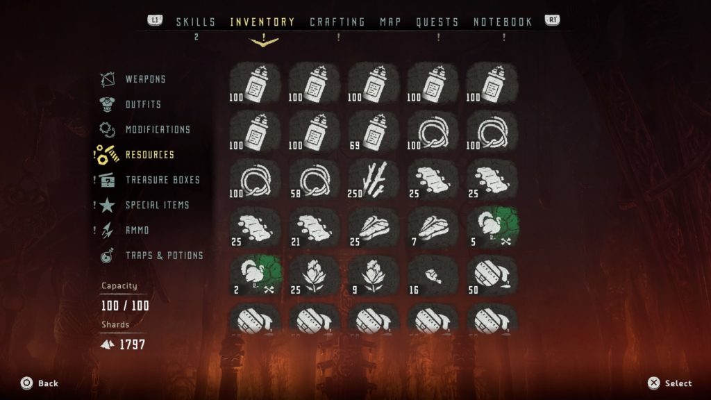
Upon first opening the “Inventory” tab, the player is presented with a grid-style layout. While all sections of the inventory have this layout, the burden of manageability is especially apparent in the “Resources” tab due to the high capacity. Visually, the iconography does not do a great job of differentiating the many items on screen. Although there is color added to some of the icons on other tabs, the resources tab only has rarity-based coloring, which does not help the player to quickly identify items at a glance.

Another reason the “Resources” tab can become overbearing when the player has many items is because items cap at arbitrary numbers. For example, the first seven items seen in the screenshot below (Sparker) are all the same, but once the player collects 100 of that item, a new inventory spot must be used. Also, there is no consistency in this numbering system, as players can obtain 100 Sparker before needing to use another inventory spot, whereas meat can cap at 25 before needing another spot.

Furthermore, when dropping items (holding triangle), there is no option to drop a partial amount of these arbitrary numbers. If the player wants to open an inventory spot by dropping (or selling) one of the seven spots occupied by Sparker, all 100 would need to be dropped. Allowing players to drop a specific amount would have allowed for more precise and customized inventory management.

Lastly, there are no filtering options to expedite the process. Players need to manually cycle through all 100 items (if full) to find an item they deem expendable. Being able to sort and filter by different categories of items, rarities, etc. would have been very useful. Alternatively, having the “Resources” tab broken into more specific categories rather than just lumping everything under one tab have made navigation and management more fluid.

Lack of further information about resources

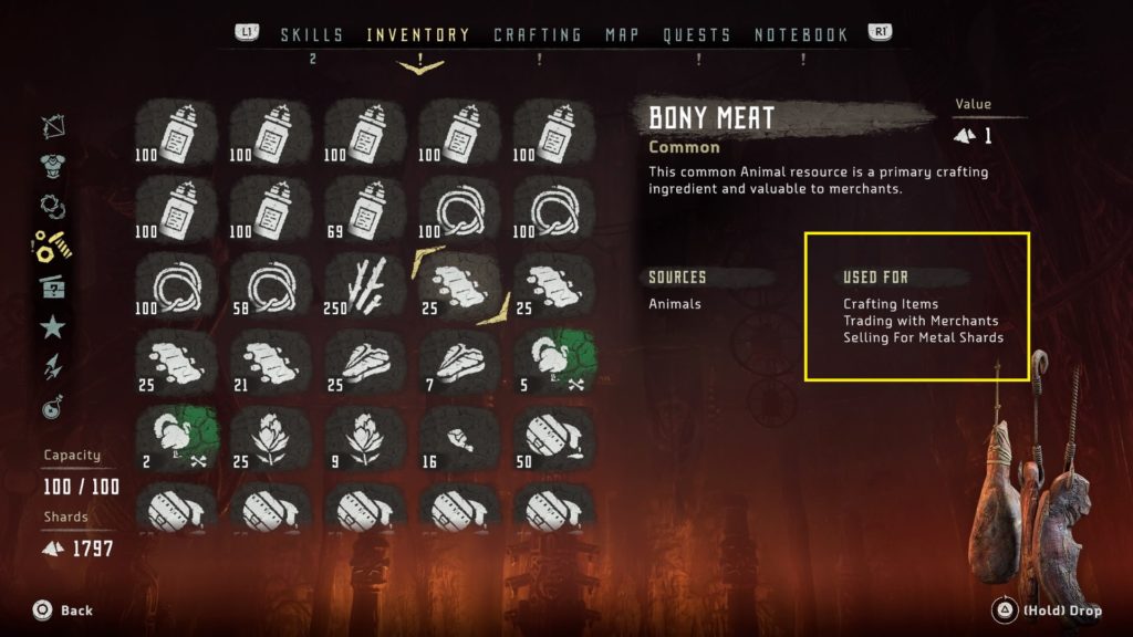
Upon further exploration of the items in the inventory, information about the use of each item is presented on the right side of the screen under “Used For.” The issue here is that this information offers very little help to players, primarily because many items in the game have multiple uses listed and there is no way to find more relevant information from here. Therefore, the player might be on the fence about selling an item that is listed as “Selling for Metal Shards” because it also has a listed use for “Crafting Items.” This lack of information severely limits important decision making for players. Also, this can cause a snowball effect, which starts with a fear of parting with any items because they might be needed later in the game to craft or trade with a merchant to get something specific. There is nothing like hoarding items in RPGs, parting with some at some later point, then ultimately realizing it’s needed for something else you want.

For example, in the screenshot below, ‘Bony Meat’ has multiple uses in the game (i.e., crafting items, trading with merchants, selling for metal shards). Important information to include here (or ways to navigate to) to inform decision making would be:

  • What item(s) can be crafted with bony meat?
  • What can bony meat be traded with merchants for?
  • How many metal shards can be obtained by selling bony meat?

“Create job” does not perform as expected

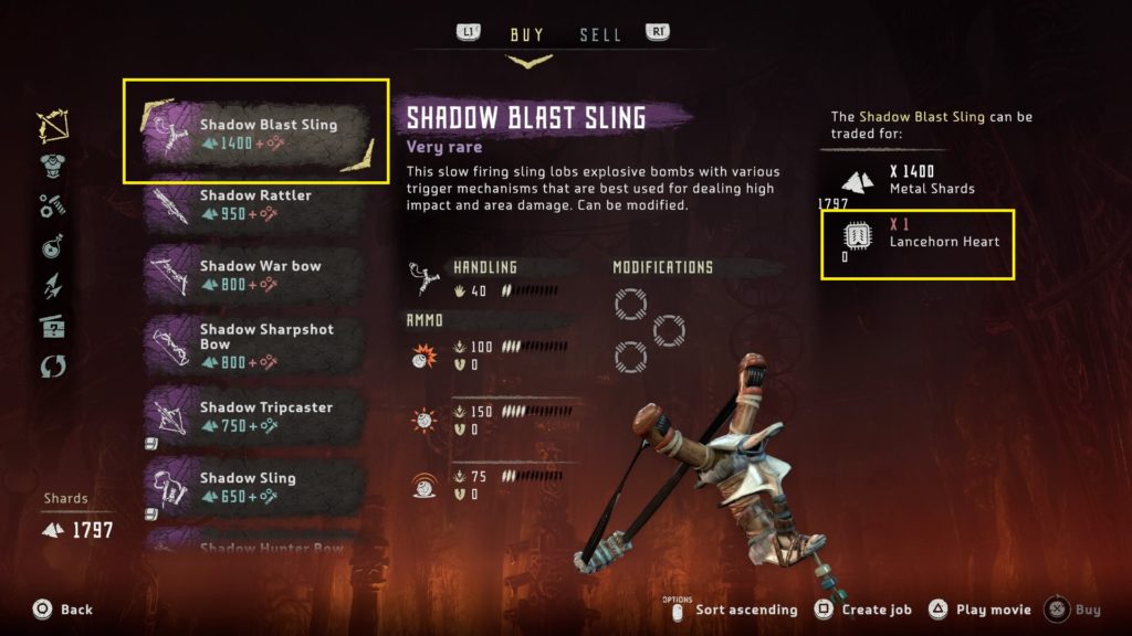
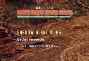
Horizon Zero Dawn has a mechanic that allows the player to create a job to find crafting items or items they might need to complete trades with merchants. While this is a great addition to help players track items, it does not perform as expected. As seen the in screenshot below, players can press square on an item to “Create job” and actively track the missing required items, which is a “Lancehorn Heart” in this instance.
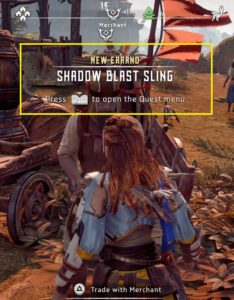
Once a job is created by the player, he/she is given the option to make it their active quest. Everything about this “New Errand” behaves like a quest, minus one major component – the determining of the location of the tracked items. The “Create job” mechanic basically gives players an on-screen checklist for items they need to find and nothing more.  Without any additional information here, such as a waypoint set to a general area of the map, players can spend a lot of time roaming around for animal parts, for example, which are not indicated on areas of the map like robots, and are needed to craft many different items. If this omission is by design, perhaps to encourage random exploration, and the intent is to be a glorified checklist, great. If not, this seems like a missed opportunity for a potentially super-useful mechanic.

Additionally, there are some issues present when trying to conduct business with Merchants:

Lack of clarity when an item cannot be sold

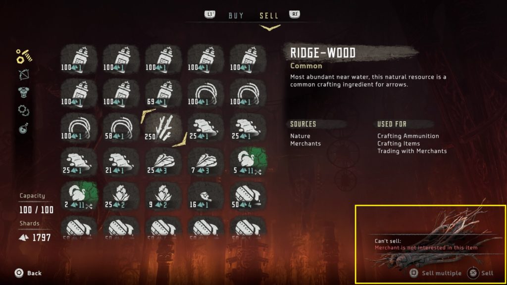
Below is a screenshot of the main UI when selling items to merchants. The “Resources” tab is similar to that discussed earlier in the “Inventory” tab. The item selected in the screen below, Ridge-wood, is a very common item in Horizon Zero Dawn used to craft arrows. It appears, just like every other item in Aloy’s inventory, when navigating the “Sell” tab. However, it cannot be sold to merchants and the only information conveying this is in the bottom-right corner, where “Sell multiple” and “Sell” are dimmed/grayed out. If the player attempts to sell it by holding X, the “Can’t sell” prompt seen in the bottom right appears. Neither of these are very clear; the dimming of the text is too subtle to be recognized and, along with the “Can’t sell” prompt when it appears, is on the opposite side of the screen away from the player’s main gaze. This important information can be easily missed. A better way to convey the “Can’t sell” information would have been directly on the items themselves, where the player is directing their attention.

Lack of clarity when an item cannot be bought due to full inventory

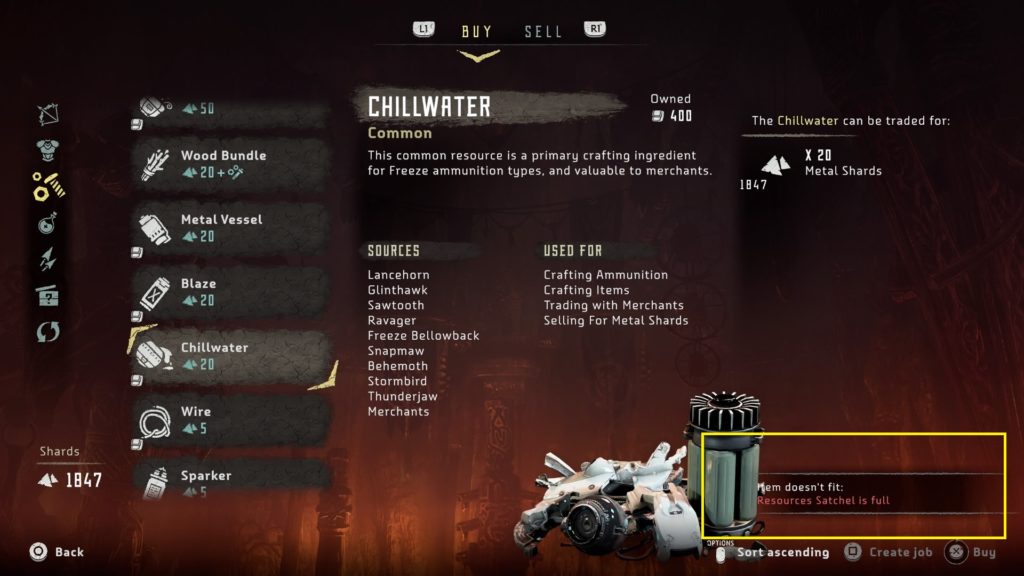
Similar to the previous issue, when navigating the “Buy” tab and attempting to buy an item when having a full inventory, the “Item doesn’t fit” prompt appears on the opposite side of the screen from the player’s main gaze. Additionally, this prompt overlaps some of the item art, which can make it harder to read.

Inconsistency with sorting options

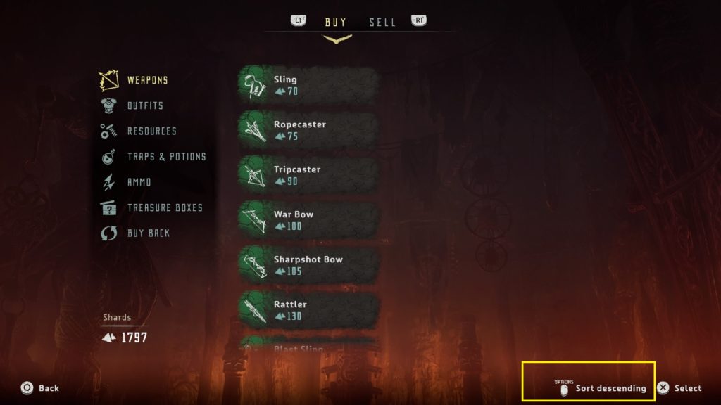
When navigating the “Buy” tab, there is the option to sort by ascending/descending item value. However, this option is not included under the “Sell” tab, adding to the list of inconsistencies within the inventory management system.

Important player-facing information cut off

Although minor, one thing that is consistent across both “Buy” and “Sell” tabs (and the inventory in general) is that the bottom-most visible row is cut off, often omitting important information and requiring the player to scroll. For example, in the screenshot below, the value of the modification is cut off.

Buying back items is unclear

Players have the option to buy back items that have been sold to merchants. Although this sounds straight forward (i.e., player sells, can buy item back), it is not. Merchants only keep the ten most-recently sold items in their inventory at any one time. Additionally, players cannot buy back any items of common rarity, only green (uncommon), blue (rare), and purple (very rare). If a player goes on a selling spree not realizing this, the player will not have the option to alleviate any potential feelings of seller’s remorse.

This is a fine system; I’m not advocating for players to have the option, at the end of the game, to buy back the very first option he/she sold. However, there is critical information here that needs to be conveyed, perhaps upon the player’s first visit to a merchant via a small tutorial or prompt.

Conclusion

Horizon Zero Dawn is a good game that does many things well, such as numerous open-world tropes, combat, and telling an entertaining story; however, inventory management is not of of those things. Although I likely spent as much time fumbling through the inventory as I did combating robots, Horizon Zero Dawn is worth checking out if you’re a fan of action RPGs.

How to break into games user research

For anyone interested in beginning or transitioning to a career in games user research, here are some tips and suggestions that might be useful. While obtaining a degree in a relevant discipline and lab experience is a helpful start, there are many additional steps you can take to help you break into the industry. Here are some of the ones I found to be effective: 

Play games and change how you think about them

This should be a no-brainer – you should play a lot of video games. When trying to professionally study game design and development for a living, playing many different types of games is beneficial. This can include games outside of your comfort zone, such as different genres. Even games that are just plain bad can expose you to various types of design and issues. Exposing yourself to different platforms (PC, console, mobile, handheld, VR, etc.) will help you develop a more versatile skill set as a games user researcher. If you’re passionate about video games, this likely won’t even seem like work (more like a learning experience). Comprehensive knowledge and exposure will make you a more attractive candidate for a multitude of positions and studios.

Furthermore, to learn more efficiently and make better use of your time while playing, it would be beneficial to change how you think about games and playing them. You’ll want to keep user experience at the forefront while playing at all times by thinking critically and analytically. Look for usability, flow and general design issues and inconsistencies. If a game has an oddly-designed mechanic compared to the industry standard, is it for a good reason? Or, was it just an oversight that could have been improved upon with iteration? Was the tutorial sufficient? How does the progression and balance feel? Do the controls feel intuitive? And the list goes on.

Work independently

In addition to having an academic background in a relevant discipline, it is important to collect resources to educate yourself. This can include books specifically about games user research (of which there are quite a few good ones) and psychology, which will provide a solid foundation for research skills and many relevant theories that drive the field. Check my resources page for some examples.

One way to culminate all of this collecting and learning is to start your own blog. This will allow you to apply what you have learned in a constructive way, which can show potential employers how serious you are about a career in games user research. It can also be a reference during interviews, as many will ask specifically for examples of user experience issues in games. Ultimately, your blog can highlight your strengths, help you strengthen your weaknesses, and be an excellent way to demonstrate your critical thinking, writing skills (for all those playtest reports you’ll eventually be writing), interests/individuality, and growth as a researcher.

Seek advice/feedback and/or obtain a mentor

Another way to collect resources is to become active on Twitter. Many researchers in the field have Twitter accounts and tweet useful advice/informative resources (especially the official GamesUR Twitter account) and have personal websites where they document their work. Everyone I know in the community is very approachable, receptive and happy to field questions from aspiring user researchers and anyone with a general interest in what they do. This can be a great way to seek advice and feedback.

There is also an official mentoring program through the IGDA Games User Research SIG with an impressive list of academic and industry researchers willing to discuss a wide range of topics. Find someone you think would be a good fit for you and reach out!

Volunteer/offer your services to independent game developers

Reach out to indie companies that interest you, even if you are unsure if they have user experience researchers or offer similar positions/internships. Let them know about you, your interests, what you’re looking to do, and what services you can offer them. You might get lucky and they could have an open position. Or, your pitch could open them up to the idea of adding such a position. They could offer to bring you on as a volunteer/intern, which is a low-overhead, high-reward opportunity for them. These companies can be local to you (if you’re seeking specifically hands-on experience) or not if you’re willing to work remotely. I recommend the former, if possible, because you’ll start new relationships and also develop an understanding of game development and culture in general. However, either instance will provide valuable experience.

Seek entry-level or contract positions

Many large publishers and studios have user experience researchers and often offer entry-level user research positions on a contract basis. These typically range from three months to one year. While some do not require any formal experience working in games and/or user experience, many see it advantageous that candidates have done some relevant work. Once you feel you’re up to snuff for such a position, throw an application out there!

Although these positions are not practical long-term solutions, they can be a great first formal experience in the industry. You’ll learn new things, meet new people, and (hopefully) work on awesome games. Of course, your geographical location in relation to your companies of interest is a major factor. However, even for short-term contract positions, some companies will offer some sort of relocation assistance to ease the burden of moving. It can be risky to uproot for such a position, but it can also bring great experience that will ultimately help you achieve your goals.

Continue to learn and grow

Never be satisfied. Continue to teach yourself new things, both on- and off-the-job, whether it be a new research method, way to report data, or statistical-analysis program. If you’re only experienced in qualitative research, learn/practice with quantitative data sets (or vice versa). Become familiar with industry standards as well as different types of design. Continue to gather useful resources, read books, attend conferences, and learn from others to help you hone your craft. Think of your career as an RPG with no level cap; grind the side quests for the extra XP that will help you level up to achieve long-term success during the main quest. Strive to be a multidisciplinary researcher!

Hopefully these tips are helpful to aspiring games user researchers!

Building player motivation in hero-collecting games: a self-determination theory analysis

Motivation is one of the main pillars of video game user experience. Competence, autonomy, and relatedness are the three basic psychological needs that people aim to satisfy according to the self-determination theory (SDT). When playing games, players need to feel adept (competence), have meaningful choices when deciding how to play (autonomy), and feel a sense of connection (relatedness).

SDT is one of the most well-known and widely-used psychological theories in games user experience research, primarily because of its influence on building the framework for player motivation. Free-to-play monetization models are a modern norm in the gaming industry and designers are always seeking ways to keep players motivated and coming back to their games for more. This post will discuss SDT through a series of popular mobile free-to-play hero-collecting games.

Star Wars: Galaxy of Heroes 

Star Wars: Galaxy of Heroes focuses on collecting the many characters in the Star Wars universe and is a great demonstration of the competence motivator of SDT. For this motivator to have the desired effect, players need to feel like they are progressing and getting better at the game. Early on, Star Wars: GOH offers positive feedback on progress the player has achieved. Building this competence from the start and letting players know they are succeeding can help motivate them to continue.

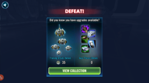
The main progression is focused on players leveling up their character collection, which makes them more powerful and able to unlock new and upgraded skills in order to tackle increasingly-difficult content. Feedback is also presented during defeat, which reminds the player of items in his/her inventory to make characters more powerful in order to help overcome any current obstacles (see screenshot below). Even in defeat, player competence can be strengthened.

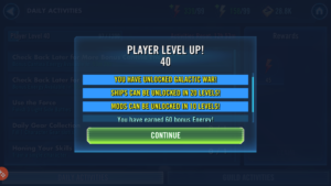
Additionally, the player has a level, which increases the energy used to play different modes and unlocks different game modes as well. Star Wars: GOH makes this information very clear to the player and notifies them of their progress with each level, presenting them with yet another goal to work towards. This feedback enables players to monitor their advancement and effort regulation towards a distant goal. Having an achievable distant goal also allows players to decide their playing pace/strategy and enhances autonomy.

Fire Emblem: Heroes

An important factor when playing a game is that the player has meaningful choices when deciding how to play (autonomy). In mobile games and, more specifically, RPG mobile games such as hero-collectors, choosing which quests to pursue or how to pursue them is a choice players have to make. For example, in Fire Emblem: Heroes, players can choose from story missions, training missions, special (limited-time) missions, and arena duels (PvP). To give more meaning to player choice, Fire Emblem: Heroes includes secondary check-list-type objectives that include things such as clearing specific missions, completing a certain number of specific mission types, and in-mission objectives, such as beating certain types of enemies.


Quest/objective lists are common in many games for a reason. At our most basic level, humans do not like it when they begin something and do not finish; such conditions create an internal tension and preoccupation with the incomplete task (Madigan, 2017). This basic desire is a major underlying reason for daily quests and similar types of limited-time events/missions; players feel the need to log in daily to games that offer such quests in order to simply “check things off their list.” Not only does such action typically provide players with a reward, but completing a task also provides closure. Additionally, although these types of quests are entirely optional, humans also hate losing options once having them; a sense of loss, or losing out on an opportunity, can overcome players if they decide to (or inadvertently) skip limited-time quests.

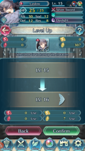
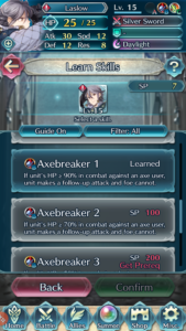
Furthermore, players can utilize different combinations of any four heroes to strategically tackle whichever quest they choose. In Fire Emblem: Heroes, players can level up their heroes with XP gained by defeating enemies in combat or spending in-game gold to level them up. Defeating enemies and leveling heroes also results in Skill Points (SP), which allows players to customize their heroes by unlocking different skills and subsequently leveling those skills. This further enhances the meaning of player choice, especially if players are attempting to combine certain hero synergies and tactics.


Together, the examples discussed here for competence and autonomy (i.e., feedback in Star Wars: GOH and quest lists in Fire Emblem: Heroes, respectively) can invoke the endowed-progress effect. When players are given the feeling of advancement toward a distant goal, they’re more likely to try harder and longer to reach that goal, even relative to players who have an equally easy goal but received no sense of momentum right from the start. For example, in Star Wars: GOH, players begin receiving shards to unlock Darth Vader within the first few quests they complete, not only making them aware of this distant goal, but also providing them with a sense of advancement toward unlocking this character. It takes 80 shards in total to unlock Darth Vader and players are continuously unlocking nominal amounts of shards through daily quests, etc. The game reminds the player of his/her progress with each shard obtained in a check-list format (e.g., 48/80 shards) via pop ups and UI panes, which provides recognition to players and their progress toward this goal.

Walking Dead: Road to Survival

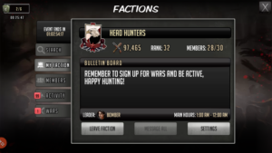
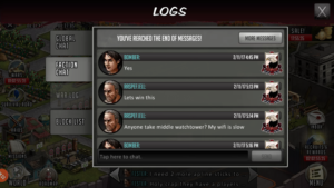
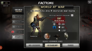
It is important for games to convey a sense of relatedness, or a sense of connection to others. These connections can be with other real players through social aspects of the game or through in-game characters. Walking Dead: RTS allows players to build both types of connections. Connections are made with other players through Factions and events such as All-Out-War, where players and their faction members take on other factions in asynchronous PvP. These Faction events give players team-oriented goals, tournaments (and placement-specific rewards when they’re over), leaderboards, and emphasis on achievements attainable only through team play, such as leveling up characters with certain traits within a specific time frame. Since players are working toward a team goal, they feel important to others and know that their play/participation affects not only themselves, but other players as well.

In-game Faction chat

Limited-time Faction events

Players can also build a connection with in-game characters through the main story mode and various limited-time events. Walking Dead: RTS is based on the comics, not the TV show, and anyone who has read and enjoyed the comics will likely feel a sense of camaraderie with some of the fictional characters and stories. Players go through a lot of effort to feel these connections and progress-related missions help with that.

If you’re familiar with the comics, you should recognize many of these faces.

Summary

Self-determination theory and its three underlying motivators (competence, autonomy, and relatedness) are, in some form, present in most games. They are especially prevalent in mobile games and games seeking to keep a high level of player motivation and retention. This will lead to higher retention rates and likely more money spent in free-to-play games. SDT and its motivators have developed a framework for designers to achieve this, not only in free-to-play games but, in more traditionally-monetized games as well through some of the design techniques discussed here. These techniques elicit responses from player’s basic psychological needs and desires. This will lead, along with good, clear, meaningful feedback (and rewards) to highly-motivated players.

References:

Madigan, J. (2017, January 2). Zeignarik Effect and Quest Logs. [Blog post]. Retrieved from http://www.psychologyofgames.com/2017/01/3613/

Affordances in The Walking Dead: Road to Survival

Even the simplest games require attention, focus, and cognitive effort, which leaves users with fewer resources for regulating in-game decisions. Affordances, or things that help users do something, can be implemented to reduce cognitive load and effort. Since playing games requires learning, an intuitive design and inclusion of affordances can help reduce cognitive resources allocated to figuring out how a game works and increase allocation to where these resources are designed to be spent. There are four main affordances in UX design:

Physical

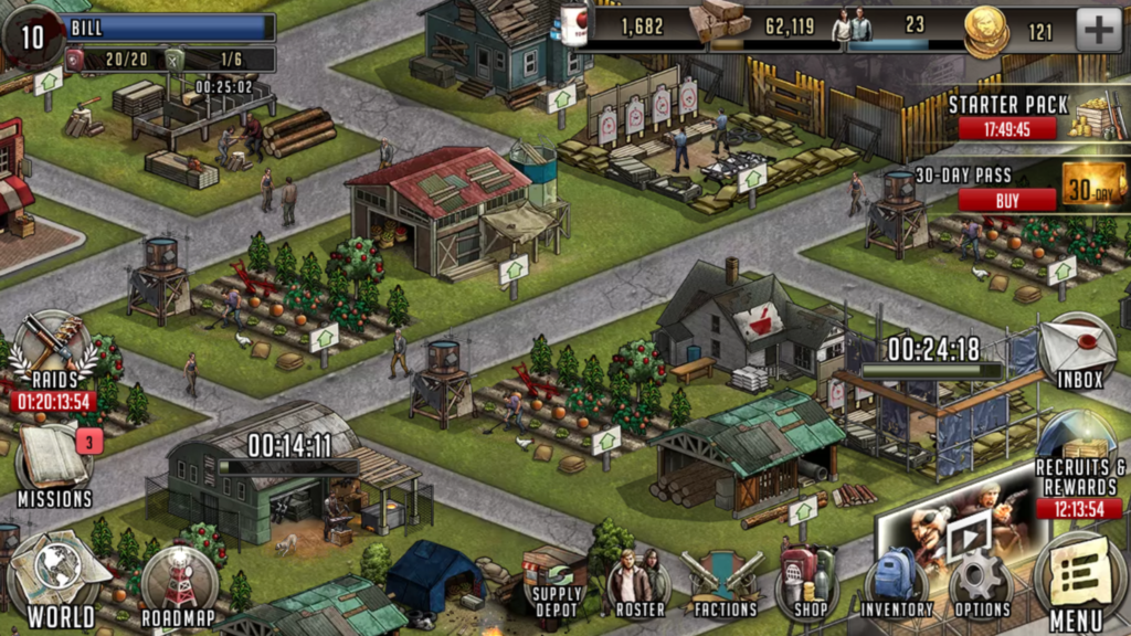
A physical affordance is a feature that helps users accomplish physical actions with the interface. An example might be the distance of a button on the interface of a mobile game from the user’s thumb while the phone is in a portrait or landscape position. While some games allow the user to play in either of these positions, The Walking Dead: Road to Survival is only playable in landscape. See below for a screenshot of the main town hub, which is one of the main interfaces of the game and where the player spends a bulk of his/her time when building the community and collecting resources.

walking-dead_2016-11-15-14-46-05

Although it is a busy interface, the main interactive icons populate the perimeter of the landscape-positioned interface. The type of device the player is using (i.e., phone or tablet) will determine the difficulty of reaching these icons with his/her thumbs but, from my experience, it is never an uncomfortable reach, even to access the top icons, when playing on a phone. Again, this will differ according to the size of the device and the size of the player’s hands.

Additionally, when a building, post, farm, etc. in the community is selected, the menu interface is retracted and replaced with a building-specific interface. Although the icons in this interface are similar in style to the menu ones, they are distinct by having different symbols that are also larger in size. Not only are these buttons easier to press, but this physical affordance, along with retracting the menu interface to avoid an overly-busy screen, results in the building-specific interface not becoming easily confused with/as the menu interface. These two interfaces can be seen at the bottom of the GIF below.

building-interface-gif

Cognitive

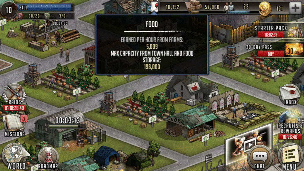
A cognitive affordance is a useful feature in design that allows the user to think, learn, understand, and know about something in an intuitive manner. For example, in the screenshot below, there are symbols that represent specific in-game resources that can be accumulated by the player. These symbols help the player understand the different types of materials at a glance and precisely how many of each he/she has at the moment.

cropped-icons

Also, if the player is ever unsure of the current state of his/her resources, he/she can tap the symbol, which brings up an overlay with more information about the respective resource. See the GIF below for the overlays for each of these resources.

cog-affordance-gif

Sensory

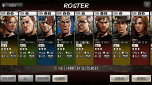
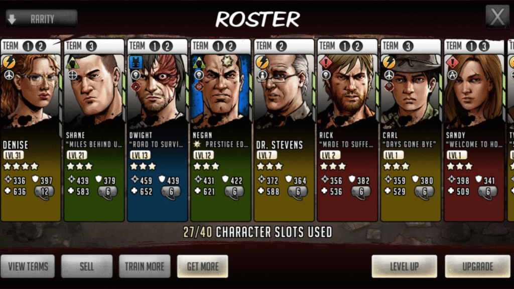
A sensory affordance is a feature that helps users sense (i.e., see, hear, feel) something intuitively, which enhances perceptibility and (hopefully) information processing. At its core, The Walking Dead: Road to Survival is an RPG about community building and character development. This development is attained by fighting walkers and humans through single-player story missions, scavenging missions, and asynchronous PVP ‘Raids’. It is up to the player to build successful, synergistic teams and below is the screen that displays the player’s roster of characters. Since players can have multiple teams, IUGO incorporated useful signifiers that allow the player to see the most important information about each character right from this screen, such as player persona, trait, stats, and level, which are all indicated by symbols and numbers. Importantly, at the top of each character, it displays what team(s) that specific character is currently on. If a character is not currently on a team, it will be blank. This is a useful feature to help the player notice and quickly track what characters are on what team without having to proceed to ‘View Teams’.

roster-gif-2

Additionally, the roster of characters can be sorted by rarity, type, cost, etc. by tapping the down arrow in the top-left corner, which leads us to the final type of affordance.

Functional

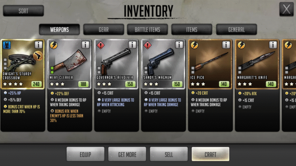
A functional affordance is something that simply adds functionality, such as sorting or filtering items in an inventory. Similar to the sorting feature for the character roster, the inventory interface in The Walking Dead: Road to Survival clearly breaks down items into specific categories along the top of the interface and allows the player to sort through the inventory, which can be activated by tapping ‘Sort’ in the top-left corner. After sorting, the player simply has to swipe left/right to see the items. This added functionality enables the player to more easily find a specific item in a game that has many, many different types of weapons and items.

inventory-gif

Final thoughts

There are four main affordances that are useful in UX design for games: physical, cognitive, sensory, and functional. Only some examples were discussed in this post and, while which affordances to incorporate into a specific game’s design depends on the design intent, many games will have instances of all four to some extent.

I hope this post has been informational. If not, well, as with many Walking Dead games, you’ll have a difficult decision to make:

cropped-garrett

(Bill will remember that)

Special-ability conveyance in action games

Special abilities are obtained throughout gameplay and typically give the player some sort of advantage or enhanced/diversified gameplay experience. They can be unlocked over time, via certain in-game actions, or by meeting certain criteria. Also, they can range from all sorts of things, such as being “on fire” in NBA Jam, to invincibility in Sonic the Hedgehog, to kill streaks in Call of Duty, to bad-ass superhero powers. This post will look at how different action games notify the player that he/she has an ability ready to be used, as well as the advantages and disadvantages of each design from a UX perspective. Scroll to the end of the post for the TL;DR version/conclusion.

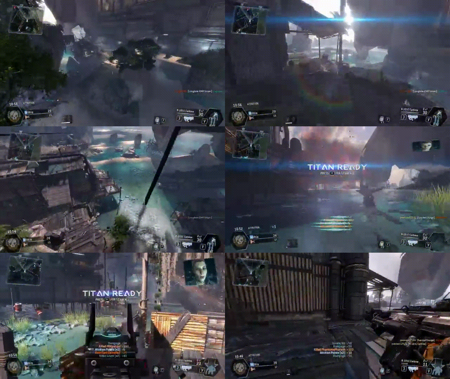
Titanfall

6tmsomx-imgur

In Titanfall, a first-person shooter, the player can summon mech-style “Titans”. There is special ability mech suit HUD/UI in the bottom-right corner, which is represented by relevant iconography, and both a numerical timer and a progression-style timer that fills in the gray suit, indicating when the ability is ready to be used. Additionally, the icon changes from a standing position to a kneeling position, further indicating when the mech suit can be summoned. All of this is coupled with a “Titan Ready” pop up in the middle of the screen and a button prompt for how to activate it.

Advantages:

  • Player is informed through multiple means
  • Pop up is in the center of the screen and in the player’s main gaze
    • large, legible font
    • contains direction how to activate ability
  • Relevant icongraphy as supplemental conveyance
    • positioned in the corner of the screen out of the player’s main gaze, yet is easily accessible as a reference
    • provides on-screen reference for player if the ability is not used immediately
    • multiple visual cues
      • mech suit
      • numerical timer
      • countdown progression timer

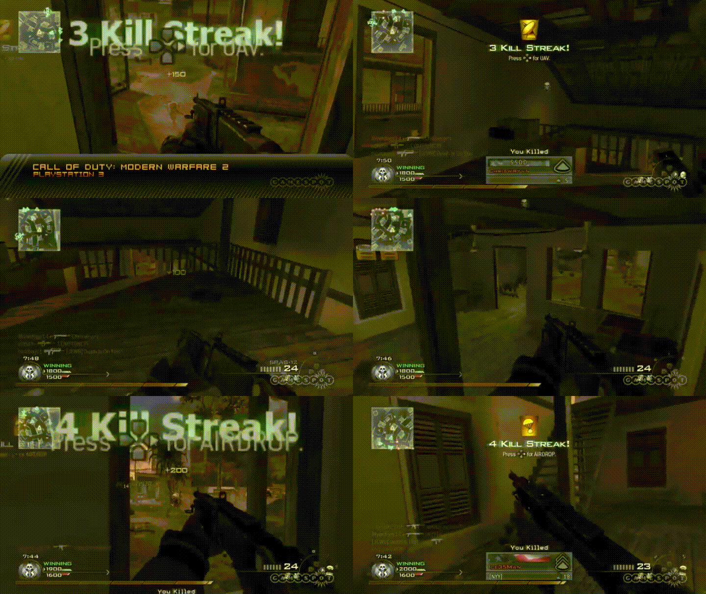
Call of Duty Modern Warfare 2

uwodel2-imgur

In Call of Duty multiplayer, when a player achieves a kill streak, he/she is rewarded a specific special ability depending on how long of a kill streak has been achieved. This is conveyed via pop-up text in the center of the screen, which is coupled with the appropriate button to press in order to activate the ability. Additionally, above the text, there is an icon that conveys which ability is ready; this specific scenario presents a parachute and satellite dish to represent airdrop and UAV, respectively.

Advantages:

  • Notification is presented in the center of the screen near the player’s main gaze
  • Relevant iconography as supplemental conveyance
  • Direction/button prompt how to activate ability
  • Numbers also presented to help the player keep track of his/her kill streak

Disadvantages:

  • If the ability is not used right away, there is no on-screen reference to notify/remind the player

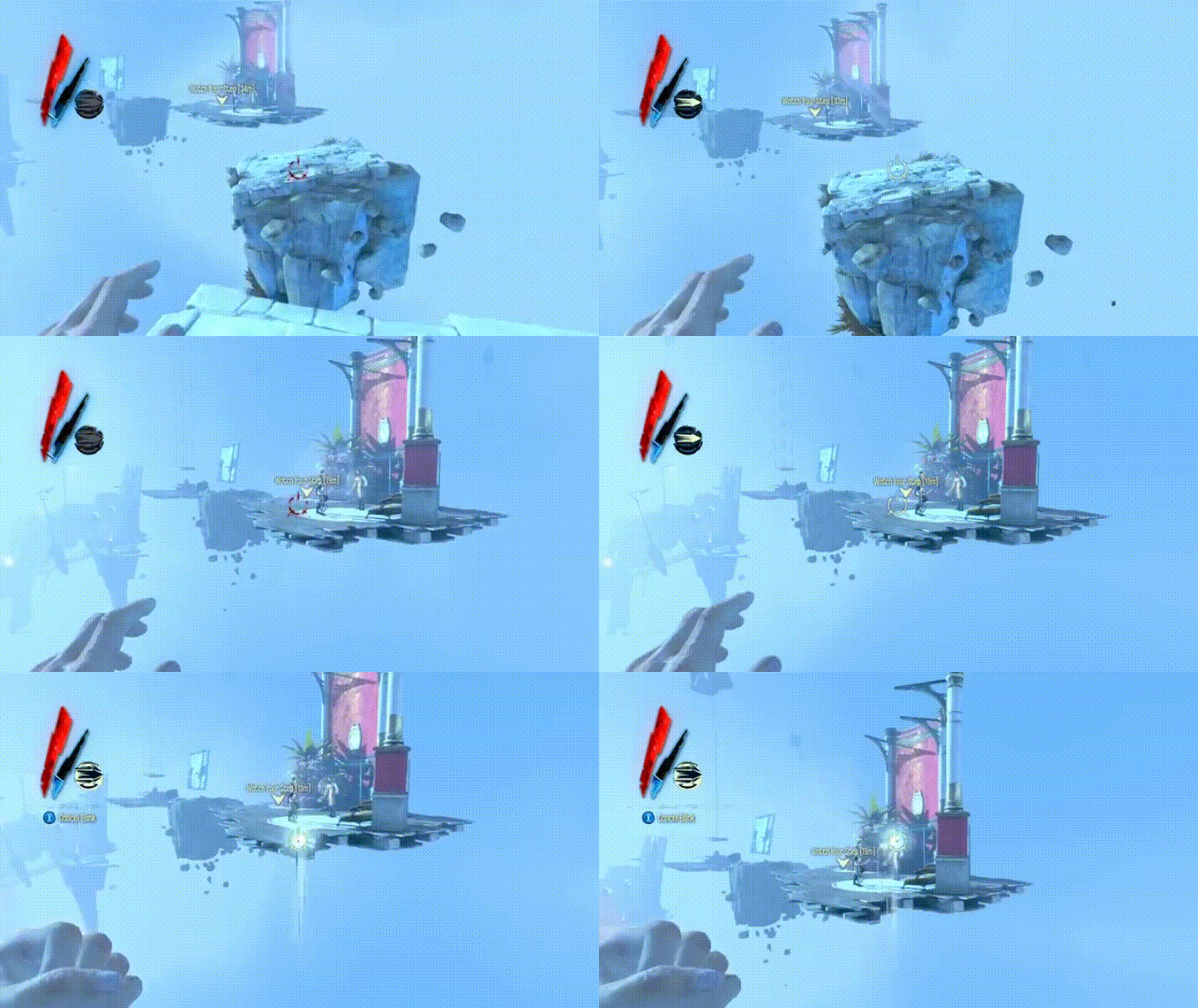
Dishonored

a1tvctt-imgur

There are many different abilities that can be used in Dishonored, a first-person action game. In the upper-left corner, there is HUD for this specific ability, which is a blink/teleport ability that helps the player traverse the environment. Along with a progress bar, there is a relevant icon (arrow) that changes, as a visual indicator to the player, when it is ready to be used (white arrow, black background), currently being held (black arrow, white background), or depleted (grayed out).

Advantages:

  • Doing more with less – minimalist, yet stylistic, approach
    • one icon represents three different states: ready to be used, in progress, and depleted
    • this is important in first-person games, as players might want less HUD/UI on-screen in order to feel more immersed
  • Black/white contrast is visible to the player’s periphery while looking at the center of the screen
  • Button prompt to “Cancel Blink” appears under HUD once activated by the player

Disadvantages:

  • Some of the HUD/UI can clash with the color palette of the game’s environment, which might present contrast/visibility issues for some players

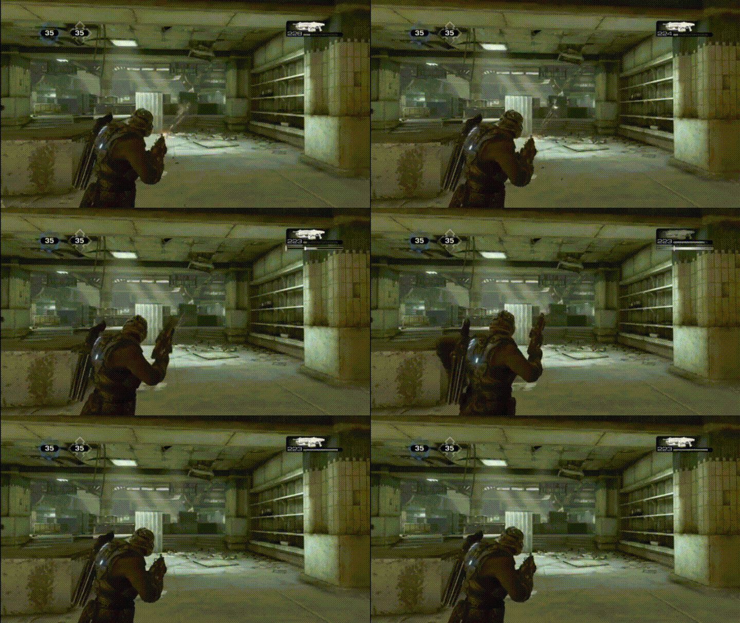
Gears of War series

nncgkkj-imgur

The HUD for the player’s current weapon and ammo is in the top-right corner. There is a “perfect reload” mechanic where, if the player can time the reload of his/her weapon perfectly, he/she receives an increased-damage buff for a limited time. This is indicated by the reloaded portion of ammo flashing briefly (as well as the gun), which receives an increased-damage buff for a short period. Conversely, if the player mistimes the reload, the UI will turn red, indicating failure and the gun will jam briefly.

Advantages:

  • Doing more with less – minimalist approach
    • conveyance is integrated into weapon HUD
    • the player knows where to look for all weapon-related information
  • Black/white contrast is visible to the player’s periphery while looking at the center of the screen
    • this is enhanced because not only does the ammo that is buffed flash, but also the weapon as well

Disadvantages:

  • As Gears of War is (primarily) an Xbox game, the player is likely to be playing farther away from the screen than when playing either PC, handheld, mobile, etc.
    • although the contrast of the flashing is helpful, some players might have difficulty seeing the HUD from certain distances

The Division

on4grwi-imgur

In The Division, the player has customizable skill slots, which have cool downs, and are located on the HUD in the center of the screen near the player’s avatar. As these skills are regenerating, the skill-specific spot turns into a whitish-gray pulsing progress bar. Once complete, the icon for the skill is restored.

Advantages:

  • Location of the HUD/UI is based on the center of the screen and the player’s main gaze
    • player does not need to divert attention
  • This HUD/UI moves intuitively with the player’s avatar as he/she traverses throughout the game world
  • Pulsing progress bars are visible when aiming with reticle
    • player is able to constantly track the progress of the cool down
  • Relevant iconography makes it easy to identify which skill is ready to be used

Disadvantages:

  • Some players might not like too much information constantly within their main gaze

DOOM

cgg6jnl-imgur

Similar to The Division, the HUD/UI for cool down/regeneration of accessories (bottom right) shows a loading progress bar that culminates in a flash and restoration of the specific icon as a visual cue for the player.

Advantages:

  • Close to player’s main gaze, yet not directly in the center of the screen
    • flash can be seen from peripheral vision
    • easily seen upon quick glance
  • Relevant iconography makes it easy to identify what item is ready

Disadvantages:

  • Depending on distance from/size of the screen, some players might have difficulty seeing this 

TMNT: Mutants in Manhattan

bw3wldz-imgur

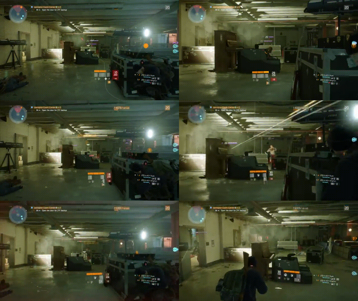
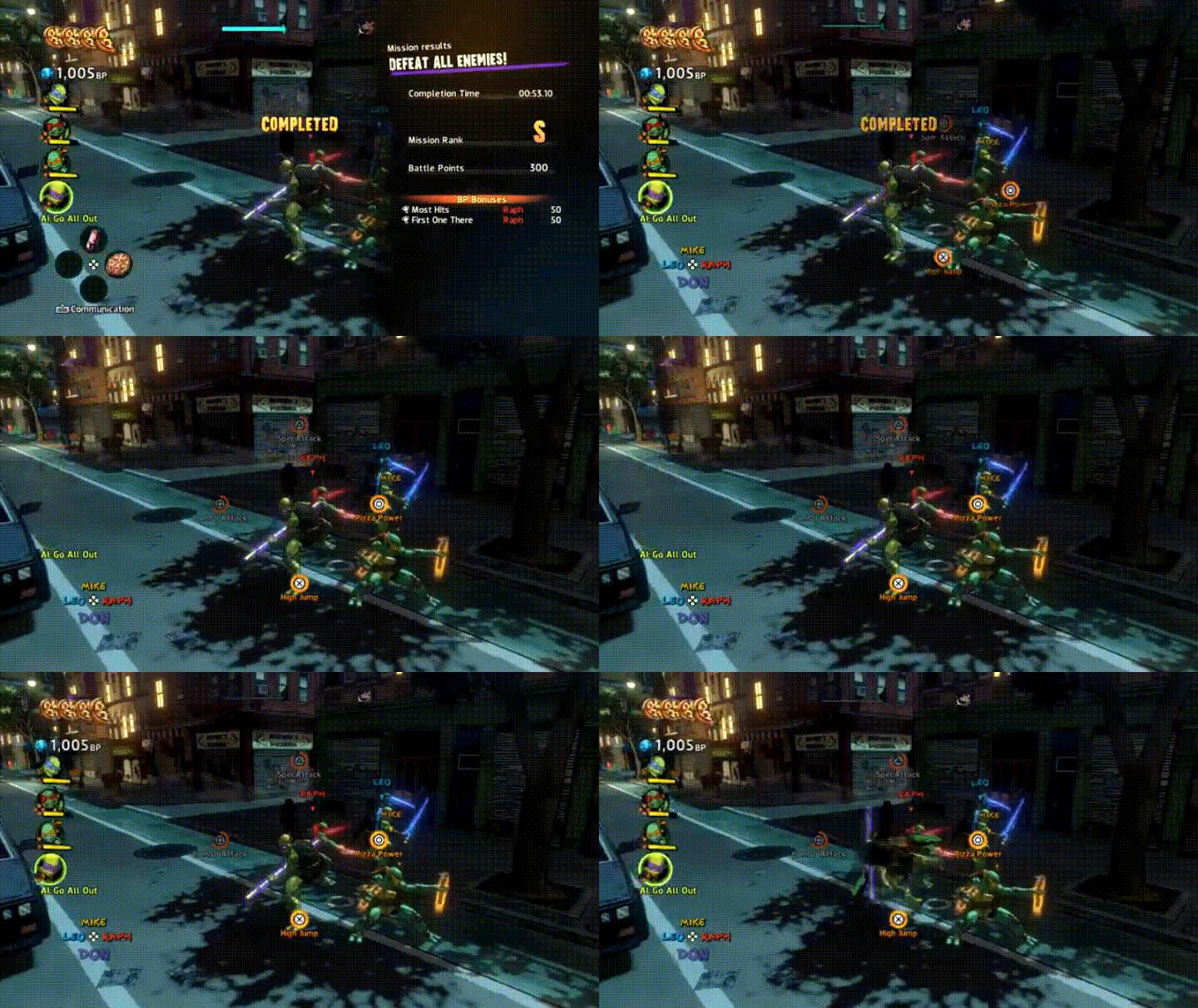
In TMNT: Mutants in Manhattan, the special-ability regeneration is not a transient pop-up, but is one the player can access at any time. By holding down the L2/LT, the player can see a circular regeneration progress bar in the middle of the screen for their four ninjitsu specials. Ready-to-use ones are bright orange, whereas currently regenerating ones are grayed out. However, there is no cue to notify the player when these are ready to use; the player must actively seek that information.

Advantages:

  • Accessible at any time
  • Contrast – bright orange for ready, grayed out/loading bar to convey cooling down
  • Name labels and associated buttons for each of the four moves

Disadvantages:

  • No cue to the player when these abilities have regenerated and are ready to be used
  • Having to manually bring up this information could be inconvenient/ruin the flow of a high-paced game such as TMNT: Mutants in Manhattan

Batman: Arkham City

bgnyxi8-imgur

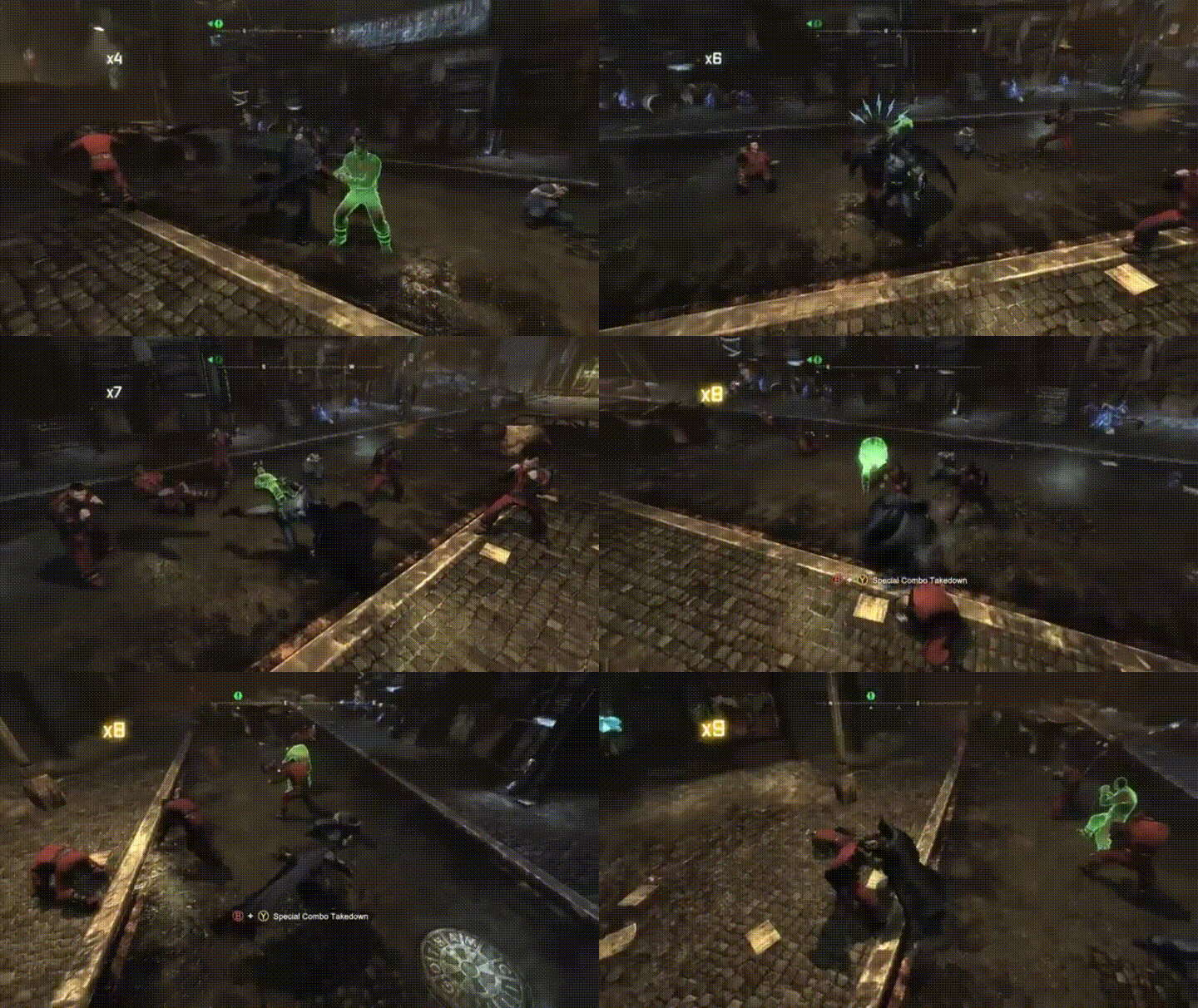
During combat, there is a multiplier in the upper-left corner that tracks the players’ successful hits. Certain upgraded abilities require the player to reach a certain number on the multiplier to be triggered; when this number is reached, it flashes and turns yellow, offering a visual cue to the player indicating that the specific move is ready to be used. Additionally, button prompts and ability name appears in the center of the screen.

Advantages:

  • Minimalist, yet effective
  • Flash is easily seen from player’s peripheral vision, regardless of screen size/distance from
    • contrasts the dark environment of the game
  • Button prompts and name labels to remind player which ability can be used
    • this is very helpful in notifying the player in a game with a deep combat system

Disadvantages:

  • Button prompt may be difficult to see from a distance/smaller screen; however, additional conveyance through color (red for B and yellow for Y on an Xbox controller) should help with this potential issue

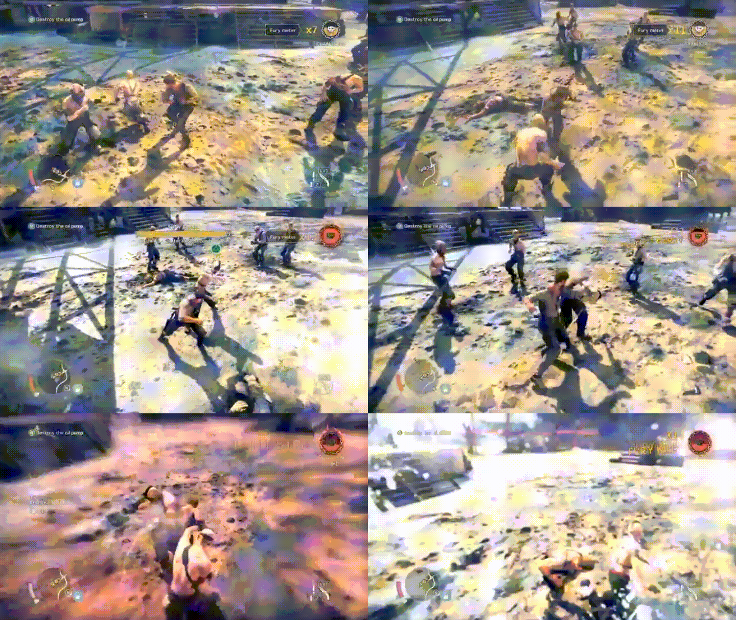
Mad Max

0kq26ei-imgur

Similar to the Batman: Arkham series, there is a combat multiplier in the upper-right corner that pulses and increases with each successive hit. Additionally, there is a Fury Meter next to it that fills up/pulses with each hit and turns red and pulsates once it is ready to be used, as well as a brief slow-down in the action once the meter is full.

Advantages:

  • Progress is always visible to the player
  • Numbers and fury meter used to convey progress
  • Full Fury Meter can be seen from peripheral vision and is conveyed by pulsating and a brief screen pause

Disadvantages:

  • Multiplier is close in proximity/color to Fury Meter, which can make them difficult to differentiate without diverting full attention
  • Multiplier and Fury Meter are yellow and can clash with the environment (i.e., post-apocalyptic wasteland with a yellow-heavy color palette)

Conclusion

Good practices for special-ability conveyance:

  • Use basic/relevant-to-art-style fonts and legible sizes
  • Convey information in multiple ways (e.g., color, text, iconography) when possible
    • do more with less approach
  • Flashing/pulsating is an effective way to make HUD/UI visible without requiring the player to glance away from his/her main gaze (important during high-paced action games)
  • Make information constantly available to the player as a reference to give the option to track progress
  • When possible, include button-prompt pop ups if there are many abilities that can be used in the game
  • Knowing when a special ability is ready to be used is vital information, so make it stand out from other text/UI/HUD
    • different colors
    • flashing/pulsing
    • avoid placing too close in proximity to other text/UI/HUD
    • contrast from primary environmental colors


Telemetry – mission completion time example

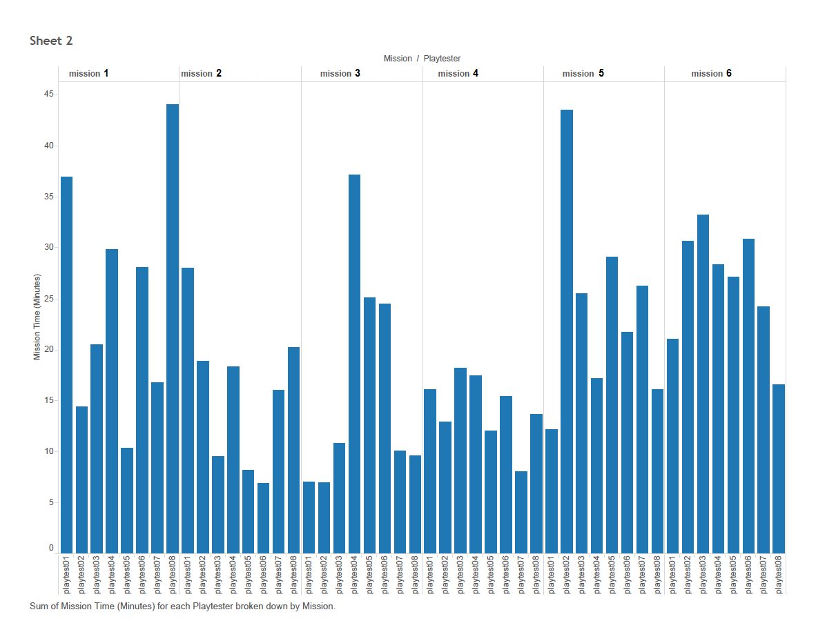
Telemetry data, which are units of data (hardwired/gameplay metrics) embedded into the game via code that are then transmitted to a collection server. This data can help answer questions about player behavior and how players are experiencing games on a level that can be difficult or impossible to obtain through direct observation. Example behaviors caught by telemetry in an action game, for example, can include units such as player deaths, number of enemies killed, abilities used, weapon/ammo pick ups, or mission completion time (as in the following example). One primary use of telemetry data, which can be collected during a playtest or during another period of play (e.g., closed/open alpha or beta, as well as post-launch), is for post-playtest analysis. In the following example, a developer was curious how long it took players to finish the missions they played. This dev had an ideal length in mind for each mission and this data would inform next steps to help reach that vision.

The figure shows the data split by each player (x axis, n = 8) and their completion time per mission (y axis, in minutes).

Following more iteration and playtesting, additional players can be added to these analyses to increase the sample size and provide an average completion time per mission. Averages are not super useful with small sample sizes (here n = 8) since outliers can easily pull the average in a certain direction, skewing the results. And you can see from the graph that the range of time it took playtesters is quite varied within missions.

Furthermore, data can be collected during longer periods of play, such as an alpha or beta period, with averages calculated throughout as well how the average mission completion time may have fluctuated from one play period to subsequent ones (e.g., pre-alpha playtests –> closed alpha –> closed beta –> open beta). This will give devs a better representation of the execution of the mission design and how iteration has helped manipulate its length on a larger scale.

This is one example of how telemetry data collection during playtests can be useful. Specific queries can be generated to pull the relevant data from the server and then visualized for consumption by the dev team following the playtest. In turn, this data can help inform and drive next steps for designing specific game elements to ensure players’ experience is as close to the intention as possible.

Timer conveyance in games

Company X is interested in how other games have incorporated timers into HUD and UI, perhaps to inform the design of an upcoming demo that will let players play for a specific amount of time. How have games conveyed this to players?

This post will examine some examples of how games have handled demo-specific timers, as well as timers in general, to convey this vital information and the advantages/disadvantages of each design. If you do not feel like reading through individual examples, there is a tl;dr version/summary at the end of the post.

Demo-specific timers

Just Cause 2

map5vaf-imgur

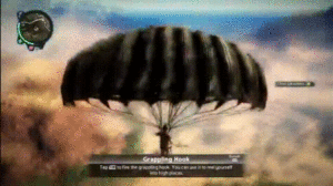
There is a prompt that appears in the middle of the screen notifying the player that the demo timer has begun, which then starts a countdown in the top-right of the screen before disappearing from the screen entirely. However, throughout the duration of the demo, this pane reappears in the top-right of the screen periodically to remind players how much time they have left.

Advantages: 

  • Initial presentation in the center of the screen effectively notifies the player that the timer has begun.
  • Timer pane in the top-right corner is out of the player’s main gaze and flashes to grab the player’s attention.
  • Periodic reappearance of the pane reminds players how much time is left in the demo.

Disadvantages: 

  • Disappearance of the timer pane results in no constant reference for time left; some players might not like not always knowing how much time is left

Mafia 2

5bnclkz-imgur

Once the player enters the open-world portion of the demo, a countdown timer appears (in red) in the top-right of the screen.

Advantages: 

  • Timer does not impede the player’s vision/main gaze, which is likely centered around the avatar

Disadvantages: 

  • Font is small and a dark color that could clash repeatedly with the environment in a game with a brown/black-heavy color palette
  • No indication that the demo timer has started
  • Timer being constantly present could make the player feel rushed

Minecraft

htwjv0m-imgur

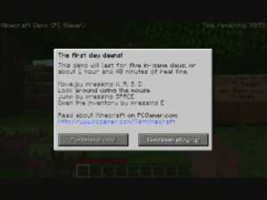
Minecraft provides an overlay notifying the player how long the demo will last. This information is then constantly present in the top-right of the screen.

Advantages: 

  • Upfront, player knows exactly how long the demo can be played
  • If the initial message is skipped without being read, the player has the on-screen timer as a reference
  • Basic, legible font and size

Disadvantages: 

  • Timer being constantly present could make the player feel rushed

Mission-related timers

Here are some examples of how timers are implemented into games for various reasons, such as indicating how much time is left to complete an objective or how much time is left in a match.

Just Cause 3 

raolt2t-imgur

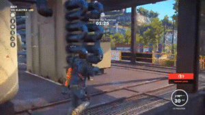
Just Cause 3 presents mission-objective-related timers in the top center of the screen.

Advantages:

  • Basic, legible and large font
  • Close to the center of the screen without interfering with other HUD/UI

Disadvantages: 

  • Could potentially interfere with something in the world since it is so close to the center of the screen and the player’s avatar

Paragon

bc6maz2-imgur

Constant timer display is common in MOBAs because it is necessary information. Also, MOBAs contain some of the busiest screens in video games when it comes to HUD and UI. Paragon, the new MOBA from Epic, has permanent timer HUD to keep track of the length of the match in the top center of the screen.

Advantages: 

  • Basic, legible font and size that doesn’t stand out too much, yet is easily seen upon a glance
  • Players can use the two white bars as reference points, allowing the timer itself to not be overly large
  • Clutter with other HUD and UI elements is avoided since it is isolated at the top of the screen

Grand Theft Auto 5

ry47qcp-imgur

Grand Theft Auto 5 displays timers in the bottom-right of the screen for things like racing missions and timed objectives.

Advantages: 

  • Basic, legible font and size

Disadvantages: 

  • Far away from the player’s peripheral vision
  • Too close in proximity to other text and timers, which causes the players to stray far from the center of the screen, where their gaze is likely fixated, and might cause the player to mix up the timers

Need for Speed: Rivals

e5hmg1b-imgur

Need for Speed: Rivals displays timer information in the top-right of the screen.

Advantages: 

  • Basic, legible font and size
  • Distanced/distinct enough from objective and target timer HUD to keep player from chunking them together/mixing them up
  • The grayish shading prevents the white font from clashing with similar backgrounds, such as the clouds in the GIF above

The Division

loz3jhi-imgur

The Division flashes timer UI along with the new objective notification in the center of the screen. It then trails off to its permanent location in the top of the screen. Because it is a countdown, the timer is continuously flashing orange in order to be kept within the player’s attention.

Advantages: 

  • Initially brought into center of the screen near the player’s main gaze
  • Flashing orange is consistent with the rest of The Division’s color scheme and brings the player’s attention to the vital information, which is the time.
  • Trails off to its permanent location next to the mini map where it also shrinks in size, not to impede the player’s vision in the center of the screen
  • Continues to flash so the player is constantly aware where he/she can go to see how much time is left
    • This also encourages a sense of urgency, since it conveys something that needs to be done in a timely fashion.

Disadvantages: 

  • Once the timer is in its permanent position, the font is a bit small; however, the flashing orange prevents this from being an issue.

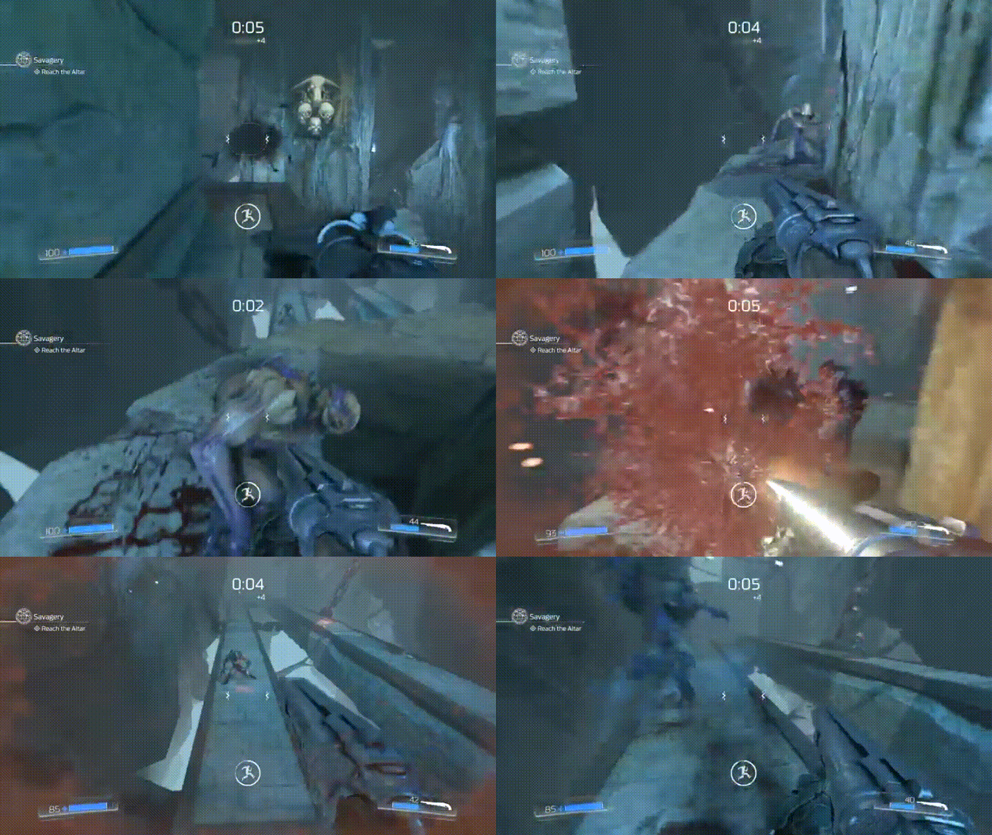
DOOM

dbpffta-imgur

For timed sections, there is a countdown timer in the top-center of the screen. Additionally, since these missions are based on killing enemies to replenish the timer, there is additional HUD with iconography and a circular countdown around it.

Advantages: 

  • Basic, legible font and size
  • Top-center of the screen is far enough away from the center of the screen, where the player’s gaze is likely fixated, yet close/large enough that is within periphery/quick glance
  • Iconography and circular visual timer in the center of the screen within the player’s main gaze, which is large enough to be seen easily, yet doesn’t impede the player’s vision.
    • This makes it unlikely that the player would ever need to stray his/her gaze from the center of the screen, which is important in a high-tempo game like DOOM.

Disadvantages: 

  • Some players might prefer nothing be directly in their main gaze

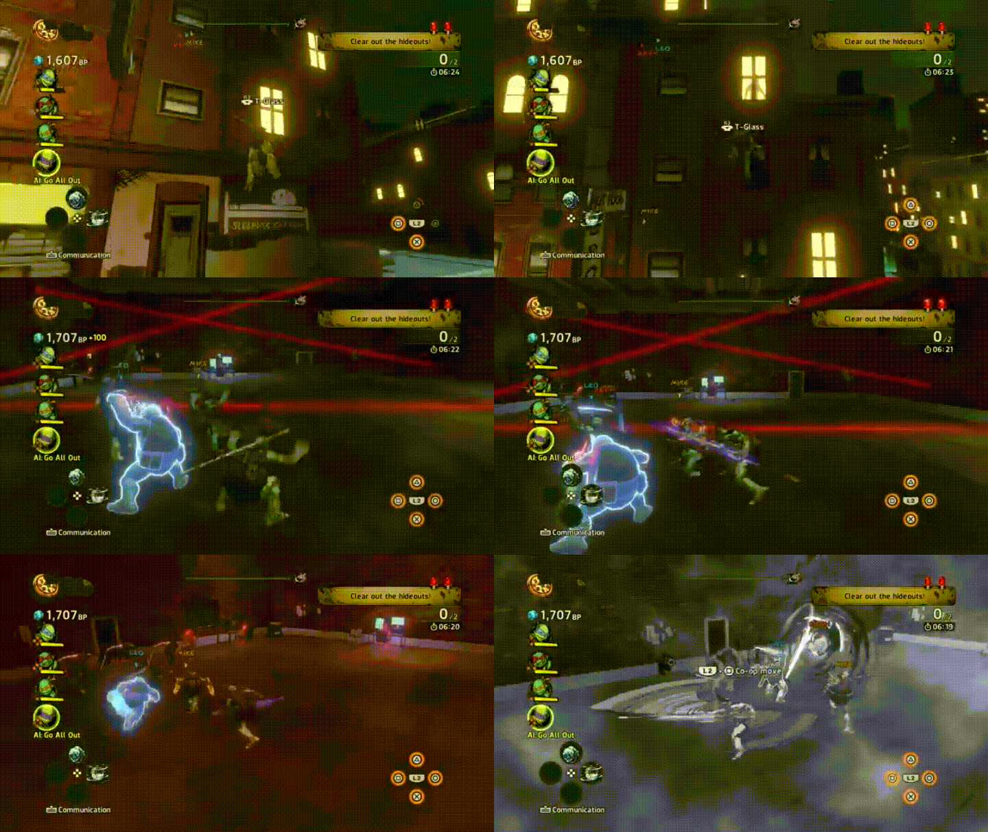
TMNT: Mutants in Manhattan

sn7rofh-imgur

TMNT: Mutants in Manhattan places its mission-related timer near its objective HUD in the top-right of the screen along with relevant iconography.

Advantages: 

  • Basic, legible font
  • Relevant iconography

Disadvantages:

  • Player’s attention is never directed to the timer location
  • Close in proximity to hideout indicator above it

Alienation

xuqbsvo-imgur

Timer HUD appears and pulses in the top-right of the screen.

Advantages: 

  • Large and legible font
  • Pulses as it counts down, which conveys a sense of urgency
  • Far enough away from the player’s main gaze, yet large enough to be seen easily from player’s peripheral vision/quick glance

Dying Light

mytedsd-imgur

Mission-specific countdown timer with relevant iconography is under the mini map/objective HUD in the top-right of the screen.

Advantages: 

  • Timer is orange and a different color from other text
  • Consistency – timer is located near objective text, which is where the player is used to looking

Disadvantages:

  • Font is a bit small and not easily seen upon initial glance

Conclusion

Good practices for timer conveyance:

  • Use basic/relevant-to-art-style fonts and legible sizes
  • If designing a demo timer, provide clear notification to the player how long he/she has to play, as well as either a constant or periodic reference timer
  • Once the timer appears, the player’s attention should initially be directed to it
    • If possible, present the timer in the player’s main gaze initially and then transition it to its permanent position
  • Include iconography as supplemental conveyance of time when possible
  • Timers represent vital information, so make them stand out from other text/UI/HUD
    • different colors
    • flashing/pulsing
    • avoid placing too close in proximity to other text/UI/HUD


Signal Detection Theory and user interface design

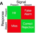
Signal Detection Theory (SDT) is a way to quantify decision-making in the presence of uncertainty, which is also referred to as internal and external “noise.” The basic premise of this theory is that both signal and noise are represented in calculated probabilities within the individual making the decision, and the extent to which those representations overlap can be quantified based on the individual’s response and whether the signal is present or absent (Anderson, 2015; although the specific mechanics and statistics underlying this quantification are beyond the scope of this post, there are a multitude of resources available for those interested in further pursuing that information). Therefore, there are four possible outcomes to the SDT (matrix from Anderson, 2015):

SDT2

  1. Hits: correctly reporting the presence of the stimulus/cue
  2. Correct rejections: correctly reporting the absence of the stimulus/cue
  3. Misses: failing to report the presence of the stimulus/cue when it occurred
  4. False alarms: incorrectly reporting the presence of the stimulus/cue when it did not occur

Furthermore, the detection of a stimulus depends on both the intensity of the stimulus and the physical and psychological state of the individual. Recognition accuracy depends on whether a stimulus was actually presented, as well as the individual’s response.

In relation to games user research, the SDT can be used to measure and design many different aspects of games. Any instance in a game where a player has to make a decision under some uncertainty is when this theory can be best applied. Since SDT has been applied extensively in perception and decision-making research, let’s first discuss how some of this work is relevant to the player experience in video games.

Perception research commonly utilizes a behavioral task called the oculomotor delayed-response task, which requires an individual to make an eye movement to a cued location following a specific delay. The schematic of the oculomotor delayed-response task (from Goldman-Rakic, 1996) below should help demonstrate the connection between this task and video games.

Figure 1

For the oculomotor delayed-response task, during signal-absent trials, the individual has to hold off judgment until the whole observation period is finished whereas, during signal-present trials, the individual can judge the signal presence immediately after the signal is presented. Ultimately, researchers are typically interested in the number of trials an individual responded correctly and incorrectly (i.e., recognition accuracy). While the oculomotor delayed-response task has been manipulated in many ways (e.g., varying inter-trial intervals, cue/delay periods) to answer specific questions, perhaps its most relevant connection to video games is when players learn the meaning of a stimulus/cue presented in a game and then, at a later time point, need to respond appropriately about whether that stimulus/cue is present or not, as well as how to apply the information conveyed by that stimulus/cue in the current situation. Although players’ recognition accuracy of specific game elements is not being tested or predicted when they play games (unless, perhaps, they are playtesting), the relevance to the oculomotor delayed-response task and how it tests decision-making and working memory is evident.

Let’s look at some examples in games that might fit the four possible outcomes of the SDT:

Hit

IOBT6F8 - Imgur

In Prototype 2, a third-person action game, instructional text is introduced to the player about the effect of their actions on specific UI elements. This appears near the relevant UI, which allows the player to easily associate this with the specific UI, and flashes briefly to attract the player’s attention. Additionally, there is time manipulation, which minimizes in-game distractions and allows the player to focus on the conveyance. Ultimately, this type of UI introduction is likely to result in a hit, according to the SDT, because it is a very attention-seeking design that minimizes extraneous distractions, or external noise.

Miss

PPym2Zg - Imgur

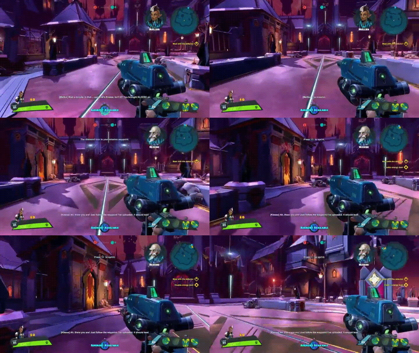
In Battleborn, the tutorial starts once the player takes control of the character. White text is presented in the top-center of the screen, which explains features of the UI (e.g., minimap) as well as basic movement (i.e., sprint). However, since this text is small and cycles quickly, there is a high chance the player will miss this information. In addition, there is new objective text, character/story narrative, subtitles, and upgrade available notification. All of this presented simultaneously is cognitive overload for the player, who is also trying to experience the world and art style of the game at the same time. Ultimately, the low salience of the white text, in combination with higher-salient cues, is likely to cause the player to miss some, if not all, of what the white text is trying to convey.

Correct rejection

While correct rejections and false alarms can seemingly be more difficult to design around than hits and misses, a correct rejection would simply be the player correctly identifying the absence of a UI element. Designing for a correct rejection would likely be successful when implementing common UI industry-best practices, such as Neilsen Norman Group’s 10 Usability Heuristics for User Interface Design.

sU9jquc - Imgur

Infamous: Second Son introduces instructional text to the player describing one of the game’s main UI elements, the smoke meter, which is accompanied by a bright arrow that points to it. Also, in the GIF above, you can see the “Drain Shard” UI that appears when the player is in the appropriate position to complete such an action. Being that video games are only becoming increasingly more complex, with many things typically appearing on-screen simultaneously, it is important to note how the “Drain Shard” UI is noticeably different from other UI elements and notifications. It differs in size, color, and iconography. This and similar designs would likely result in correct rejections, according to the SDT, because the player would be able to easily notice the difference in the UI, not mistaking the “Drain Shard”, which is an in-game action, with another UI tutorial/notification.

False alarm

Continuing with the theme of video games becoming increasingly complex and containing numerous on-screen cues to attend to simultaneously, a busy screen is likely to result in some false alarms. Overall, The Division is an example of a game that handles the busy-UI screen relatively well by relying, primarily, on pop-up text boxes and a lot of flashing orange to convey information to the player. However, one example that might produce a false alarm can be seen below.

Fg6ZojZ - Imgur

During the tutorial, there is almost continuous tutorial text appearing on the left-side of the screen. Specifically, the constant orange blinking and similar text-box pop ups could result in the player attending to a certain cue expecting one thing and it is actually an entirely different message. Although consistency in game elements is typically praised, when all UI elements are of similar design, this might result in the player thinking a certain UI element represents one thing when it actually represents something else entirely.

Conclusion

Although this post focused primarily on the external noise component of the SDT, it is important to note that the internal noise component (i.e., how external aspects of the SDT affect players cognitively) is an integral part of the theory. The internal response is an internal state that produces an individual’s impression about whether a stimulus/cue is present, has shifted, or is absent. Also, these components of the SDT typically fluctuate from individual to individual and situation to situation (Imai & Tsuji, 2004; Kubovy, Epstein, & Gepshtein, 2013); numerous variables can factor into this fluctuation, such as current psychological state, cognitive (e.g., attentional) resources, and prior experience with the type of game, to name a few.

How a player perceives game elements, as well as how he/she converts this information into an in-game action, is a complex process and, consequently, game design can affect a lot about the player experience from both psychological and physiological perspectives.  As games user research grows as a field and begins implementing additional biometric methods, such as electroencephalography (EEG) to measure local brain activity, we will be able to correlate external and internal components of the SDT during gaming experiences. Although this will likely not be implemented for quite some time, and it will take time for basic research to accumulate enough evidence to convince companies to invest in such methods, understanding the intersection of these components could help inform game design. More specifically, this could help deliver designers’ precise intentions and, ultimately, an optimal player experience.

References:

Anderson, N. D. (2015). Teaching signal detection theory with pseudoscience. Front. Psychol. 6:762. doi: 10.3389/fpsyg.2015.00762

Goldman-Rakic, P. S. (1996). “The prefrontal landscape: implications of functional architecture for understanding human mentation and the central executive,” in The Prefrontal Cortex: Executive and Cognitive Functions, eds A. C. Roberts, T. W. Robbins and L. Weiskrantz (Oxford: Oxford University Press), 87–102.

Imai, A. & Tsuji, K. (2004). Event-related potential correlates of judgment categories and detection sensitivity in a visual detection task. Vision Research, 44, 763-773.

Kubovy, M., Epstein, W., & Gepshtein, S. (2013). Foundations of visual perception. In A. F. Healy & R. W. Proctor (Eds.), Experimental Psychology. Volume 4 in I. B. Weiner (Editor-in-Chief) Handbook of psychology (87-119). New York, NY: John Wiley & Sons.