Days Gone: solid core gameplay, lackluster story and characters

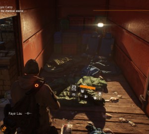
Days Gone is a AAA open-world post-apocalyptic game from Sony’s Bend Studio. It feels like is a blend of The Last of Us (i.e., character movement, melee, shooting, crafting), Red Dead Redemption 2 (open world, bike management instead of a horse, long travel time between missions, and storytelling during these sections), and Far Cry (i.e., outposts, random animal encounters, enemy scouting/marking).

You play as Deacon St. John, a drifter trying to survive the harsh post-apocalyptic Pacific Northwest by managing tasks for various camps, all while searching for information about his missing wife, Sarah. The world is full of humans and wildlife, both of which can be encountered as infected. The most common enemies are “Freakers,” the Days Gone version of zombies.

This post is more subjective than many of my posts and I’ll begin by pointing out the things I liked most about the game, followed by things that I felt could have been better.

TL;DR version down below “Final Thoughts!”

Main positives

  • Riding the bike is satisfying and gets even better over time with upgrades as you can feel the evolution in its performance. Similar to Spider-Man, the moment-to-moment traversal was so good that I rarely fast traveled, unless it was a very long distance, then it was a nice option to have. After I finished the story and was trophy-hunting, exploring the world on the upgraded bike made seeking collectibles much more tolerable.
  • Visceral, weighty melee combat with a variety of weapons. There is a satisfying “thunk” when Deacon lands a blow into a human enemy’s neck or when chopping off Freaker limbs. A great usability addition is the ability to press [R2] at any point to take out a melee weapon. It allows the player to quickly swap between shooting and melee when Freakers close in rapidly in large numbers.
  • Horde encounters. The varying locations and sizes of these encounters keep them feeling fresh. There are a variety of ways incorporated into the level design that give the player numerous environmental options, in addition to shooting and crafting, to deal with them. However, the tuning of these encounters can impair the feeling of intensity and despair. If the player lures the horde away too far from its origin point, only a subset of the horde will continue to chase the player, whereas the rest will slowly stumble back. This results in the player being able to fairly easily deal with the subset of Freakers, pick off stragglers as they stumble back, as well as regroup, craft, and devise a new strategy to deal with the rest. Overall, this made defeating hordes much more manageable but often made it feel like there were many mini-horde encounters rather than one large one. However, I’m curious if the newly-released Survival Mode difficulty might change this. Altogether, as a fan of zombie media and games, these large-scale encounters were something that I was craving from the genre.
  • Emergent gameplay. Although these were not as prevalent as I had hoped, the situations where a horde or wildlife came crashing down as I was attempting to take out an enemy camp, similar to Far Cry games, were exciting and added an element of unpredictability to encounters that became a bit repetitive due to poor human AI.

STORY SPOILERS ABOUND!

Main negatives

Trivial missions inhibit story pacing

It begins with Deacon and his friend, Boozer, getting into some trouble with some local Freaker worshipers called Rippers. Boozer gets critically injured, which results in Deacon searching for ways to help him recover. These events, along with getting acquainted with some camps, are the focus of the first third of the story. Overall, this first section of the story has slow pacing and feels like it takes a while before Deacon is doing anything meaningful; there are a lot of fetch quests that do not drive the plot forward. A lot of the pre-release coverage (e.g., Rager bear, harsh world, hordes) is not relevant until you progress the plot far enough to unlock the southern portion of the map, which is in second third. To have certain expectations set via marketing made me question if the game was as advertised. Ultimately, it was, and I’m glad I played long enough to see it grow into that.

The last third of the story has the player return to the northern portion of the map where they were at the start. The main reason for Deacon to return to this region is to warn a fellow camp about the militia camp he joined down south, which is holding Sarah hostage, and that they plan to attack the (Lost Lake) camp. There is a sense of urgency when returning up north, which comes to a screeching halt when the player is tasked with more “kill X enemies” objectives. The player needs to do a bunch of outpost-clearing missions before the main plot continues. These kill the tension that the militia is going to attack and that Deacon needs to return South to save Sarah as soon as possible. While not an issue that is unique to Days Gone, as it is a part of many open world games, I still found it to be irritating, nonetheless.

Overall, some of the content crammed between these story beats made it feel artificially inflated rather than continuously driving the story forward, even if at a slow pace. There were multiple instances where I thought, “okay, this has to be near the end, right?”

Secondary characters lack meaningful development

While the overall story is not necessarily unique, considering the genre, great character development can go a long way when it comes to carrying an average story. However, in Days Gone, the lack of character development drags its already mediocre story down.

I do believe this lack of character development is related to my previous issue with the poor pacing of the story due to filler content. If this filler content were slightly more meaningful in the sense that it strengthened the relationships with the people for whom you were doing the tasks rather than bounty hunting random post-apocalyptic ass holes, it would have made a big difference. Most missions are “go and find this person who is being a dick out in the “shit,” which does not further Deacon’s relationship with that specific camp or character (e.g., Rikki). There are hints at a past that are often described briefly or in passing but felt like a weak attempt at making the player care about the specific character.

Another example is that it is unclear why Deacon cares so much for a random girl, Lisa, he is tasked to save by one of the camps early on in the story. You have to go digging in the subtext of the storyline menu to see that “she resembles Sarah’s sister” which, from a storytelling standpoint, is not mentioned until the very end of the storyline when she returns to one of the camps. Throughout the entire storyline, I was left wondering, “why am I doing what I’m doing?” and “why do I care about this random girl?” The player is never even introduced to Sarah’s sister via flashbacks or in conversation with Sarah herself to build any context about how Lisa resembles her. Ultimately, this gives the player very little reason to care about Lisa. Additionally, the fact that Lisa is an otherwise underwhelming character who makes boneheaded decisions makes this even more difficult.

Furthermore, underdeveloped characters and relationships with other secondary characters result in important scenes lacking emotional impact. There were several big scenes (i.e., the reunion with Sarah, Iron Mike’s death, the rally to hit the militia to avenge Iron Mike, and “Boozer’s death”) that simply did not land for me due to storytelling structure (e.g., flashbacks to establish Deacon’s relationship with Sarah), lack of significant time spent with the character (e.g., Iron Mike) or predictability (e.g., Boozer’s “death”).

Game flow issues

  • Frequent black screens between gameplay and cutscenes. There are a lot of loading screens, as well as many of them being quite long even when running on PS4 Pro. There are also countless instances where black loading screens appear between cutscenes and gameplay or cutscenes and other cutscenes. The latter often seem like they could have just been one lengthier cutscene. These are often serious pace killers, especially when they appear between a cutscene that is supposed to provide an emotional impact and the resolution to that scene.
  • Blue “search” circles will appear randomly on the mini-map but ultimately lead to nothing. These blue circles are search zones that indicate that there is something for which the player can search. However, you can find the first clue to initiate the search, but this often results in some tracks to follow that would end abruptly with nothing to see. There was one instance that I was captured and caged by marauders when doing this, which was cool and added to the feeling of unpredictability and “harsh” world. However, that lone instance was not enough to make up for the multiple other times I investigated these zones with nothing to show for it. It was unclear if this was a bug or if some of these encounters are indeed intended to result in nothing, which would be a surprising design decision.
  • Hordes teased early, relevant later, then too many required in succession without warning. The player is introduced to hordes (one of the largest in the game) early on via a side character in a cutscene. However, there are no horde-clearing story missions until the player enters the southern region of the map, which is a decent amount into the story. Then, multiple story missions in a row that require the player to clear hordes, often without warning until the player reaches the desired location. This lack of notification beforehand was frustrating because hordes need the player to have a pretty stocked inventory, which takes quite a bit of scavenging and crafting prep work. Not only does this negatively affect the player’s ability to continue the story at their own pace, but it also feels like forcing the player into exploring the world rather than encouraging it to happen organically.
  • Inconsistent respawn locations. One anarchist camp mission has you take out twelve anarchists in a mine to free a hostage. Once the hostage runs to safety, a horde spawns in the back of the mine that engulfs the player almost immediately. There is no warning whatsoever. Then, upon death, the player spawns outside the mine and has to do the entire encounter over again.
  • Intrusive “mission complete” prompts when fighting infestation zones and hordes. These often appear before the player finishes killing every enemy, which was often disorienting as I was in the middle of combat.

Mediocre human AI and some repetitive mission structure

The entire spectrum of human enemies the player encounters, from Rippers to marauders, to anarchists, has weak AI. Some exhibited behaviors include running out of cover, running straight at the player, and not noticing the player when within sight or reacting when right next to them. There were multiple instances when clearing camps that the last couple remaining enemies continued patrolling while I was engaged in a fire fight with their comrades as if they were utterly oblivious to what was happening around them.

This poor AI led resulted in some lack of challenge and feelings of repetition during some missions, but the Nero storyline missions all follow the same structure, whereas camp-clearing missions at least threw different layouts and amounts of enemies at the player. For Nero missions, the player needs to avoid detection from a few guards and remain within the distance of a researcher to hear what they are saying, which typically included new updates about the infected and the virus. Not only do all of these missions follow the same structure, but the stealth required is also quite rudimentary; the player can roll around closely to guards without detection and is completely undetectable when crouched in the grass.

Minor usability issues

  • Grapple prompts are small, hard to see, and difficult to time, primarily the mash prompts and critical attack triangle indicator. The latter are also difficult to time as the player has to get the quickly-spinning indicator into a small triangle and the sizes of these triangles vary by enemy type. I don’t think I successfully timed one throughout my entire experience with the game, which did not improve my feeling of competence.
  • Survival wheel can require a lot of precision to navigate. The player needs to hold [L1] to bring up the crafting wheel, which is similar to many games. However, there are so many categories and subcategories available for crafting that navigating between all of these can require a lot of precision when using [RS]. These multiple levels of menus can make this experience frustrating when trying to craft on the fly (e.g., being chased by a horde) and I often found myself accidentally equipping an unintended item.
  • Object geometry getting in the way of shots. There were numerous instances when using sniper rifles that my clearly-lined up shots did not register properly, presumably because the geometry from objects in the world was getting in the way.

Final thoughts

Overall, the story felt artificially bloated with filler content that often killed the pacing and did not add anything meaningful to Deacon’s relationship with secondary characters. I liked the approach taken with the story, having multiple storylines, many of which converge near the end but I expected stronger cohesion and character development, especially considering how long the game is. There were also some flow, usability, and technical issues (e.g., framerate drops, repeating survival hints and audio/VO bugs, being thrown across the map by a bear) that moderately hindered my experience.

Although this post has been largely critical, I really enjoyed Days Gone from a gameplay standpoint and, the more I played it, the more I liked it (so much so that I Platinum’d it). Deacon’s arc reminded me somewhat of Arthur’s in Red Dead Redemption 2; they both start as notably unremarkable men that grow to realize things about themselves and the people around them. Deacon became a leader of sorts and developed trust with a camp, which he was typically against because of his drifter lifestyle. Over time, I became quite fond of Deacon, having gone through so much with him, but I don’t think the story and writing brought this to as satisfying of a conclusion as Arthur’s arc in Red Dead Redemption 2.

Days Gone was a great effort from a Bend Studio team that had not developed a non-portable console game since Siphon Filter in the mid-2000s. I think it is a better game than the critical consensus, which may be partially due to “zombie fatigue” or simply not sticking with it long enough. There is a solid foundation that, with better writing and characters, would be a world I would enjoy returning to, especially with the ending that seems to prime it for an interesting sequel.

Some issues with inventory management in Horizon Zero Dawn

This post will look at some issues with inventory management in Horizon Zero Dawn. It is not a comprehensive review of the UI or the game overall, rather a focused analysis of the “Inventory” tab and some pain points encountered during my playthrough.

General navigation and usability of “Inventory” and “Resources” tabs cumbersome

Horizon Zero Dawn allows players to pursue a few different paths when it comes to assigning skill points on the skill tree. Being a player who prefers not running out of necessary items for crafting, I initially invested in perks that allowed me to gather more resources from loot drops. Although I was constantly using many of the items, I quickly filled my inventory (resources are capped at 100) and was routinely looking to remove/drop things when finding newly-dropped items. Anyone who has ever played a RPG knows the feeling of a full inventory, but Horizon Zero Dawn makes dealing with this a chore.

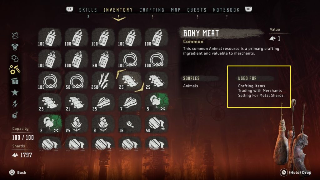
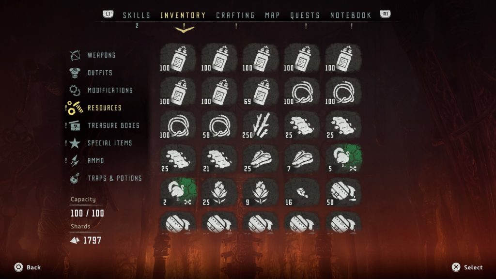
Upon first opening the “Inventory” tab, the player is presented with a grid-style layout. While all sections of the inventory have this layout, the burden of manageability is especially apparent in the “Resources” tab due to the high capacity. Visually, the iconography does not do a great job of differentiating the many items on screen. Although there is color added to some of the icons on other tabs, the resources tab only has rarity-based coloring, which does not help the player to quickly identify items at a glance.

Another reason the “Resources” tab can become overbearing when the player has many items is because items cap at arbitrary numbers. For example, the first seven items seen in the screenshot below (Sparker) are all the same, but once the player collects 100 of that item, a new inventory spot must be used. Also, there is no consistency in this numbering system, as players can obtain 100 Sparker before needing to use another inventory spot, whereas meat can cap at 25 before needing another spot.

Furthermore, when dropping items (holding triangle), there is no option to drop a partial amount of these arbitrary numbers. If the player wants to open an inventory spot by dropping (or selling) one of the seven spots occupied by Sparker, all 100 would need to be dropped. Allowing players to drop a specific amount would have allowed for more precise and customized inventory management.

Lastly, there are no filtering options to expedite the process. Players need to manually cycle through all 100 items (if full) to find an item they deem expendable. Being able to sort and filter by different categories of items, rarities, etc. would have been very useful. Alternatively, having the “Resources” tab broken into more specific categories rather than just lumping everything under one tab have made navigation and management more fluid.
Lack of further information about resources

Upon further exploration of the items in the inventory, information about the use of each item is presented on the right side of the screen under “Used For.” The issue here is that this information offers very little help to players, primarily because many items in the game have multiple uses listed and there is no way to find more relevant information from here. Therefore, the player might be on the fence about selling an item that is listed as “Selling for Metal Shards” because it also has a listed use for “Crafting Items.” This lack of information severely limits important decision making for players. Also, this can cause a snowball effect, which starts with a fear of parting with any items because they might be needed later in the game to craft or trade with a merchant to get something specific. There is nothing like hoarding items in RPGs, parting with some at some later point, then ultimately realizing it’s needed for something else you want.

For example, in the screenshot below, ‘Bony Meat’ has multiple uses in the game (i.e., crafting items, trading with merchants, selling for metal shards). Important information to include here (or ways to navigate to) to inform decision making would be:

  • What item(s) can be crafted with bony meat?
  • What can bony meat be traded with merchants for?
  • How many metal shards can be obtained by selling bony meat?

“Create job” does not perform as expected

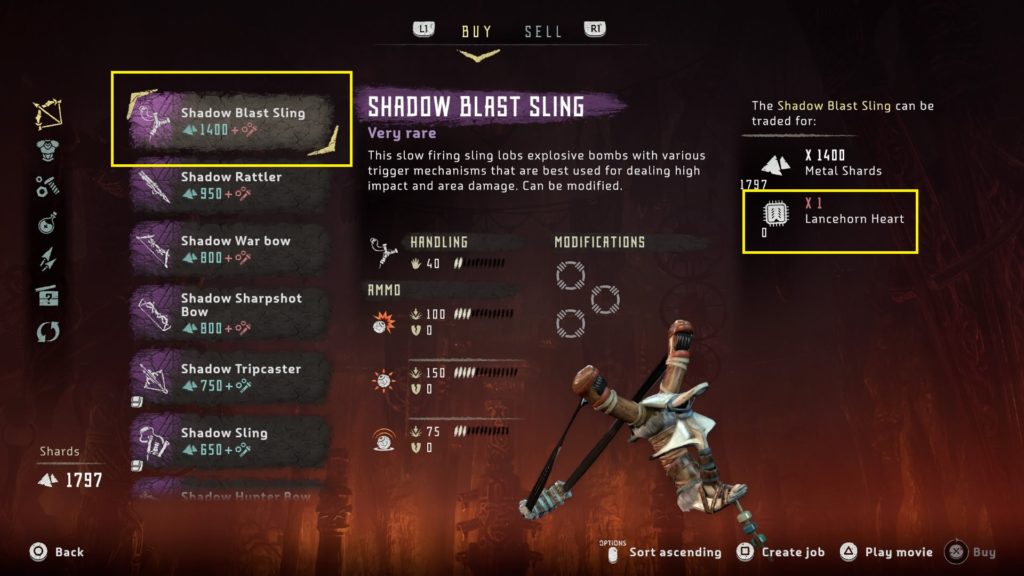
Horizon Zero Dawn has a mechanic that allows the player to create a job to find crafting items or items they might need to complete trades with merchants. While this is a great addition to help players track items, it does not perform as expected. As seen the in screenshot below, players can press square on an item to “Create job” and actively track the missing required items, which is a “Lancehorn Heart” in this instance.

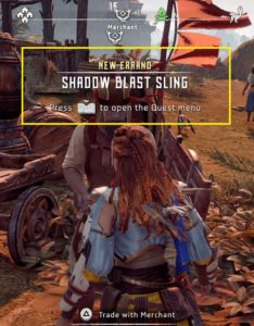
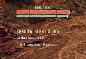
Once a job is created by the player, he/she is given the option to make it their active quest. Everything about this “New Errand” behaves like a quest, minus one major component – the determining of the location of the tracked items. The “Create job” mechanic basically gives players an on-screen checklist for items they need to find and nothing more.  Without any additional information here, such as a waypoint set to a general area of the map, players can spend a lot of time roaming around for animal parts, for example, which are not indicated on areas of the map like robots, and are needed to craft many different items. If this omission is by design, perhaps to encourage random exploration, and the intent is to be a glorified checklist, great. If not, this seems like a missed opportunity for a potentially super-useful mechanic.

Additionally, there are some issues present when trying to conduct business with Merchants:

Lack of clarity when an item cannot be sold

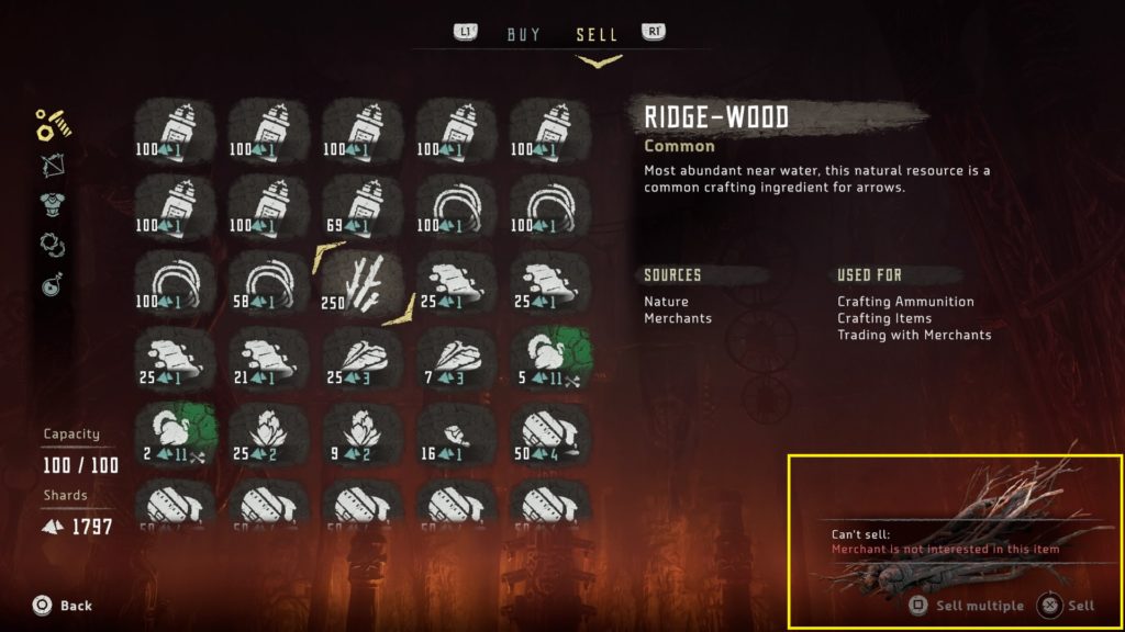
Below is a screenshot of the main UI when selling items to merchants. The “Resources” tab is similar to that discussed earlier in the “Inventory” tab. The item selected in the screen below, Ridge-wood, is a very common item in Horizon Zero Dawn used to craft arrows. It appears, just like every other item in Aloy’s inventory, when navigating the “Sell” tab. However, it cannot be sold to merchants and the only information conveying this is in the bottom-right corner, where “Sell multiple” and “Sell” are dimmed/grayed out. If the player attempts to sell it by holding X, the “Can’t sell” prompt seen in the bottom right appears. Neither of these are very clear; the dimming of the text is too subtle to be recognized and, along with the “Can’t sell” prompt when it appears, is on the opposite side of the screen away from the player’s main gaze. This important information can be easily missed. A better way to convey the “Can’t sell” information would have been directly on the items themselves, where the player is directing their attention.

Lack of clarity when an item cannot be bought due to full inventory

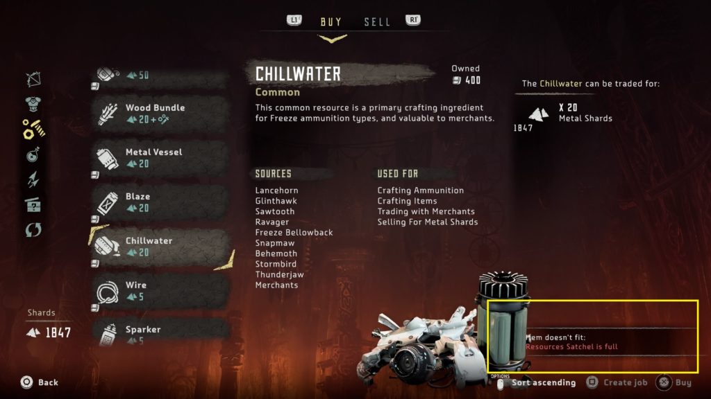
Similar to the previous issue, when navigating the “Buy” tab and attempting to buy an item when having a full inventory, the “Item doesn’t fit” prompt appears on the opposite side of the screen from the player’s main gaze. Additionally, this prompt overlaps some of the item art, which can make it harder to read.

Inconsistency with sorting options

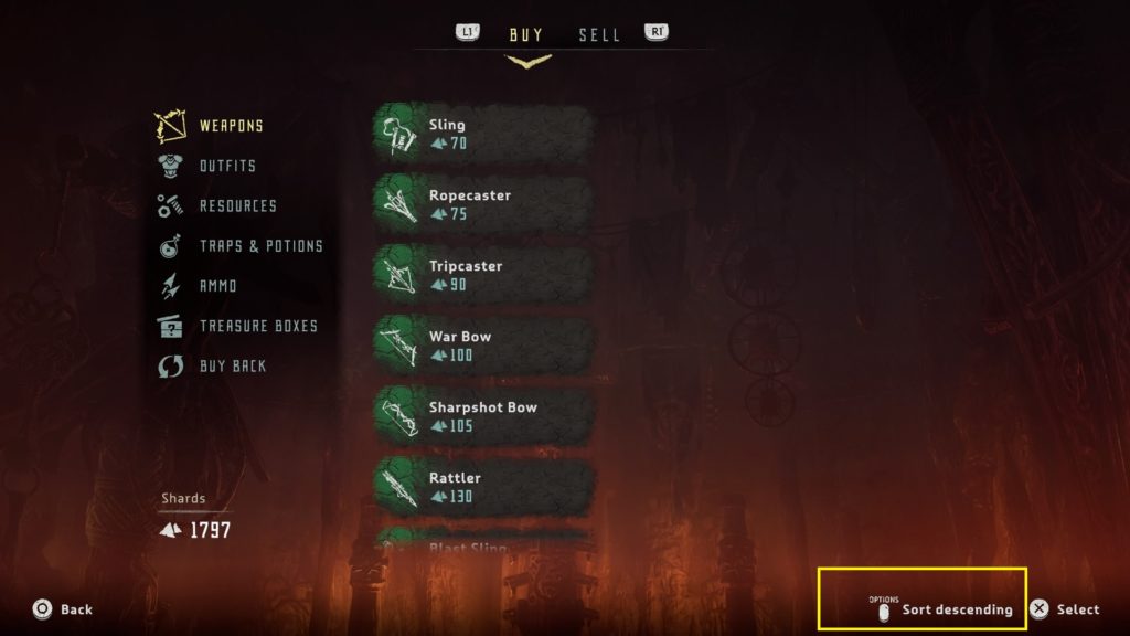
When navigating the “Buy” tab, there is the option to sort by ascending/descending item value. However, this option is not included under the “Sell” tab, adding to the list of inconsistencies within the inventory management system.

Important player-facing information cut off

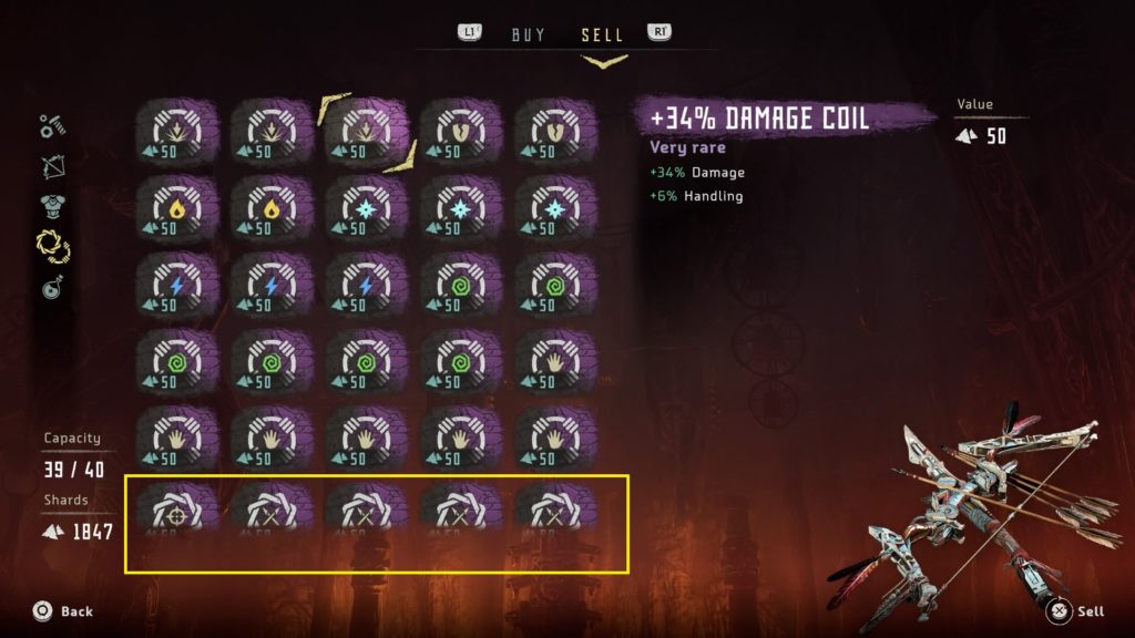
Although minor, one thing that is consistent across both “Buy” and “Sell” tabs (and the inventory in general) is that the bottom-most visible row is cut off, often omitting important information and requiring the player to scroll. For example, in the screenshot below, the value of the modification is cut off.

Buying back items is unclear

Players have the option to buy back items that have been sold to merchants. Although this sounds straight forward (i.e., player sells, can buy item back), it is not. Merchants only keep the ten most-recently sold items in their inventory at any one time. Additionally, players cannot buy back any items of common rarity, only green (uncommon), blue (rare), and purple (very rare). If a player goes on a selling spree not realizing this, the player will not have the option to alleviate any potential feelings of seller’s remorse.

This is a fine system; I’m not advocating for players to have the option, at the end of the game, to buy back the very first option he/she sold. However, there is critical information here that needs to be conveyed, perhaps upon the player’s first visit to a merchant via a small tutorial or prompt.

Conclusion

Horizon Zero Dawn is a good game that does many things well, such as numerous open-world tropes, combat, and telling an entertaining story; however, inventory management is not of of those things. Although I likely spent as much time fumbling through the inventory as I did combating robots, Horizon Zero Dawn is worth checking out if you’re a fan of action RPGs.

Affordances in The Walking Dead: Road to Survival

Even the simplest games require attention, focus, and cognitive effort, which leaves users with fewer resources for regulating in-game decisions. Affordances, or things that help users do something, can be implemented to reduce cognitive load and effort. Since playing games requires learning, an intuitive design and inclusion of affordances can help reduce cognitive resources allocated to figuring out how a game works and increase allocation to where these resources are designed to be spent. There are four main affordances in UX design:

Physical

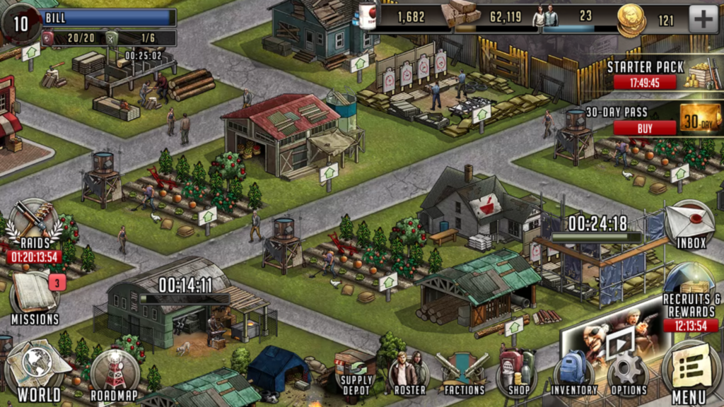
A physical affordance is a feature that helps users accomplish physical actions with the interface. An example might be the distance of a button on the interface of a mobile game from the user’s thumb while the phone is in a portrait or landscape position. While some games allow the user to play in either of these positions, The Walking Dead: Road to Survival is only playable in landscape. See below for a screenshot of the main town hub, which is one of the main interfaces of the game and where the player spends a bulk of his/her time when building the community and collecting resources.

walking-dead_2016-11-15-14-46-05

Although it is a busy interface, the main interactive icons populate the perimeter of the landscape-positioned interface. The type of device the player is using (i.e., phone or tablet) will determine the difficulty of reaching these icons with his/her thumbs but, from my experience, it is never an uncomfortable reach, even to access the top icons, when playing on a phone. Again, this will differ according to the size of the device and the size of the player’s hands.

Additionally, when a building, post, farm, etc. in the community is selected, the menu interface is retracted and replaced with a building-specific interface. Although the icons in this interface are similar in style to the menu ones, they are distinct by having different symbols that are also larger in size. Not only are these buttons easier to press, but this physical affordance, along with retracting the menu interface to avoid an overly-busy screen, results in the building-specific interface not becoming easily confused with/as the menu interface. These two interfaces can be seen at the bottom of the GIF below.

building-interface-gif

Cognitive

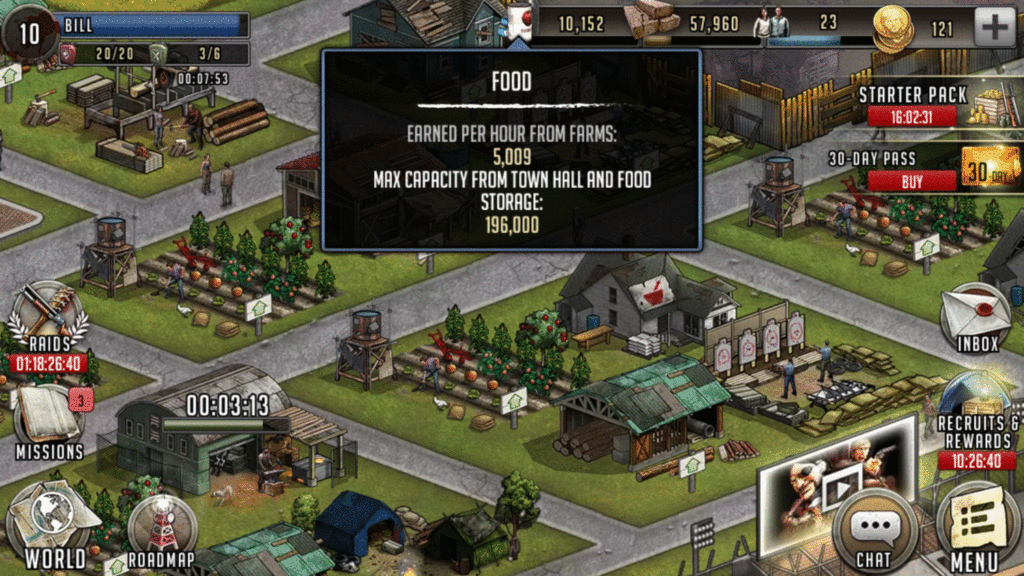
A cognitive affordance is a useful feature in design that allows the user to think, learn, understand, and know about something in an intuitive manner. For example, in the screenshot below, there are symbols that represent specific in-game resources that can be accumulated by the player. These symbols help the player understand the different types of materials at a glance and precisely how many of each he/she has at the moment.

cropped-icons

Also, if the player is ever unsure of the current state of his/her resources, he/she can tap the symbol, which brings up an overlay with more information about the respective resource. See the GIF below for the overlays for each of these resources.

cog-affordance-gif

Sensory

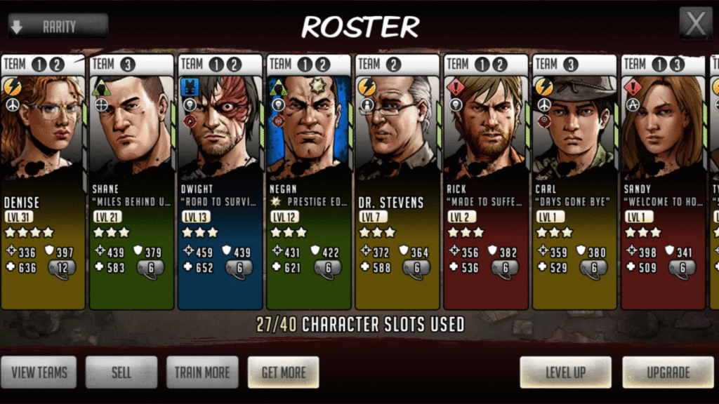
A sensory affordance is a feature that helps users sense (i.e., see, hear, feel) something intuitively, which enhances perceptibility and (hopefully) information processing. At its core, The Walking Dead: Road to Survival is an RPG about community building and character development. This development is attained by fighting walkers and humans through single-player story missions, scavenging missions, and asynchronous PVP ‘Raids’. It is up to the player to build successful, synergistic teams and below is the screen that displays the player’s roster of characters. Since players can have multiple teams, IUGO incorporated useful signifiers that allow the player to see the most important information about each character right from this screen, such as player persona, trait, stats, and level, which are all indicated by symbols and numbers. Importantly, at the top of each character, it displays what team(s) that specific character is currently on. If a character is not currently on a team, it will be blank. This is a useful feature to help the player notice and quickly track what characters are on what team without having to proceed to ‘View Teams’.

roster-gif-2

Additionally, the roster of characters can be sorted by rarity, type, cost, etc. by tapping the down arrow in the top-left corner, which leads us to the final type of affordance.

Functional

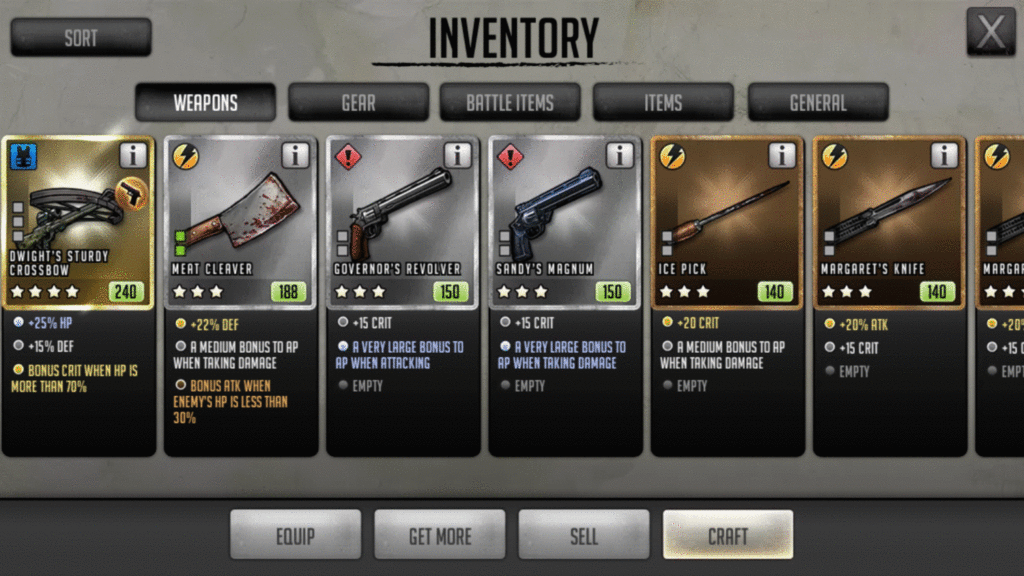
A functional affordance is something that simply adds functionality, such as sorting or filtering items in an inventory. Similar to the sorting feature for the character roster, the inventory interface in The Walking Dead: Road to Survival clearly breaks down items into specific categories along the top of the interface and allows the player to sort through the inventory, which can be activated by tapping ‘Sort’ in the top-left corner. After sorting, the player simply has to swipe left/right to see the items. This added functionality enables the player to more easily find a specific item in a game that has many, many different types of weapons and items.

inventory-gif

Final thoughts

There are four main affordances that are useful in UX design for games: physical, cognitive, sensory, and functional. Only some examples were discussed in this post and, while which affordances to incorporate into a specific game’s design depends on the design intent, many games will have instances of all four to some extent.

I hope this post has been informational. If not, well, as with many Walking Dead games, you’ll have a difficult decision to make:

cropped-garrett

(Bill will remember that)

DOOM (PS4) – subtle, yet appreciated, usability

Doom_Cover

Intuitive access to current objective and challenges

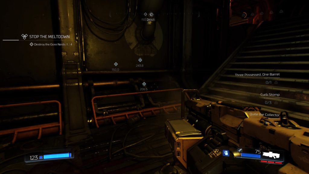
DOOM has many subtle usability features that contribute to the user experience. The first being the inclusion of a secondary way to display the current objective and challenges, which is mapped to down on the d-pad. The objective appears on the left-hand side of the screen and the challenges appear on the right, which can be dismissed by pressing down on the d-pad a second time. This is a handy, simple, one-button press that is a design feature that flows nicely with the overall relentless pace set by DOOM. Below are three screenshots demonstrating this feature.

DOOM_20160626135931
Tutorial text pop up explaining how to view mission information.


DOOM_20160626151103
Current objective on the left and challenges on the right.


DOOM_20160626143258
This feature allows you to easily keep track of completed challenges, as it is noted in the UI in all caps and a change of color.

Color-coded objective markers

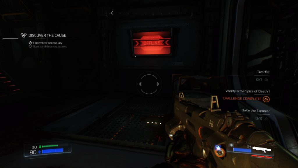
Multiple times throughout the campaign, the player has to obtain colored key cards or skulls to gain access to corresponding doors. It is great practice to display vital information in more than one way; in this case, the color-coding of the objective markers provides supplemental information to the distance marker. If the player proceeds to the incorrect door first, he/she is less likely to make an error navigating to the other, as there is additional discriminatory information to help avoid mixing up the objective markers.

Color-coded objective markers

Green lights for vertical traversal

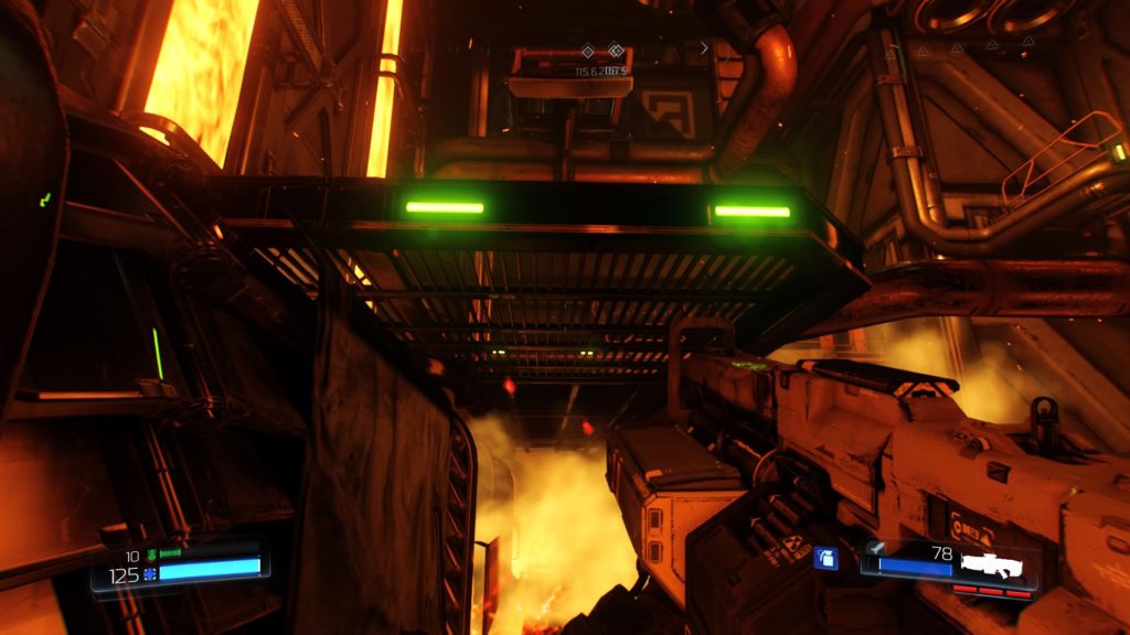
There are many scenarios in DOOM where the player has to traverse vertically. The density of some of these areas can make it seem like a daunting task; however, there are green lights on ledges to indicate a sense of directionality and climbable surfaces. This is similar to games like Tomb Raider and the Uncharted series that require a lot of traversal and design it such that it is noticeable to players, but also seems like a natural part of the game’s world; it doesn’t stick out like a sore thumb (I’m looking at you, Ryse: Son of Rome). DOOM uses this method in a couple ways, which can be seen below; flashing green lights seem like something you would realistically see if navigating a facility on Mars.

DOOM_20160626150428

Available weapon points/suit tokens reminder

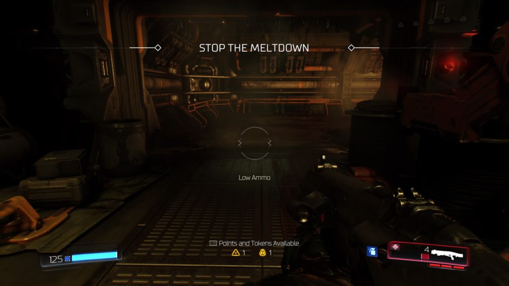
Another subtle feature is a reminder about how many weapon points and suit tokens the player currently has available to spend, which appears on the lower-half of the screen in the center (see screenshot below). There were numerous times that I was caught up in slaying demons that I lost track of how many points and tokens I had, so this reminded me to level up consistently with the natural progression of the game, which, inevitably, only led to more brutal slaying. These appeared during slower moments in the game, so they didn’t interrupt any action and allow the player to focus on spending available points and tokens according to specific play styles. Promoting recognition, not recall, by players is always a win in my book.

Weapon mod reticles

Each weapon and its mods has its own distinct reticles. This system also added the ability to visually track current ammo for certain weapon mods without diverting the player’s attention away from the reticle in the center of the screen. Not only does it track the number of shots for each mod, but also color cues (i.e., green when ammo is full and flashing red when low).  This is very useful because many weapon mods include firing multiple shots in a row. See the video below for examples of this system with the charged (triple) shot mod for the shotgun and missiles for the assault rifle.

Simultaneous presentation of vital information

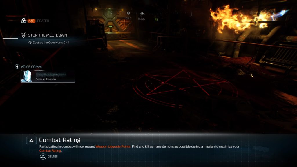
Lastly, an issue encountered was the simultaneous presentation of vital information, which included verbal narration progressing the story and tutorial text information. Although this only happened once to my recollection, this issue makes the player’s verbal and auditory channels compete for attention, likely resulting in him/her missing some of the information trying to be conveyed. The screenshot below demonstrates this scenario, with the verbal narration from Samuel Hayden under “Voice Comm” and the “Combat Rating” on the bottom of the screen.

Recommendation: The verbal narration is essential information here in order to progress the story, whereas the combat rating tutorial is not vital at that precise moment because it is describing, generally, how combat results in points to upgrade weapons. This issue could be resolved by simply changing the timing of the combat rating information to a time when the player’s attentional resources aren’t currently under load due to other stimuli.

DOOM_20160626150019

Final thoughts

DOOM is an unrelenting, adrenaline-pumping, demon-slaying, rush. Aside from the tight gameplay mechanics, the inclusion of design features such as specific visual cues on reticles for modded weapons allow the player to exert more resources toward slaying demons and surviving when the action is dialed to 11, rather than worrying about ammo running low and having to slow the action and pull up the weapon wheel, for example.

In the downtime between demon onslaughts, DOOM remains fun in part due to these usability features. The surprising amount of exploration and vertical traversal are aided by slick visual cues that aid navigation in multiple ways. Informational pop ups during this time let the player know he/she can take a moment to breathe, upgrade themselves, and prepare to, once again, fight like hell.

TMNT: Mutants in Manhattan – lack of accessibility and poor tutorialization

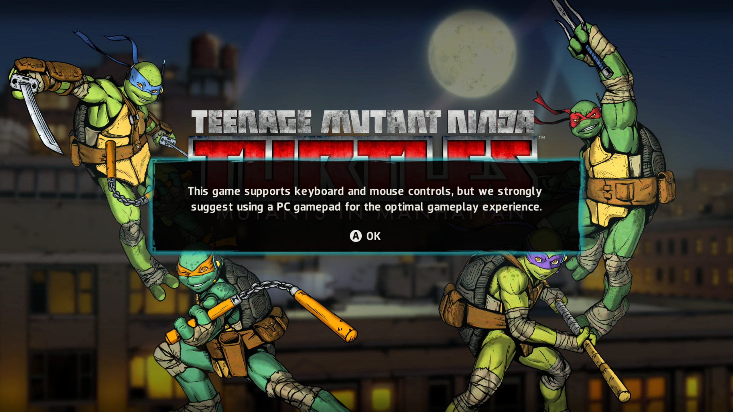
I didn’t want to believe the reviews (e.g., IGN, Gamespot); I really, really, didn’t. The nostalgia and desire for a good TMNT game was just too strong. However, I should have bitten the bullet and quit after the title screen:

TMNT_MiM 2016-06-21 19-50-11-10

From a usability/accessibility standpoint, this might be the worst possible opening message for a PC game. Luckily, I was able to play with a DS4 controller; otherwise, I wouldn’t have gotten the “optimal gameplay experience.”

Although this issue likely warrants no explanation, a PC game should be optimized for PC controls and controller support should be secondary (although it is a very welcomed accessibility feature). Turning on the game and seeing this screen makes me feel taken advantage of, because this message suggests that the PC version is not well-optimized and less time, money, effort, etc. was allocated to it. Moreover, this completely alienates anyone who plays on PC and does not own a controller from achieving the best possible experience playing this game. Ultimately, this limits accessibility to a game that should be available to a wide audience, ranging from young kids to adults who grew up with TMNT. Immediately, they know they are not playing the best version available, and this could ruin the experience from the outset.

The tutorial room

Another usability issue lies within the tutorial, which is an optional mode that teaches the player all of the necessary controls in a room separate from any in-game action. However, TMNT: Mutants in Manhattan has more than just a few controls to remember, making the tutorial room a less-than-ideal choice for this kind of game. While it’s not overly-complex, it has a surprising amount of controls, ranging from basic movement/combat, to item use, to turtle swapping, to commands, to distinct ninjitsu moves for each turtle. See below for a full playthrough of the tutorial.


A tutorial room that takes almost ten minutes to complete is not beneficial to players here because it is information overload, as there are multiple controls explained followed by gameplay executions for each. More importantly, it’s just plain boring and does not hold the player’s attention, making it even more likely to be skipped altogether, ultimately leaving the player even more confused when playing the actual game and unable to obtain the “optimal gameplay experience.”

Recommendations:

  • Incorporate the tutorial into the first mission of story mode. This will help reduce the likelihood of the tutorial being skipped altogether.
  • Exclude the redundant on-screen text during the tutorial, which is simultaneously being narrated by in-game characters (this requires the player to split his/her attention). Instead, integrate the textual explanations into gameplay diagrams/actions. This will allow the player to learn by doing while likely maintaining his/her focus. Additionally, it can reduce working memory overload for players with less prior knowledge, which likely make up a large percentage of the players for a game with such broad appeal.
  • Break aspects of the tutorial into chunks and present them as they occur organically in the open world. This will require the player to remember less and produce less load on memory. Also, this segmenting will allow him/her to proceed at his/her own pace, granting him/her a greater feeling of control. Ultimately, this will likely lead to less player frustration and a better overall experience.

Alienation – tutorial blunders and a hindsight proposal for usability testing

cover

Having spent countless hours playing Dead Nation and Resogun, Housemarque’s next title, Alienation, has been on my radar for quite a while. It is definitely a worthy spiritual successor to Dead Nation, adding three different playable classes, deeper RPG elements, and four-player multiplayer. I’m currently about 7 hours into the campaign with the Saboteur; I’ve played solo as well as with 1-3 additional teammates. Both play styles are fun in their own way and, while the four-player multiplayer can, at times, be too hectic to know what’s happening, it’s an amusing type of chaos. However, I noticed a usability issue before even playing the first real mission.

Non-intuitive tutorial access

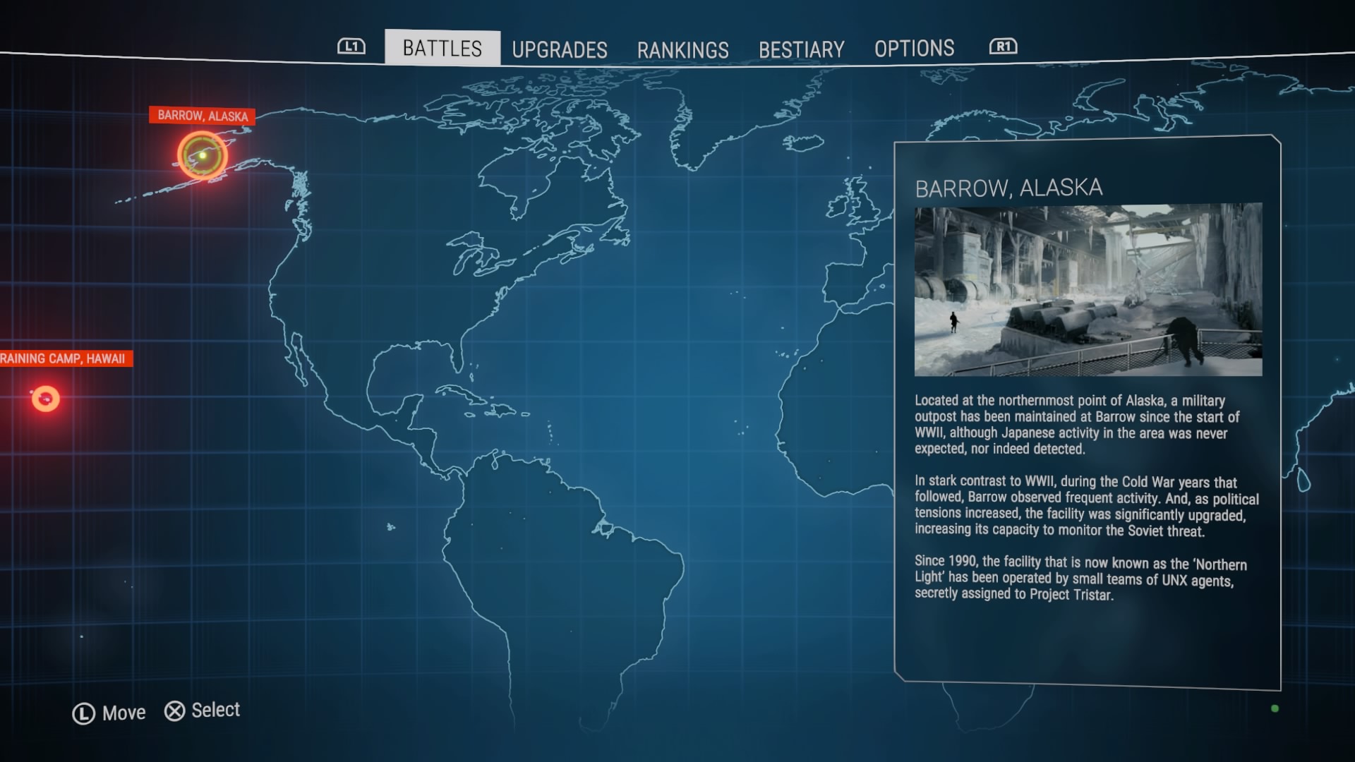
The main mission-select screen for Alienation can be seen below. It is an intuitive design because you complete missions that take place all over the world, many times multiple in the same location, and makes navigating easy.

ALIENATION™_20160430104104
Alienation main mission-select screen

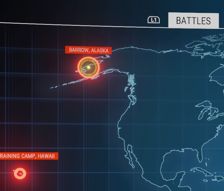
However, below is a zoomed-in screenshot of what is important on this screen and, although it is an overall intuitive design, two issues are present here. The cursor the player uses to navigate the map is a green circle, which can be seen in the left-hand screen shot below, under “Barrow, Alaska.” This is where the cursor is located by default, although “Barrow, Alaska” is actually the first real mission and not the tutorial. The tutorial is “Raining Camp, Hawaii,” which is the second issue. The “T” in training is presumably cut off by the screen here, which could induce even more confusion by the player. They might assume that “Raining Camp, Hawaii” is the second mission, based on its displayed name and how the cursor is on “Barrow, Alaska” by default. The option to skip the tutorial is a nice addition for veteran players of Housemarque or twin-stick shooter games; however, how that option is presented in Alienation is not clear. This lack of clarity might also result in new players skipping the tutorial completely before entering the first mission and missing the introduction to the controls might induce frustration.

The tutorial’s title is partially cut from the screen and not selected by default.

Reloading visual cues – a hindsight proposal

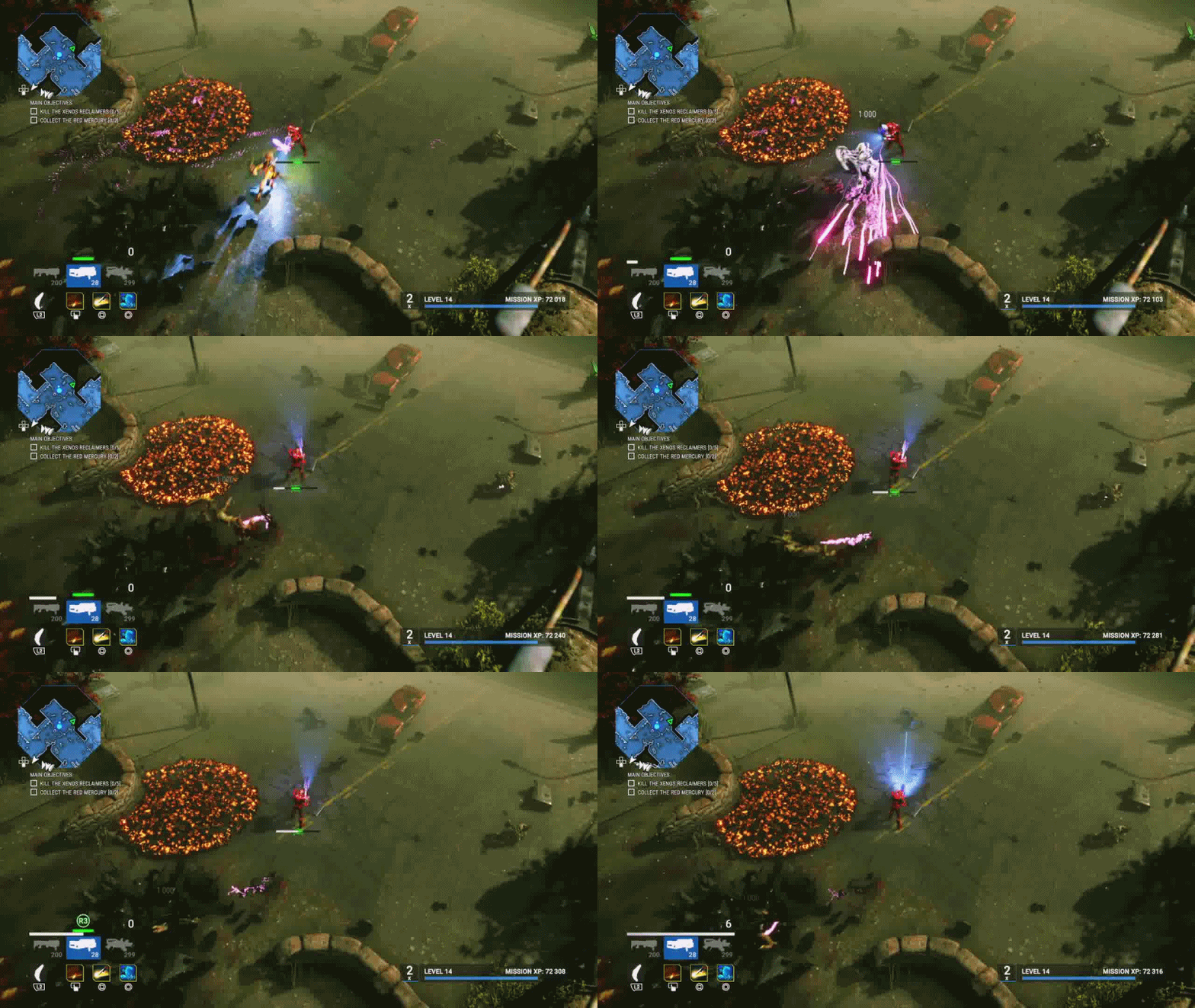
Alienation has a “perfect reload” mechanic similar to the Gears of War series. Briefly, a real-time progress bar is presented to the player and they need to press a button (here, it’s R3) at the right time (here, indicated in green on the bar). Mistiming the reload will result in the green turning to red and the player having to wait longer for their character to reload. This bar is presented in two places: above the gun interface in the bottom-left-hand portion of the screen and right below the character; however, there is one main difference in these presentations. Besides being obviously larger, the bar above the gun interface presents an “R3” cue when the bar reaches the green, essentially reminding the player what button to press and when. The GIF below demonstrates both reloading bars in action.

reload gif 2
Reloading bar presented in two places: above the guns UI and below the character

This dual presentation made me wonder if both are actually necessary. Personally, from a line-of-sight perspective, I rarely look away from the character when playing unless I know I’m completely alone; there are just too many situations where there are an overwhelming amount of enemies swarming the character, and that split second it takes to look over to the bottom-left to reload could mean the difference between life and death. Additionally, if the player is fixated on the character, the R3 pop up could be mistaken as an enemy coming from the periphery. While I am ignorant to whether Housemarque conducts external usability tests for their games or not, I would imagine a handful of tests would have brought this matter to the forefront. Regardless, in hindsight, I would propose this to Housemarque – would playtests categorize this extra bar as unnecessary and/or distracting? Furthermore, I know that conducting eye-tracking usability studies can be out of budget’s reach for many companies, but I wonder if that, combined with direct observation and self-report testing, would have shone light on this topic.

Pierre Chalfoun, the biometrics project manager at Ubisoft Montreal, gave an excellent talk about eye tracking and line of sight at GDC 2016. While I highly recommend watching the whole video, I would like to direct your attention to 28:05 – 32:15 in the video below, where he discusses a mixed-methods case study they conducted with eye tracking in Assassin’s Creed Unity to help inform UI design based on player’s actions. He makes a great point that players can have difficulty self-reporting in-game reactions, such as where on the screen they would look when completing certain actions, which is where the quantitative method of eye tracking can be very useful.

For Alienation, I would go out on a limb and hypothesize that most players would not use the reload UI on the left of the screen, making it superfluous to an already busy lower quadrant of the screen. If this did happen to be the case, perhaps an “R3” cue under the character, in addition to the bar, would be beneficial, similar to how Ubisoft integrated stealth UI elements in Assassin’s Creed Unity based on the results of their study.

In the end, this is pure speculation and we can only guess how such a study would conclude. While this question could be answered with traditional usability tests, eye tracking does contribute a quantitative component, which is ultimately more trustworthy than a player’s self-report recollection about such a UI design/feature and its usability.

How Hearthstone perfects the digital card-collecting and deck-building experience

There are a variety of digital trading card games that contain any mixture of favorable and unfavorable user interface (UI) designs. More specifically, if there is not an intuitive system in place for the card-collecting and deck-building portions of these games, it can be a laborious process that places unnecessary effort on trivial tasks that could be focused on building an awesome deck. Since this can be one of the most enjoyable aspects of trading card games, this process could ultimately hinder the player’s experience. With the recent release of Whispers of the Old Gods, we will all be spending a lot of time with the collection and deck-building interface in Hearthstone, so let’s see how it stacks up according to well-established usability heuristics for UI design.

Brief overview

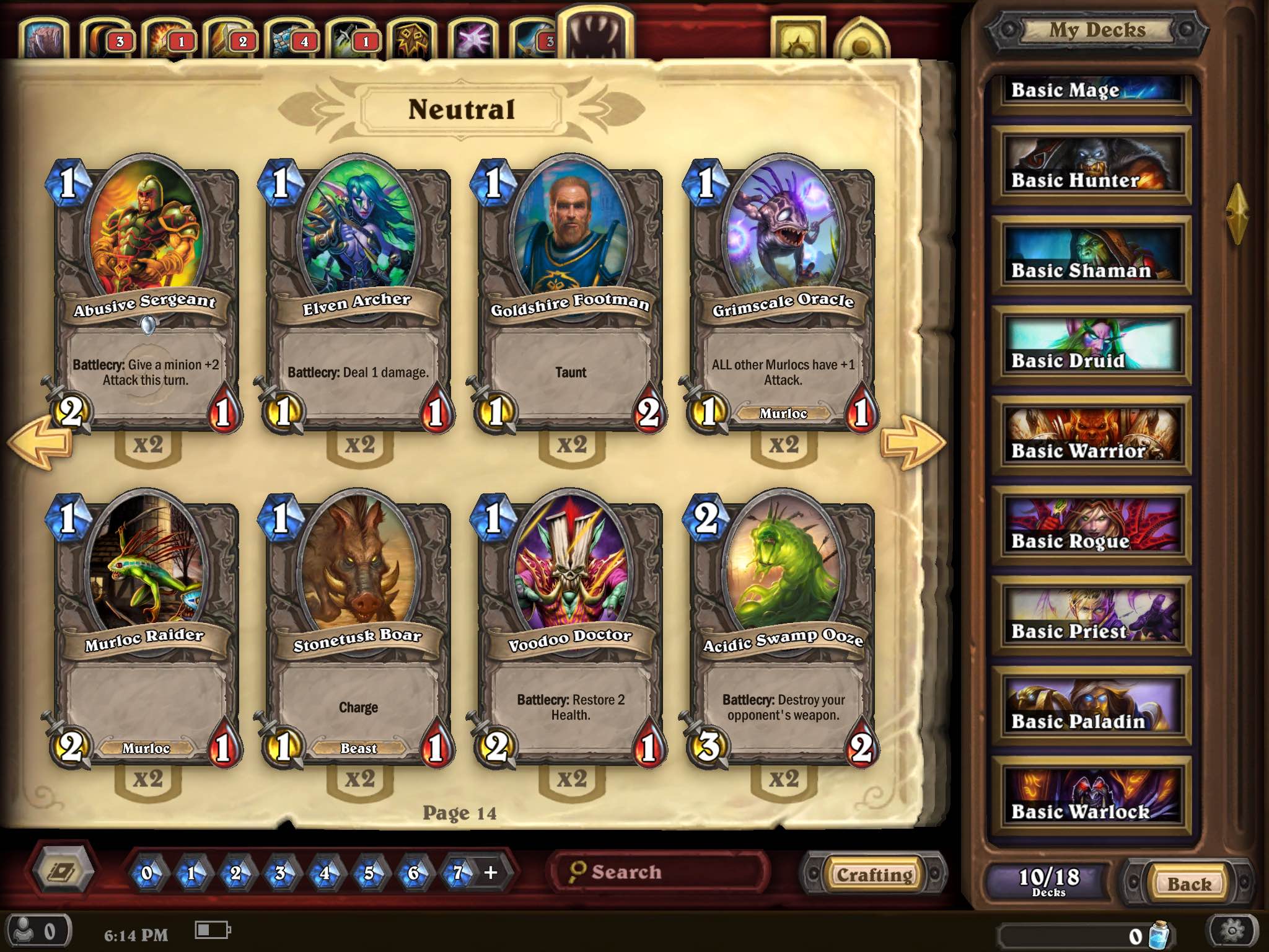
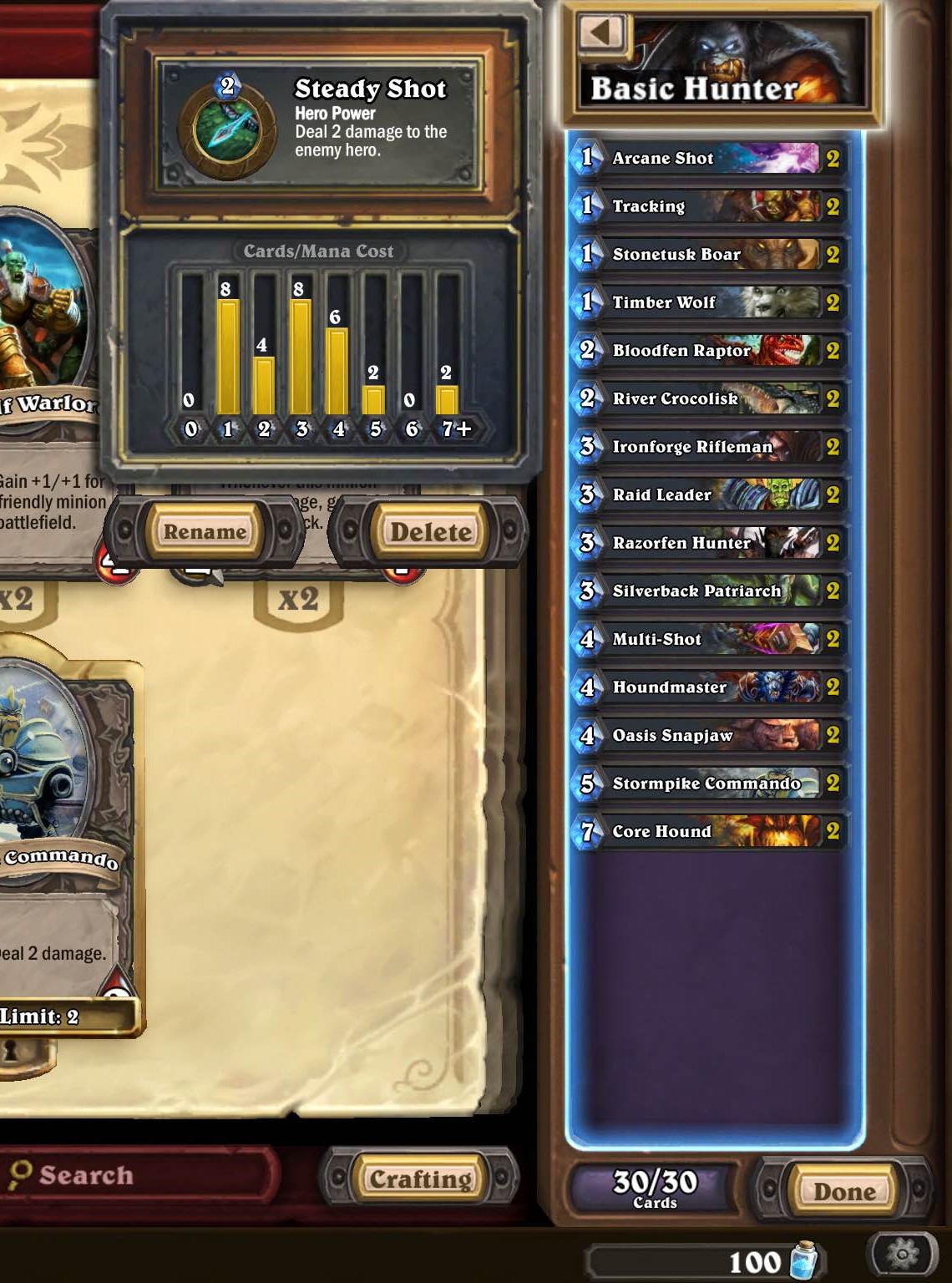
Below is a screenshot of the collection and deck-building screen for Hearthstone on iPad. It is setup like a virtual card binder with numerous different filters, all while maintaining aesthetic appeal and a minimalist design. Starting in the top left, there are tabs that let the player filter cards by the nine hero types and neutral cards. The two gold icons to the right of these tabs allow the player to view collected card backs and heroes. The bulk of the screen is comprised of the cards currently chosen, which includes the hero name at the top along with relevant artwork, the cards, as well as the quantity in the collection. On the far right is the second-largest portion of the screen, which is a scroll bar where the player can select from any of the basic hero decks and custom-built decks. Once a deck is selected, the player can tap again to see an overlay of the mana distribution, the hero’s power, and options to rename or delete it. The bottom-left portion of the screen allows the player to filter by different card sets and mana crystal costs. Additionally, there is an indicator of online friends, a clock and a battery indicator (much-welcomed inclusions). Moving from the center to the bottom-right of the screen, there is a search bar, a crafting button that opens the card-crafting pane, the current number of decks, amount of arcane dust, and back and menu buttons.

2

IMG_0573111

Match between system and the real world 

Upon initial navigation of Hearthstone’s menus and card-collecting and deck-building interface, it is immediately obvious how well-expressed the targeted theme and identity of Warcraft is. This, along with the virtual-binder design, which is similar to how the backpack is utilized as the menu system in the Pokemon games or how the player slices menu buttons in Fruit Ninja, can allow for deeper immersion and enhance the overall experience.

Hearthstone also makes the screen intelligible from left to right, both logically and intuitively as if the player is flipping through a card binder. There are arrows to navigate forward or back and, if no filters are selected, the cards are presented in order of mana cost, as if reading a book. Additionally, the tabs at the top of the screen that allow the player to filter cards by hero type are represented by intuitive icons easily recognized by players, such as knives for a Rogue and a sword for a Warrior.

IMG_057711

Visibility of system status

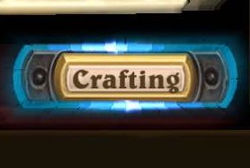
Hearthstone’s collection UI remains the same throughout the process of searching your collection and building a deck, with a couple subtle changes introduced when card crafting. This consistency makes it easy to keep track of multiple things, such as what card types and mana costs are currently filtered. Hearthstone achieves this by utilizing pulsing and glowing visual cues, such as a blue outline around the crafting button and lighting up the currently-filtered mana cost.

4

3

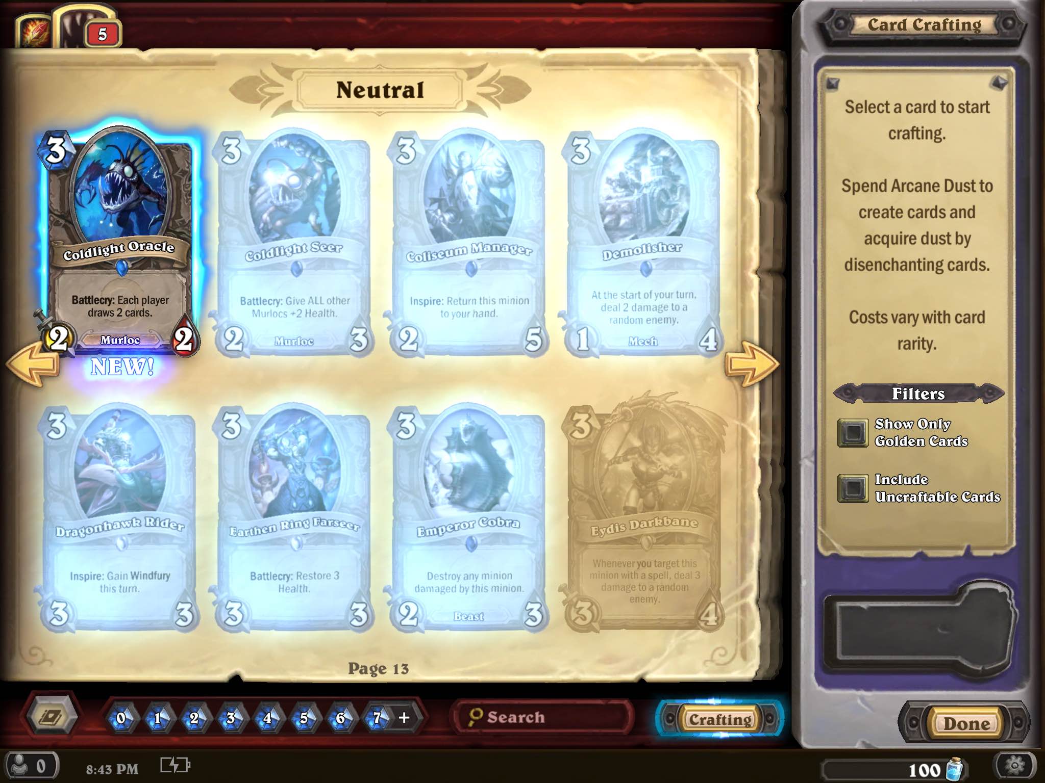
Also, when in card crafting, cards you currently have and can afford to craft are shown and outlined in blue, whereas cards you do not have, but can craft, are faded but highlighted in a similar glow. Cards you do not have and cannot currently afford to craft are grayed out to closely match the background, clearly indicating that this option is unobtainable at the moment.

IMG_0579

Error prevention in card crafting

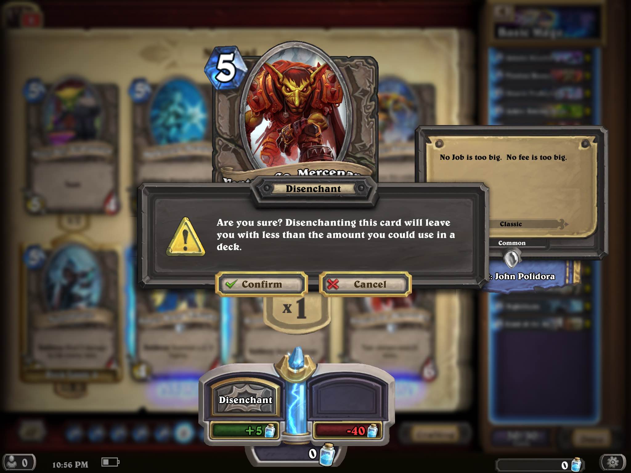
Confirmation messages can be a great option for UI design to prevent errors. Hearthstone introduces error prevention during card crafting by presenting the player with a confirmation dialog box when attempting to disenchant a card that would leave them with less than 2 of said card, which is the maximum allowed per deck for certain cards. This message gives players a moment to reflect on their current action and potentially prevent them from accidentally disenchanting a super-powerful legendary card.

IMG_0570

Recognition rather than recall in card crafting

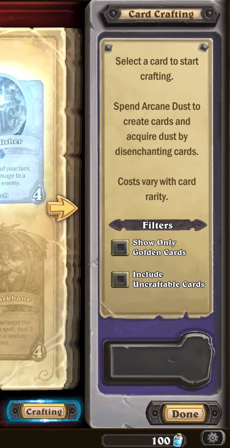
The card-crafting screen is the only slight deviation from the main collection screen. Here, players are presented with a pane with instructions and additional filters for card crafting. The inclusion of this pane in place of the deck pane on the main screen presents players with a well-located reminder about the general idea behind card crafting, which is ultimately more beneficial than accessing decks during this portion.

5

Other UI usability features worth noting:

  • The interactive UI stands out from the background, as evidenced by the design of the buttons, as well as using concepts that players can relate to real life, such as searching through an organized physical card collection.
  • Throughout, there is consistency in font sizes, colors, styles, and icons, which can be read clearly even though they are small.
  • There are subtle aspects of the UI that help keep the player informed during the entire collection/deck-building process, such as indicators on cards in your collection when you have the max amount of that card allowed in the deck or if you have none left. Again, this allows the player to recognize rather than recall what cards are in the deck.IMG_056411

Final thoughts

Not only does Hearthstone have deep, yet simplistic and accessible gameplay, it also seems to have implemented that philosophy into its UI design. This is an incredibly important inclusion, as it results in a more complete package that is not only accessible to younger players, inexperienced card game players, and inexperienced Warcraft players, but also the most hardcore card game, such as Magic: The Gathering, players. Ultimately, regardless of experience, the UI is not a (usability) barrier to entry and is very intuitive and easy to use throughout. However, building dominant decks on a budget and remaining competitively ranked is another story. 🙂

Dead Star tutorial think-aloud

dead star

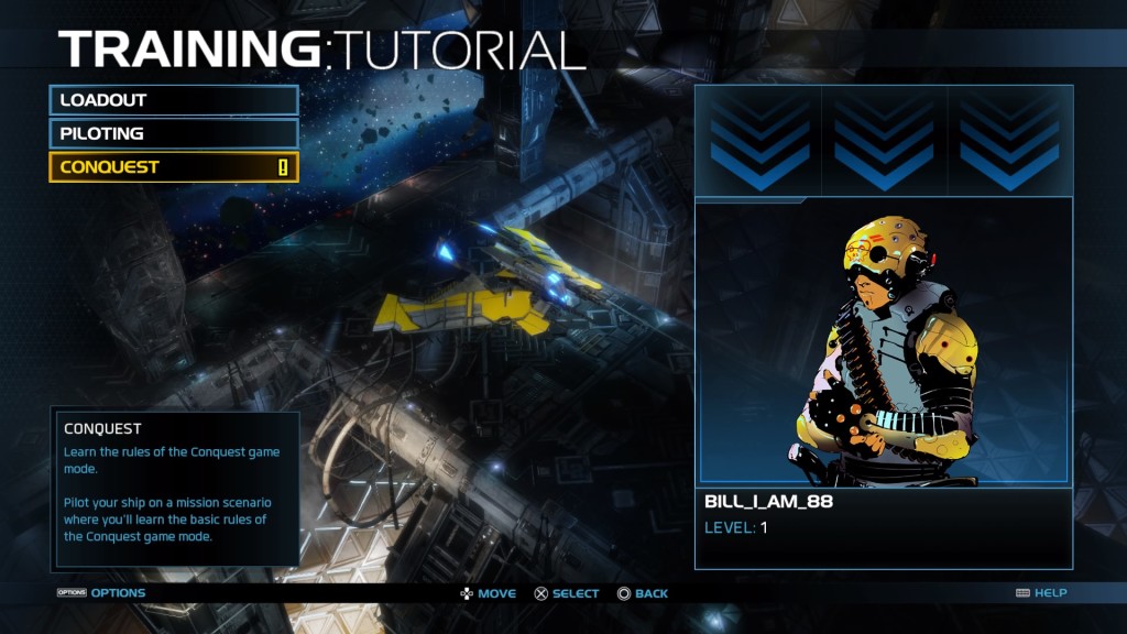
Dead Star is a twin-stick space-shooter with hybrid MOBA and RPG elements. Here, it was reviewed in the format of a think-aloud, which is a form of usability testing where a researcher observes a participant “thinking aloud” and verbally expressing feelings, experiences, actions or issues encountered while playing the game (Desurvire & Seif El-Nasr, 2013). This think-aloud was conducted with me as the researcher and a female in her mid-twenties, who does not self-identify as someone who plays video games, as the participant. The tutorial of the PS4 version of Dead Star was played, which is comprised of three sections: Loadout, Piloting, and Conquest, and lasted about 30 minutes. The initial tutorial screen can be seen below.

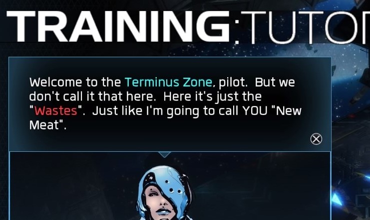
Dead Star™_20160405153001

The player proceeded to complete the tutorial in the order in which the sections were presented, beginning with Loadout, which can be seen below.

Dead Star™_20160409130320

Dead Star™_20160409130320

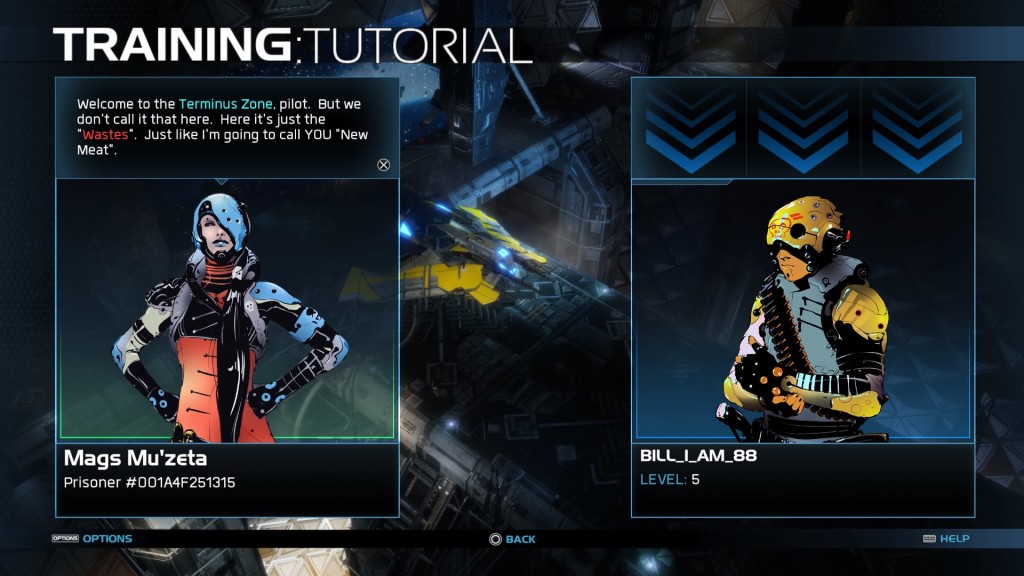
As seen above, the tutorial commences with Mags Mu’zeta speaking instructions to the player along with the written instructions presented in the top-left corner of the screen. Once the player noticed the option to read the text and skip ahead by pressing “X,” she progressed through these subsections at an expedited pace, not waiting for Mags Mu’zeta to finish reading the introduction and instructions aloud.

Dead Star™_20160409130450

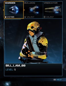
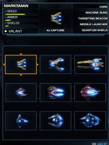
At the heart of the Loadout section of the tutorial, it presents the player with the three categories of space ships that can be used during gameplay, as seen above. The player was instructed to navigate to the Estari Warden ship and swap it out for the Marksman. Although the ship currently selected is outlined in a yellow square, as well as labeled with the ship’s name in the box, the player became confused as to why she could not swap the Warden out for the correct ship, the Marksman. The issue was simply that the player was unaware that she was currently selecting the Bulldog instead of the Warden, which was rectified after a few seconds of focusing on her options. She proceeded to correctly highlight the Warden and swap it out of the loadout for the Marksman.

Dead Star™_20160405151748

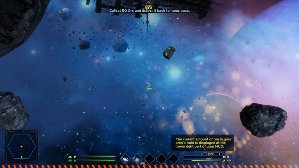
The player then proceeded to navigate, without issue, back to the main tutorial screen to select the Piloting tutorial. This was where the player learned how to perform basic controls, including navigating the ship, shooting, and collecting loot. First, the player was instructed to collect 50 ore and return to the home base, which was instructed verbally by Mags Mu’zeta, as well as with a small text indication at the top of the screen (see screenshots below). When instructed to shoot the ship’s gun for the first time, the player verbally expressed confusion about how to control the dual-stick firing system (right stick to aim and RT to fire). After some troubleshooting and time spent looking at the controller, she was able to successfully destroy and collect the ore rocks.

Dead Star™_20160409130735

Dead Star™_20160405152003

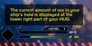
The current amount of ore the player has is indicated by HUD on the bottom right-half of the screen (see below). Here, you can see the current amount in the player’s inventory, as well as a progression bar indicating how close the player is to capacity. While not explained at this point in the tutorial, different types of ships have different ore-carrying capacities. At this point, the player was controlling the Estari Marksman, which has a capacity of 50 ore and, as seen in the screenshots, the player currently has 40. However, she was not aware of this HUD element, even though there is a brief text pop-up explaining this feature. Once she had reached the capacity of 50 and was unable to collect the remaining available ore, she asked “why can’t I collect more ore?” and “do I have too much?” After some time spent flying the ship around the remaining ore and failing to pick it up, she continued to her objective by navigating the ship in the direction of the yellow directional reticle.

Dead Star™_20160405152003

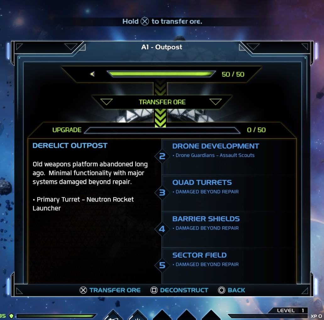
Upon returning to the home base, the player was instructed to transfer the ore in her inventory to the base as supplies for upgrades. The UI for this can be seen in the screenshot below. Similar to other instructional segments throughout the tutorial, there are text instructions at the top of the screen, as well as button prompts at the bottom (e.g. X Transfer Ore). When presented with this screen, the player demonstrated a facial expression of confusion. However, after a few seconds of looking up and down the screen a number of times, she was able to successfully transfer the ore.

Dead Star™_20160405152038

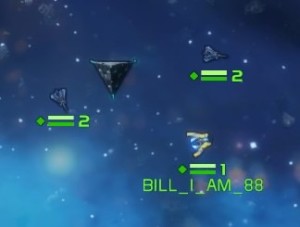
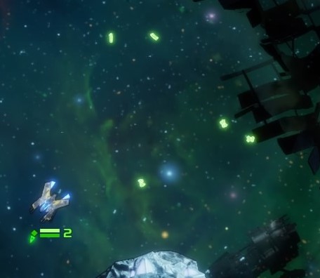
After upgrading the home base, the player was instructed to investigate a nearby cargo salvage. Before proceeding to said cargo, the player was instructed to recruit nearby drone ships to fly with her. She quickly correctly recruited two drone ships; however, she attempted to circle the larger, stationary, object thinking it was another drone and asked “are they supposed to come with me?” The similar size and shape of this object was mistaken as a drone ship (see screenshot below).

Dead Star™_20160409130835

She then proceeded to navigate the ship to the correct location of the cargo salvage. Once she arrived, two text pop ups were presented on the screen simultaneously, although only one was relevant to the current objective, as seen in the screenshot below. She verbally expressed frustration with this scenario, saying “how am I supposed to read both at the same time?!”

Dead Star™_20160405152308

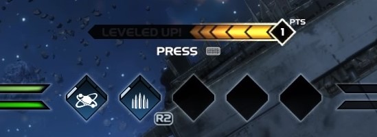
Once the player destroyed the cargo and collected the artifact, she was instructed to level up and was presented with the screen below. Here, there were visual cues on the screen as well as a repeating “upgrade available” as an auditory cue. She expressed confusion about the prompt to press the PS4 controller’s touchpad, saying “I don’t know what button that is.”

Dead Star™_20160405152330

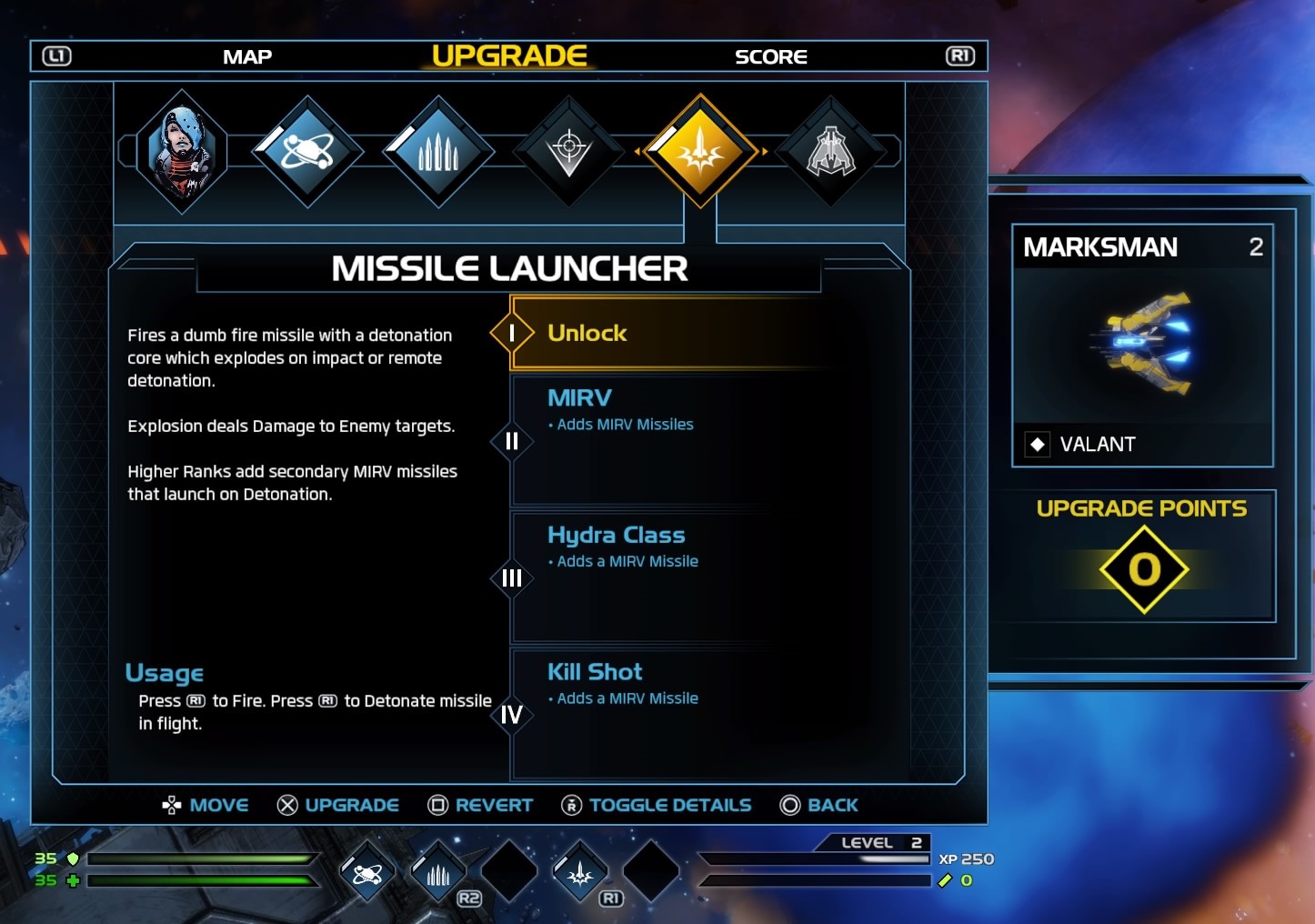
After examining the controller for a brief moment, she was able to reach the level-up screen, which can be seen below. The player was instructed to level up the missile launcher, which was when she asked, “how do I choose the missile launcher?” She then navigated to the right and the player’s current selection was highlighted in yellow, as seen below. She proceeded to press X to upgrade the missile launcher; however, the two indicators of successful leveling up, which were the white bar filling in half of the left portion of the highlighted diamond and the “1” under “Upgrade Points” turning to a “0,” were not noticed by the player. Therefore, she hesitated once upgrading the missile launcher and, shortly after, realized she needed to press “O” to back out of the level-up screen. She then proceeded to try her new weapon against incoming enemies, however, her ship was destroyed, resulting in a respawn at the home base.

Dead Star™_20160409130930

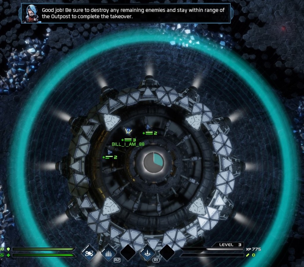
Upon respawning, the player was urged to destroy any remaining enemies and then navigate to the enemy’s controlled station. Upon arrival, she successfully destroyed the enemy ships and began the process of taking over the base. At this point, the player was instructed to stay within range (indicated by a blue pulsating aura) of the base and the time it takes to complete the takeover was indicated by a timer within the base (see below). Once remaining enemies were destroyed, she navigated away from the base and asked, “are there any remaining enemies?” While there was text for the current objective at the top of the screen, the player stated, “I don’t know what I am supposed to be doing right now,” and “it’s not clear what I’m supposed to be doing.” After several minutes of navigating around the home base, but not within range to complete the takeover, the player was prompted by the researcher to “look to the top of the screen for your objective.” The player read the objective aloud and further asked, “what am I supposed to do?” The researcher then clarified that the player was out of range and that she had to stay within the blue circular aura for the appropriate amount of time.

Dead Star™_20160409131157

Once the takeover was complete, the player proceeded to follow the level-up prompt. Again, she displayed frustration with this system and the verification that she had correctly upgraded her intended option. Lastly, the player completed the Conquest tutorial, which consisted of attacking and overtaking an enemy outpost using one of the largest ships available, the Vindicator. The player expressed no verbal frustrations or obvious issues with this part of the tutorial and completed it in a timely fashion.

Summary

While inexperience with games in general was evident throughout this playtest, it also revealed some potential usability issues in Dead Star. For one, during this think-aloud, the player was tripped up by the leveling-up system, suggesting that the indication for successfully leveling up may be too subtle for some players. Secondly, as a game with MOBA-like elements, there can be a lot going on on screen; therefore, it may be beneficial that stationary, non-interactive, objects in the game world not resemble objects that can be interacted with, as seen in Dead Star with commandable drones. Thirdly, the simultaneous presentation of two instructional text boxes (one with additional auditory presentation) can confuse the player and potentially direct their attention in an unintended direction, ultimately significantly affecting the experience.

Additional thoughts on usability

During my time with Dead Star, I noticed some usability issues not previously mentioned in this review. Although I played through it on PS4, I played it on a PC monitor, so I was only ~3 feet away from the screen. However, some of the HUD and pop ups, including words, numbers, and button prompts are small and I wonder how this holds up when playing on a TV, where the player is significantly farther from the display. Lastly, as seen in the screenshot below, it can be easy to lose track of the aiming reticle (bright green triangle) when aiming at the lower half of the screen. It not only clashes with the colors of the shield and health bars, but also collectible ore and the background of certain maps. A different color choice for this reticle or the option to change the color along with certain maps would have been beneficial.

Dead Star™_20160405162352

References:

Desurvire, H. & Seif El-Nasr, M., “Methods for Game User Research: Studying Player Behavior to Enhance Game Design,” IEEE Computer Graphics and Applications, vol. 33, no. 4, pp. 82-87, July-Aug. 2013, doi:10.1109/MCG.2013.61

Tom Clancy’s The Division

The Division is a game that needs no introduction considering how popular it is and how many sales records it has broken. It seems like just yesterday that I was picking my jaw up off the ground following Ubisoft’s gameplay reveal at E3 2013 . Seeing the agent avoid the bullet-stricken NYPD car window and close the car door on his way to safer cover was just one of those “wow” moments. Played on PC (with a controller), here are my thoughts on usability and the overall experience:

Usability:

 A-B-C, easy as 1-2-3? 

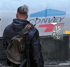
Many games (e.g. Gears of War) have used a very similar third-person-shooter cover system to the one utilized in The Division. Typically, “A” is used to get into cover, as well as to move around and over. In The Division, using the reticle, the player can look where he wants to run into cover and “A” can be seen popping onto the screen for every spot the player can use. As a game with a lot going on on the screen at any one time, both UI- and notification-wise, the “A” popping up everywhere can easily misdirect the player’s attention elsewhere on the screen, perhaps thinking it is loot or that a mission-oriented task needs to be performed. Thankfully, this feature can be disabled in the settings menu.

The main difference in this cover system compared to other third-person shooter cover mechanics is that, to go over an object or climb up/down something, “B” is used. See the screenshot below.

Tom Clancy's The Division™2016-3-9-18-45-19

However, there are some inconsistencies with this system, primarily with dropping down from something. Sometimes, pressing B is required to drop down, whereas other times simply moving your character in the direction you want to drop suffices. It is never made clear when to press B versus not other than “B” appearing on the screen. If you’re high enough, there is an indicator along with the B that notifies you that you’ll lose some health from the fall. Is the necessity to press B versus not dependent on height? Unclear.

Tom Clancy's The Division™2016-3-9-18-48-14 (2016_03_10 00_35_34 UTC)

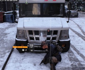
Another inconsistency with this system can be seen in the screenshot above. Additional arrow indicators can send mixed signals to players, which could lead to some confusion. It is pretty clear that the B here informs the player how to climb to the top of the truck; however, does the A indicate that the player can take cover against the window or drop down from the truck? This is a system that took a few minutes to practice, since it essentially complicated an already established simplistic system of using one button to perform multiple cover- and traversal-related actions. While it’s possible that Ubisoft implemented this to appeal to an audience that doesn’t have a lot of experience with third-person cover systems, the constant visual cues makes the player wonder if a “less is more” approach would have been more beneficial here. Again, once the subtleties of this system are controlled, it can be helpful to to turn the cues off.

Poorly-timed explanations or just none at all

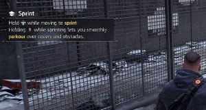
As mentioned, The Division can have a lot happening on the screen at any given moment and, although there is a fairly lengthy prologue that covers the majority of the tutorials and essential info, there are explanations for some aspects of the game that are either awkwardly timed or nonexistent. There are numerous occasions where an informative pop up was presented on screen, either explaining a basic gameplay mechanic or feature. For example, after completing the prologue Precinct Siege mission (and sprinting a multitude of times throughout), the player is informed how to make his agent sprint. Another example came after the second story mission where the player is tasked with rescuing Dr. Kandel; here, your agent’s primary attributes (i.e., stamina, firearms, and electronics) were explained. Knowledge of these attributes is essential to proper character building and presenting its tutorial at an ill-advised time does not provide it the attention it needs; players might deem it immediately irrelevant to them and quickly dismiss it.

Tom Clancy's The Division™2016-3-9-20-26-46
But didn’t I just run through that whole mission?

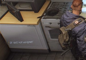
While awkwardly-timed tutorials can throw a wrench in the experience, not explaining important features can be far worse. One feature that is never fully explained are your agent’s skills, which are a very important aspect of gameplay, primarily how they compliment each other and are especially important later in the game against stronger enemies. The first indicator of skills is a notification that the player has a skill that is not assigned. However, there was no explanation of what these skills are, how they’re unlocked/achieved, or how to assign them.

Tom Clancy's The Division™2016-3-9-19-20-55

Other features that were never explained include emotes and status effects. What is the point of emotes, why use them, and HOW are they used? Down on the d-pad is designated to numerous emotes, all of which can serve different purposes, such as helping communicate with team members or getting your agent some exercise (as if running around NYC wasn’t enough). There are visual indicators for status effects (i.e., bleed, burn, disoriented, blind-deaf, shock, and disrupt), however, their actual effect on gameplay is never clarified.

Missing loot

Briefly, the loot system is categorized into five different rarities: worn (white), standard (green), specialized (blue), superior (purple), and high-end (yellow). Loot dropped by enemies is signified by a sky-high beacon the color of the item’s rarity. However, being that the main ambiance of The Division is a snowy/smoky, post-apocalyptic NYC, it can be incredibly difficult to notice worn items, which include ammo, med kits, and some weapons to name a few, against the daytime and snowy sky. This issue is non-existent with the other rarities, simply because the contrast is much greater between those colors and the game environment.

Tom Clancy's The Division™2016-3-19-8-58-44
Transparent white beacons can be hard to see.

Appeals/opinions

Features that enhance the experience

While The Division has some usability issues, it also contains some subtle features that help streamline tasks, such as navigating the menu, and improve the overall experience. One such feature is that, when visiting vendors, the game doesn’t give you the option to (accidentally) sell equipped guns/gear. With what seems to be a never-ending backpack full of loot, it is quite useful to not have to memorize everything you have equipped in order to not accidentally sell it. Anyone who has ever played an RPG has experienced that immediate sense of regret (quickly, reload last save!). Additionally, while navigating the world, the option to override the current object with a quest that is close in proximity by simply holding X is a nice way to change objectives on the fly and allows for better real-time “city randomness.”

Immersion – “open-world” as an umbrella term

As a huge fan of open-world RPGs, once the tutorial/prologue is completed and I’m unleashed into the open world, my first matter of business is randomly exploring in order to further immerse myself in the game world and experience this “randomness.” However, during my exploration of the first Manhattan district, there was an underwhelming amount of random loot and not nearly as much as one would expect from an “open-world” game. Additionally, sick citizens, requesting aid in the form of a med kit or can of soda, and groups of enemies were encountered. The sick citizens would drop loot, almost always in the form of clothing or a worn gun, whereas we can all deduce how the encounters with enemies concluded. Upon exploration of subsequent districts, it was the same scenario – a lack of random loot, some sick citizens and groups of enemies. This, for lack of a better word, “static” environment, filled with what seemed to be copy and pasted “random” events made NYC seem lifeless. I’m aware that this is post-apocalyptic NYC, and perhaps game series like Elder Scrolls, Fallout, and The Witcher have set the bar too high, or in a different direction altogether, but this hindered immersion. Even post-apocalyptic NYC would, arguably, have more life than most places pre-apocalypse. No curiosity or sense of wonder is induced by the world of The Division because what was around the next corner and “random” events were all completely predictable and, ultimately, curiosity was never rewarded.

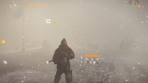
Lastly, let’s address the elephant in the room – graphically, it’s a beautiful game. While it might not have met the unworldly expectations set for itself during E3 2013 reveal, it has some of the best lighting and snow effects I have ever seen in a game. NYC looks great and, graphically, it is definitely a sight to see.

Tom Clancy's The Division™2016-3-10-21-12-50
Them light effects!

Final thoughts

I’m currently level 22 and have enjoyed the majority of my time with The Division. It is a game that does some things nicely, such as its RPG elements and shooting/combat mechanics. However, it is difficult to describe it as anything more than a blend of mechanics from older games of different genres and, unfortunately, these games typically execute said mechanics in a superior fashion. The Division, simply put, seems like an overly-ambitious game that spread itself too thin in order to appeal to a broad audience. You can’t revolutionize something without evolving an existing thing, which is where The Division ultimately falls short of its potential.

Guardians of Orion – some usability issues

Guardians of Orion is an Early Access Steam game where the player controls a class-based Guardian and fights against dinosaurs and robots either alone or in multiplayer modes. Guardians of Orion’s primary issue is its lack of explanation with some UI elements and basic gameplay.

Tutorial?

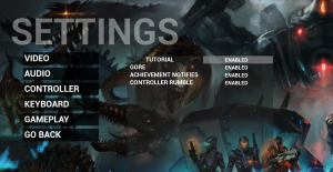
Under the gameplay tab in the settings menu, there is an option to enable/disable the tutorial, which is enabled by default; however, no tutorial is present during either single- or multiplayer modes. Perhaps this is a feature that they are planning to incorporate, but haven’t yet? It seems like something that should be present from the beginning if its absence results in basic usability issues.

407840_2016-03-05_00003.

To control or not to control?

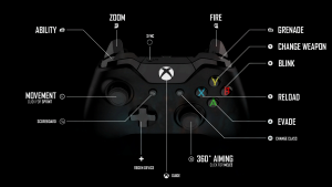
One usability issue in Guardians of Orion is based around how to control the game. Personally, I enjoy using controllers when playing PC games; however, it is not typically my initial guess that a PC game would base its usability on using a controller. This is the case in Guardians of Orion and it is never made obvious to the player, especially at first. Unless, of course, you’re perceptive enough to immediately take the only loading screen in the game as a gameplay hint…

407840_2016-03-05_00001

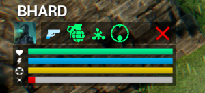
More evidence for design geared toward using a controller is present during actual gameplay. My first playthrough was with a mouse and keyboard and I was unable to figure out some of the controls, including some of the mechanics in the bottom-left-hand pane of the interface:

407840_2016-03-02_00001 (2)

Instead of fumbling through the main menu and attempting to memorize the keyboard controls, I decided to attempt my next playthrough with a controller. Here is the bottom-left-hand pane of the interface when playing with a controller:

407840_2016-03-02_00003 (2)

To say the least, I performed much better during my second go. Nonetheless, the player should not have to fall flat on his face to figure out basic gameplay mechanics and usability. A fix for this would be consistency across controller types – incorporate the respective buttons for keyboard controls in the pane.

Low health-induced change blindness

Like many games, Guardians of Orion makes gameplay increasingly difficult as the player’s health diminishes. At a certain level of health, the glass in the player’s mask begins to break and worsens with diminishing health, resulting in clear cracks and ripples across the screen. Inherently, this is not an issue. However, a couple of the maps in Guardians of Orion (e.g. Goo-Summit and Goo-Whiteout) are full of snow, ice, and mountainous terrain that produces a light blue/whitish screen. Together, these result in a form of change blindness, primarily when the player is traversing/trying to evade enemies and prevent death. There were numerous times where the map terrain was confused for cracks in the player’s mask, which resulted in the player rolling directly into the terrain, immediately stopping movement, and dying instantly.

Final thoughts

Guardians of Orion is a fun game with lots of RPG elements that is even better with more people. Hopefully Trek Industries continues to work on the game; if they do, perhaps I’ll revisit this post in the future with updates! Until next time!