Intuitive access to current objective and challenges
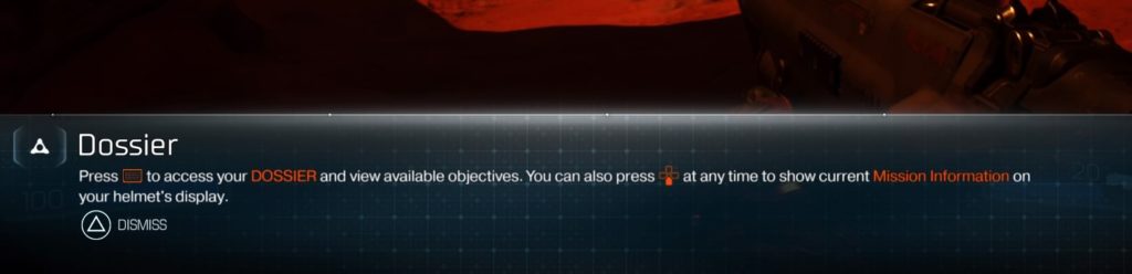
DOOM has many subtle usability features that contribute to the user experience. The first being the inclusion of a secondary way to display the current objective and challenges, which is mapped to down on the d-pad. The objective appears on the left-hand side of the screen and the challenges appear on the right, which can be dismissed by pressing down on the d-pad a second time. This is a handy, simple, one-button press that is a design feature that flows nicely with the overall relentless pace set by DOOM. Below are three screenshots demonstrating this feature.
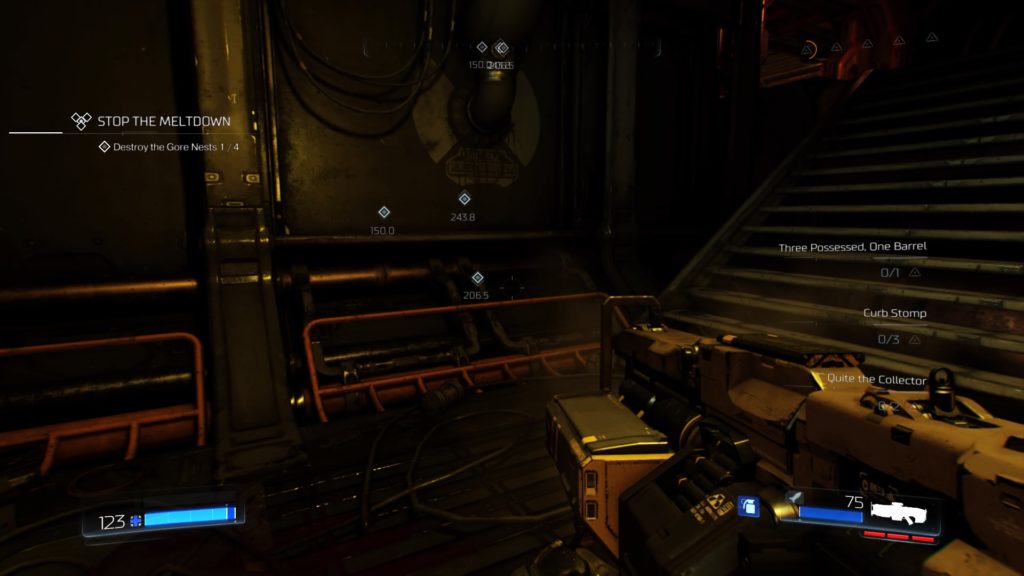
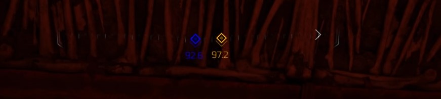
Color-coded objective markers
Multiple times throughout the campaign, the player has to obtain colored key cards or skulls to gain access to corresponding doors. It is great practice to display vital information in more than one way; in this case, the color-coding of the objective markers provides supplemental information to the distance marker. If the player proceeds to the incorrect door first, he/she is less likely to make an error navigating to the other, as there is additional discriminatory information to help avoid mixing up the objective markers.
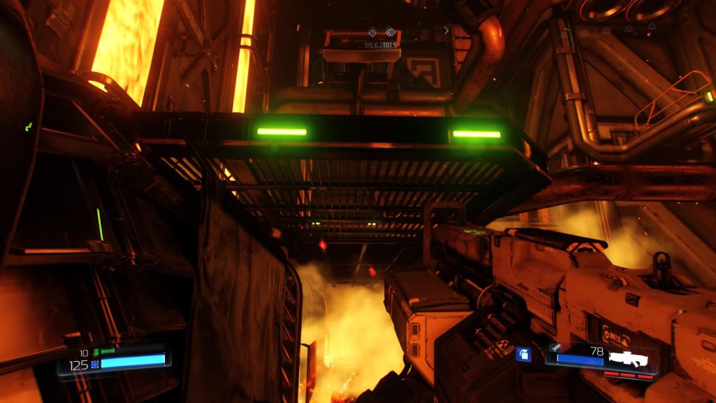
Green lights for vertical traversal
There are many scenarios in DOOM where the player has to traverse vertically. The density of some of these areas can make it seem like a daunting task; however, there are green lights on ledges to indicate a sense of directionality and climbable surfaces. This is similar to games like Tomb Raider and the Uncharted series that require a lot of traversal and design it such that it is noticeable to players, but also seems like a natural part of the game’s world; it doesn’t stick out like a sore thumb (I’m looking at you, Ryse: Son of Rome). DOOM uses this method in a couple ways, which can be seen below; flashing green lights seem like something you would realistically see if navigating a facility on Mars.
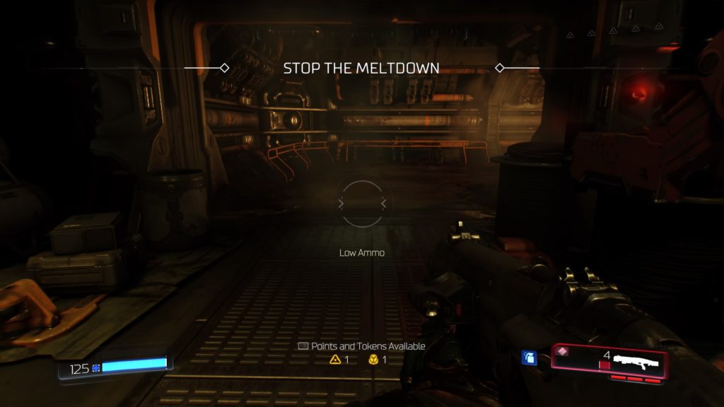
Available weapon points/suit tokens reminder
Another subtle feature is a reminder about how many weapon points and suit tokens the player currently has available to spend, which appears on the lower-half of the screen in the center (see screenshot below). There were numerous times that I was caught up in slaying demons that I lost track of how many points and tokens I had, so this reminded me to level up consistently with the natural progression of the game, which, inevitably, only led to more brutal slaying. These appeared during slower moments in the game, so they didn’t interrupt any action and allow the player to focus on spending available points and tokens according to specific play styles. Promoting recognition, not recall, by players is always a win in my book.
Weapon mod reticles
Each weapon and its mods has its own distinct reticles. This system also added the ability to visually track current ammo for certain weapon mods without diverting the player’s attention away from the reticle in the center of the screen. Not only does it track the number of shots for each mod, but also color cues (i.e., green when ammo is full and flashing red when low). This is very useful because many weapon mods include firing multiple shots in a row. See the video below for examples of this system with the charged (triple) shot mod for the shotgun and missiles for the assault rifle.
Simultaneous presentation of vital information
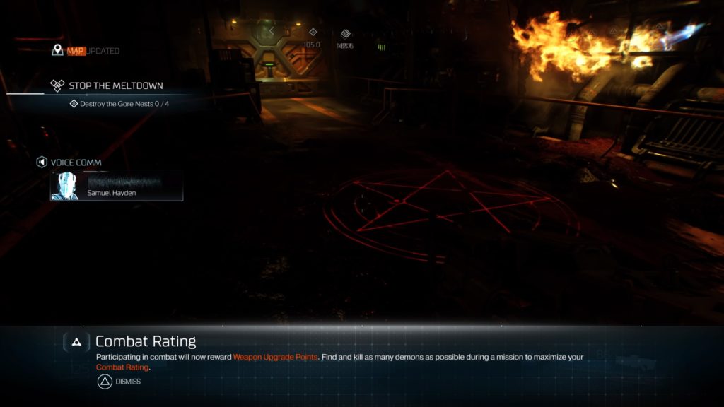
Lastly, an issue encountered was the simultaneous presentation of vital information, which included verbal narration progressing the story and tutorial text information. Although this only happened once to my recollection, this issue makes the player’s verbal and auditory channels compete for attention, likely resulting in him/her missing some of the information trying to be conveyed. The screenshot below demonstrates this scenario, with the verbal narration from Samuel Hayden under “Voice Comm” and the “Combat Rating” on the bottom of the screen.
Recommendation: The verbal narration is essential information here in order to progress the story, whereas the combat rating tutorial is not vital at that precise moment because it is describing, generally, how combat results in points to upgrade weapons. This issue could be resolved by simply changing the timing of the combat rating information to a time when the player’s attentional resources aren’t currently under load due to other stimuli.
Final thoughts
DOOM is an unrelenting, adrenaline-pumping, demon-slaying, rush. Aside from the tight gameplay mechanics, the inclusion of design features such as specific visual cues on reticles for modded weapons allow the player to exert more resources toward slaying demons and surviving when the action is dialed to 11, rather than worrying about ammo running low and having to slow the action and pull up the weapon wheel, for example.
In the downtime between demon onslaughts, DOOM remains fun in part due to these usability features. The surprising amount of exploration and vertical traversal are aided by slick visual cues that aid navigation in multiple ways. Informational pop ups during this time let the player know he/she can take a moment to breathe, upgrade themselves, and prepare to, once again, fight like hell.