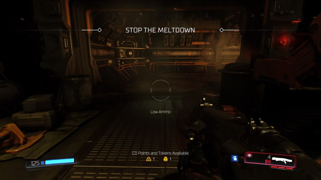
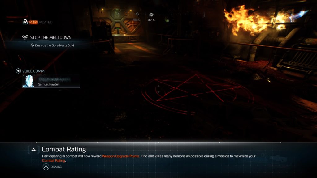
Historically, some video games have taken colorblind accessibility into account, whereas others have not been as accessible to such color-vision deficiencies. Some upcoming games have been publicizing the inclusion of colorblind accessibility and how the developers plan to implement it. However, including these features is one matter, but ensuring these games are truly accessible to colorblind gamers is another. This post will review a few common approaches to colorblind accessibility in some games over the past few years, as well as plans for a couple of upcoming games. Ultimately, we will see where games succeeded, failed, and how this can inform the future of colorblind accessibility implementation in video games.
Types of colorblindness
Before we proceed to reviewing games, let’s briefly review the three most common types of colorblindness:
Protanopia – unable to perceive red light, resulting in red and greens looking murky, and blues and yellows standing out
Deuteranopia – unable to perceive green light, resulting in red and greens looking murky, and blues and yellows stand out
Tritanopia – unable to perceive blue light, resulting in greens looking murky, and reds appear pink
Approaches to colorblind accessibility in games
Filters
Perhaps the most common way of implementing colorblind accessibility in games is including modes for the different types of colorblindness via a whole-screen filter. This is meant to target the problem colors for colorblind people; however, these filters tend to oversaturate the entire color palette, resulting in some undesirable colors. Here are some examples:
Call of Duty: Advanced Warfare
Historically, Call of Duty games would only provide a colorblind assist mode that would change colors on the mini map and HUD above players. However, more recently, COD has added a full-on colorblind mode that not only filters colors on the mini map and HUD, but also colors throughout the map.
On some maps in Call of Duty: Advanced Warfare, it is not obvious that there is a filter applied. Below is a screenshot comparison of colorblind mode enabled (left) and normal color mode (right). Overall, the color palette seems unchanged; there is some slight, subtle discoloration with certain aspects of the map. The most noticeable difference, perhaps, is the color of the stairs through the scope of the gun, which appears more purple with colorblind mode enabled (left).

Call of Duty: Ghosts
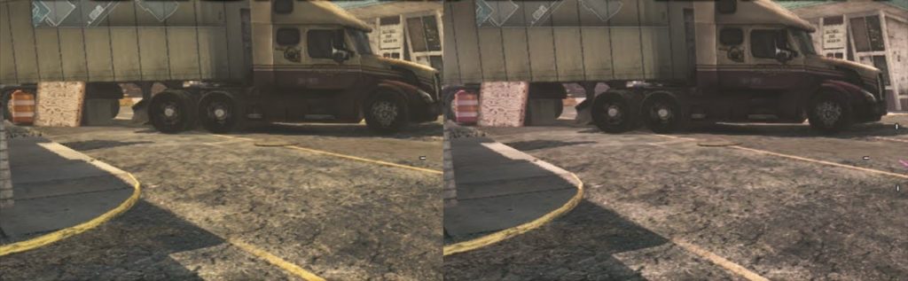
However, on other maps in the series, there are clear differences. As can be seen below, there are very noticeable differences in color when colorblind mode is disabled (left) vs enabled (right). Note the browns/reds turned purplish when colorblind mode is enabled. Because reds mesh too much with greens, it would be harder to play some of the maps in the game. So, colorblind mode adds a tinge of reddish bright pink to help players differentiate between the two; this comes off as unnatural, even to those with colorblindness.
DOOM
DOOM applies the same type of whole-screen filter for its colorblind modes.
Protanopia mode
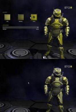
Deuteranopia mode
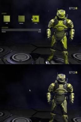
Tritanopia mode
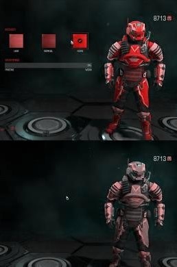
In all three colorblind modes, you can notice how the top images are very similar to the bottom images. The filter is making the image appear as if you’re colorblind instead of altering problem colors to make it easier to see for those who have colorblindness.
Here is a gameplay screenshot (the top is colorblind mode disabled and the bottom is deuteranopia mode):
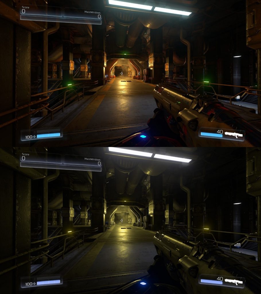
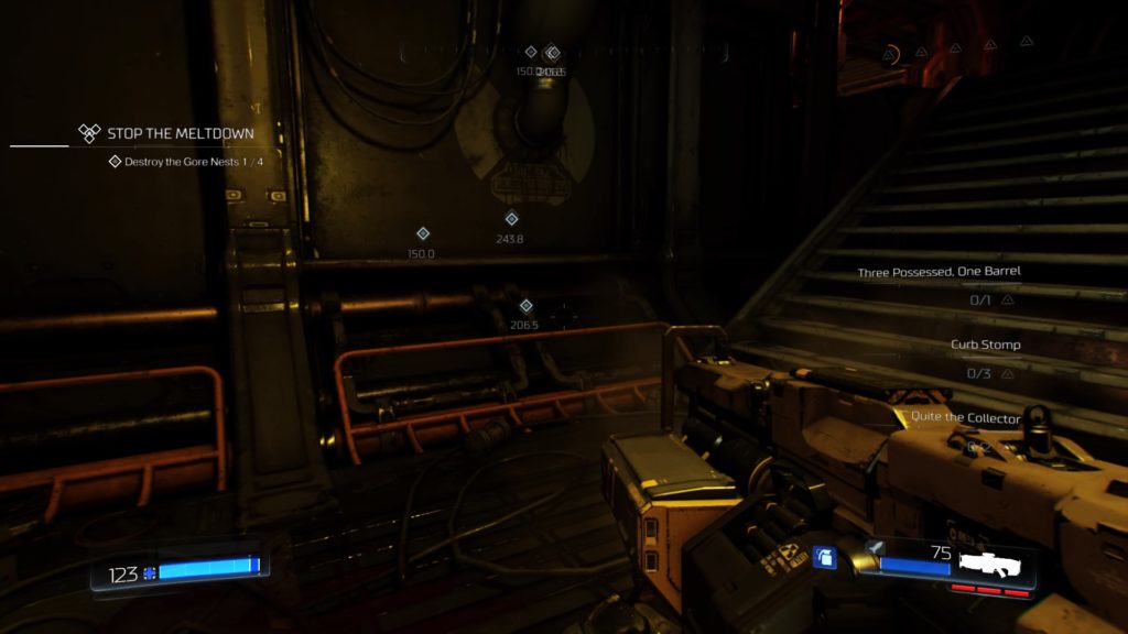
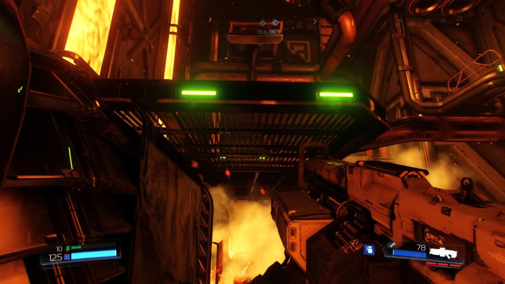
DOOM inherently uses a lot of reds; notice how turning on deuteranopia mode drowns all of these out, which essentially makes all the colors bland and muted (even those that aren’t an issue to those with colorblindness).
Overwatch
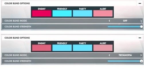
Below is normal color mode in Overwatch, where all vital information is represented by colors that can be easily differentiated. When tritanopia mode is activated, you can see that this filter makes the “friendly” and “party” colors and “enemy” and “alert” appear nearly identical. Even though there is an option to toggle the strength of the mode, this just results in differences in brightness/blandness, not contrast.
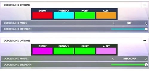
The next screenshot is an example of how normal color mode looks to someone with tritanopia, where “friendly/party” look nearly identical and “enemy/alert” are fairly similar in color as well. However, once tritanopia mode is activated, the issue actually worsens. “Friendly/party” remains nearly identical and “enemy/alert” become even more indistinguishable.
Madden 17
Although not released yet, EA Sports has released information about accessibility options in their upcoming yearly title, Madden 17. EA Sports will be including colorblind modes, similar to the ones previously discussed here, which will include whole-screen filters. More information and screenshots of this feature can be seen on EA Sports’ official site. However, being that Madden 17 is adopting a method that many games have implemented poorly, it remains to be seen if the proposed filters will be implemented in such a way that doesn’t result in other, non-problematic, colors on the screen looking unnatural.
Customizable colors for vital information
Another way to implement colorblind accessibility in video games is to include preset or customizable color combinations, based on types of colorblindness, for representing different types of vital information in the game. This method tends to receive more favorable feedback from those with colorblindness since it only induces changes in colors that are problematic, without altering the rest of the game’s color palette.
Battlefield 4
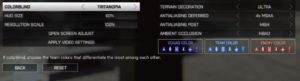
Battlefield 4 changes the colors of specific essential visual indicators, such as the color of UI elements related to the player’s squad, team, and enemy. Additionally, as many people do not know their classification of colorblindness, the game instructs players: “If colorblind, choose the team colors that differentiate the most among each other.” Unlike whole-screen filters, this approach does not affect other colors on the screen that are not affected by colorblindness, resulting in a more natural experience for those with colorblindness.
Normal color mode: Squad: light green, Team: light blue, Enemy: orange
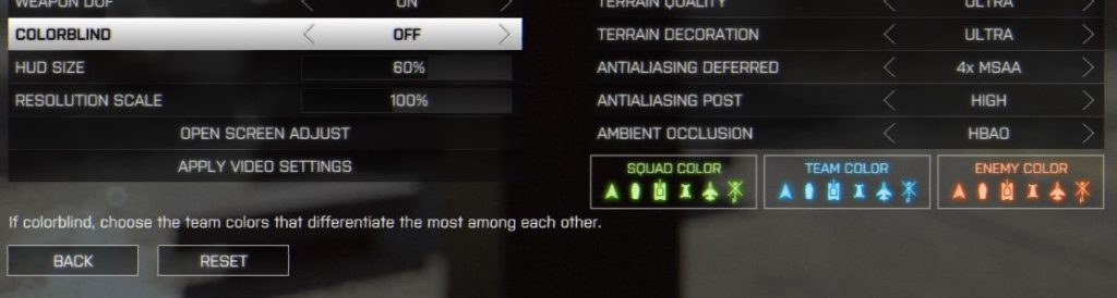
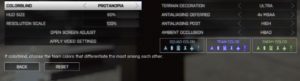
Protanopia mode: Squad: gray, Team: purple, Enemy: green
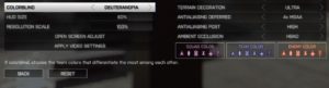
Deuteranopia mode: Squad: purple, Team: indigo, Enemy: orange
Tritanopia mode: Squad: purple, Team: blue, Enemy: orange
Destiny
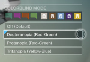
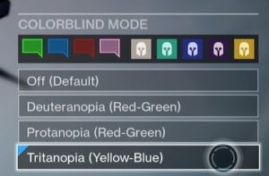
Similar to Battlefield 4, Destiny offers preset color palettes for these three types of colorblindness. Below are two examples:
Deuteranopia mode
Tritanopia mode
Battleborn
Battleborn includes a feature called “Color-Coded Teams,” where players can choose the colors for essential information, such as each team’s heroes, health bars, and competitive objects. This is different from preset colorblind modes like Battlefield 4 and Destiny because there is more customization permitted. This is an especially-important inclusion for a game like Battleborn because of its naturally-vibrant color palette and chaotic gameplay.
Incorporating iconography as supplementary conveyance
Perhaps the best approach to colorblind accessibility is including iconography as a form of supplementary conveyance. While it is always best practice to convey (vital) information via multiple methods (e.g., the “trifecta” – audio, visual, and textual conveyance), it is not always plausible. It is imperative that vital game information not be conveyed solely by color, as it could negatively impact the experience of a player who struggles to see the specific color.
Grand Theft Auto 5
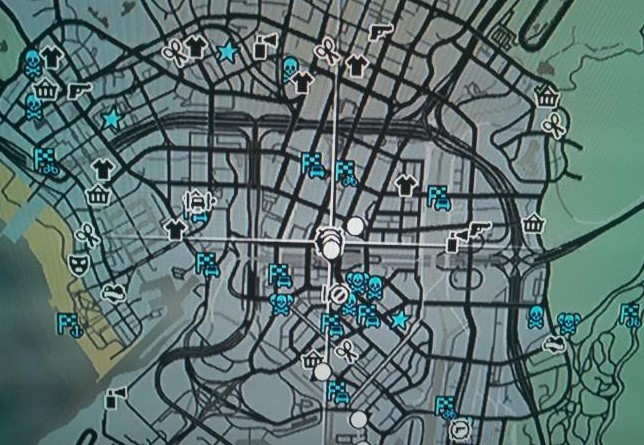
Grand Theft Auto 5, as well as many of the games in the GTA series (and other open-world games), include icons as a form of conveyance. Although there is color assigned to specific icons, color alone is not relied upon to understand what they mean.
Hearthstone
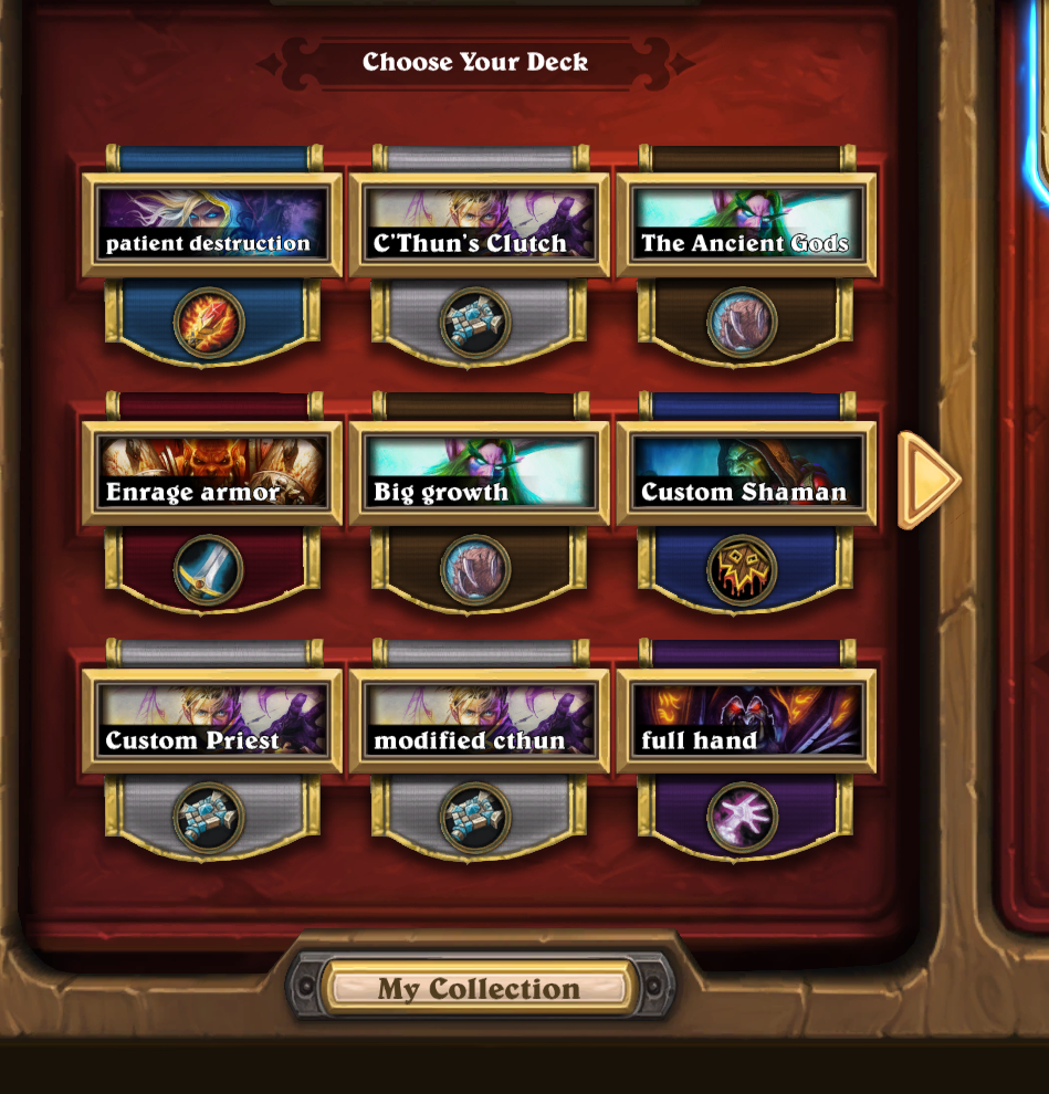
In Hearthstone’s most recent update, some noticeable changes were made to the card collection UI. While it may be possible that these changes are purely aesthetic and were not implemented with usability in mind, there are now colors associated with specific heroes for each of your decks. In addition to these colors, Blizzard also incorporated each hero’s symbol used on the tabs of the card collection UI. Again, including this iconography not only allows the player to make an association between the hero/color/icon, but not rely solely on color as the only source of information.
Recore
Although not released yet, the upcoming game from Armature Studio, Recore, will implement an “innovative icon-based” approach to colorblind accessibility. Specifics about this system have not been released, so little is known and it remains to be seen how effective its implementation will be. More on this system can be found at numerous outlets, such as SegmentNext and Polygon.
Conclusion
- Whole screen filters are, typically, not the best approach to colorblind accessibility.
- Colorblind people see a limited range of colors.
- Compressing the entire color palette pushes hues away from the problematic areas and bunches them closely up against other hues, swapping color clashes for other color clashes.
- Changing all of the colors that are distinguishable to those with colorblindness makes the game look bizarre and unnatural.
- Do not alter that which does not need to be altered.
- Help the player distinguish between vital information necessary to play the game.
- A player should not experience colors in games differently than they perceive them naturally in the world.
- Colorblind people see a limited range of colors.
- Ideally, provide the option to let players select and customize colors for vital information.
- These can be applied to outlines, health bars, icons, names, object indicators, etc.
- “One size does not fit all”
- There are varying degrees of colorblindness, so customization can offer a personal and, ultimately, more optimal experience.
- Avoid relying on color alone (by adding symbols, text, varying enemy design, etc.).
- If not possible, include a simple color palette that can be used as a single-color choice that is not problematic for those with colorblindness (e.g., dark orange/light blue).
- If neither of these are possible, a brief review of the game aspects that absolutely need to be differentiated in order to successfully play the game (e.g., teammates vs. enemies) can be done to decide if specific UI/gameplay elements can be modified.
Final thoughts
For some developers, colorblind accessibility is incorporated into the development of a game from the beginning whereas, for others, it may be an afterthought or complete oversight, accidental or not. The latter is understandable for many reasons: a lack of budgeting allocated to such resources, timing crunch, lack of flexible toolkit for designers, etc. If usability research is incorporated into the development schedule from the beginning, feedback on colorblind features (or lack thereof) can be noticed/iterated/implemented/tested before it is too late to include such accessibility.
The important question is, how will future games approach colorblind options in games? Will developers revisit previously-unsuccessful methods, as Madden 17 seems poised to do, learn which games have been successfully lauded by colorblind players, like Battlefield 4, or be proactive in implementing innovative systems that allow full accessibility for colorblind players, à la Recore?