The relationship between game sales, marketing and usability budgets

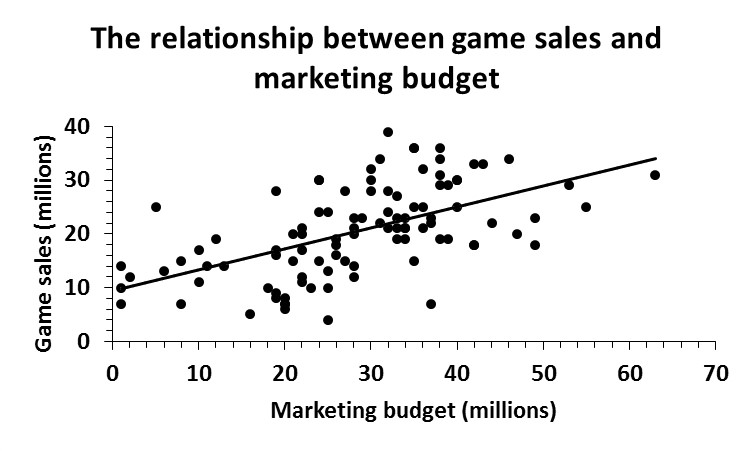
Company X wanted to predict how certain variables affect how many copies of their game sell. They believed a specific, single, variable would be the strongest predictor of game sales, so they compiled data related to the marketing budget for their last 100 games (yeah, they’ve been busy) and calculated a simple linear regression to predict the number of game sales (in millions) based on budget allotted to marketing (in millions).

linear regression marketing game sales

A significant regression was found F(1, 98) =  46.662, = .000, with an R² of .323, which tells us that marketing budget can account for about 32% of the variation in game sales, meaning that their model cannot explain 68% of the variation, which is explained by other variables. The following equation can be derived from the analysis: the predicted amount of game sales is equal to 9.342 + .391 (marketing budget) million when the marketing budget is measured in millions. Average game sales increased .391 million for each million allotted to the marketing budget. Additionally, as seen in the graph above, there was a strong, positive correlation (= .568) between marketing budget and game sales, indicating that, on average, the more Company X spent on funding marketing for their games, the more copies were sold.

While Company X was pleased to see that putting money into marketing their games had a positive relationship with game sales, they were interested in incorporating another variable into their model in an attempt to explain more than the 32% of variability in game sales. Therefore, they added the budget allotted to usability testing for each of the 100 games and, theoretically, thought that the amount of money allotted to usability testing, which provided a better overall user experience, might impact how many copies were ultimately sold.

game sales and usability

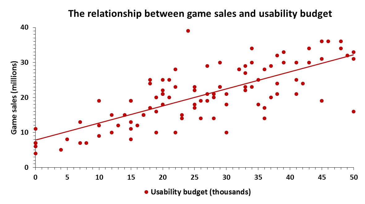
A significant multiple regression was found F(1, 98) =  90.465, = .000, with an R² of .651, which tells us that, together, marketing and usability budgets can account for about 65% of the variance in game sales, meaning that adding the usability budgets to the model explained about 33% (R² change = .328) more of the variability in game sales. Therefore, the predicted amount of game sales is equal to 4.382 + .194 (marketing) + .408 (usability), where marketing is measured in millions and usability is measured in thousands. Game sales increased .194 million for each million spent on marketing and .408 million for each thousand spent on usability testing. Additionally, as seen in the graph above, there was a strong, positive correlation (= .767) between usability budget and game sales, indicating that, on average, the more Company X spent on funding usability testing for their games, the more copies were sold.

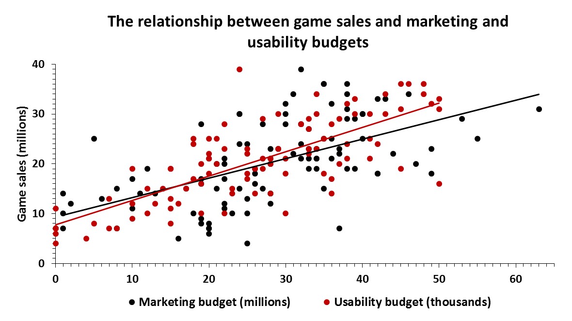
Both marketing budget (= .000) and usability budget (p = .000) were significant predictors of game sales. Importantly, the adjusted  (.644) was very similar to that of the model, indicating that, if the model were derived from the population rather than this sample, it would account for approximately .7% less variance in game sales. For comparison, below, you can see a combination of the previous two graphs with trendlines for each predictor.

game sales marketing and usability

Conclusion

It is important to keep in mind that these are mock analyses and the data is purposely fabricated to show specific results. Additionally, there are multiple ways of conducting multiple regression analyses, and one important manipulation is how predictors are entered into the model, which can greatly affect the outcome. Here, Company X began by conducting a simple linear regression to investigate the relationship between game sales and marketing budget. Although it was a significant predictor of game sales, the marketing budget of their games only explained about 32% of the variance in game sales. So, they added another predictor variable they thought might have a positive relationship with game sales, usability budget, and found that, when combined with marketing budgets, usability budgets explained 65% of the variance in game sales. This is a much better explanation of the variance compared to the 32% explained solely by marketing budgets. Therefore, while Company X realizes the importance of marketing their games, they now know there is a significant, positive, relationship between how much of their budget is allotted to usability testing and will continue these practices with future games in hopes of continuing their impressive sales record.


Tom Clancy’s The Division

The Division is a game that needs no introduction considering how popular it is and how many sales records it has broken. It seems like just yesterday that I was picking my jaw up off the ground following Ubisoft’s gameplay reveal at E3 2013 . Seeing the agent avoid the bullet-stricken NYPD car window and close the car door on his way to safer cover was just one of those “wow” moments. Played on PC (with a controller), here are my thoughts on usability and the overall experience:

Usability:

 A-B-C, easy as 1-2-3? 

Many games (e.g. Gears of War) have used a very similar third-person-shooter cover system to the one utilized in The Division. Typically, “A” is used to get into cover, as well as to move around and over. In The Division, using the reticle, the player can look where he wants to run into cover and “A” can be seen popping onto the screen for every spot the player can use. As a game with a lot going on on the screen at any one time, both UI- and notification-wise, the “A” popping up everywhere can easily misdirect the player’s attention elsewhere on the screen, perhaps thinking it is loot or that a mission-oriented task needs to be performed. Thankfully, this feature can be disabled in the settings menu.

The main difference in this cover system compared to other third-person shooter cover mechanics is that, to go over an object or climb up/down something, “B” is used. See the screenshot below.

Tom Clancy's The Division™2016-3-9-18-45-19

However, there are some inconsistencies with this system, primarily with dropping down from something. Sometimes, pressing B is required to drop down, whereas other times simply moving your character in the direction you want to drop suffices. It is never made clear when to press B versus not other than “B” appearing on the screen. If you’re high enough, there is an indicator along with the B that notifies you that you’ll lose some health from the fall. Is the necessity to press B versus not dependent on height? Unclear.

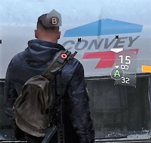
Tom Clancy's The Division™2016-3-9-18-48-14 (2016_03_10 00_35_34 UTC)

Another inconsistency with this system can be seen in the screenshot above. Additional arrow indicators can send mixed signals to players, which could lead to some confusion. It is pretty clear that the B here informs the player how to climb to the top of the truck; however, does the A indicate that the player can take cover against the window or drop down from the truck? This is a system that took a few minutes to practice, since it essentially complicated an already established simplistic system of using one button to perform multiple cover- and traversal-related actions. While it’s possible that Ubisoft implemented this to appeal to an audience that doesn’t have a lot of experience with third-person cover systems, the constant visual cues makes the player wonder if a “less is more” approach would have been more beneficial here. Again, once the subtleties of this system are controlled, it can be helpful to to turn the cues off.

Poorly-timed explanations or just none at all

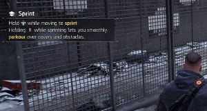
As mentioned, The Division can have a lot happening on the screen at any given moment and, although there is a fairly lengthy prologue that covers the majority of the tutorials and essential info, there are explanations for some aspects of the game that are either awkwardly timed or nonexistent. There are numerous occasions where an informative pop up was presented on screen, either explaining a basic gameplay mechanic or feature. For example, after completing the prologue Precinct Siege mission (and sprinting a multitude of times throughout), the player is informed how to make his agent sprint. Another example came after the second story mission where the player is tasked with rescuing Dr. Kandel; here, your agent’s primary attributes (i.e., stamina, firearms, and electronics) were explained. Knowledge of these attributes is essential to proper character building and presenting its tutorial at an ill-advised time does not provide it the attention it needs; players might deem it immediately irrelevant to them and quickly dismiss it.

Tom Clancy's The Division™2016-3-9-20-26-46
But didn’t I just run through that whole mission?

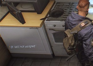
While awkwardly-timed tutorials can throw a wrench in the experience, not explaining important features can be far worse. One feature that is never fully explained are your agent’s skills, which are a very important aspect of gameplay, primarily how they compliment each other and are especially important later in the game against stronger enemies. The first indicator of skills is a notification that the player has a skill that is not assigned. However, there was no explanation of what these skills are, how they’re unlocked/achieved, or how to assign them.

Tom Clancy's The Division™2016-3-9-19-20-55

Other features that were never explained include emotes and status effects. What is the point of emotes, why use them, and HOW are they used? Down on the d-pad is designated to numerous emotes, all of which can serve different purposes, such as helping communicate with team members or getting your agent some exercise (as if running around NYC wasn’t enough). There are visual indicators for status effects (i.e., bleed, burn, disoriented, blind-deaf, shock, and disrupt), however, their actual effect on gameplay is never clarified.

Missing loot

Briefly, the loot system is categorized into five different rarities: worn (white), standard (green), specialized (blue), superior (purple), and high-end (yellow). Loot dropped by enemies is signified by a sky-high beacon the color of the item’s rarity. However, being that the main ambiance of The Division is a snowy/smoky, post-apocalyptic NYC, it can be incredibly difficult to notice worn items, which include ammo, med kits, and some weapons to name a few, against the daytime and snowy sky. This issue is non-existent with the other rarities, simply because the contrast is much greater between those colors and the game environment.

Tom Clancy's The Division™2016-3-19-8-58-44
Transparent white beacons can be hard to see.

Appeals/opinions

Features that enhance the experience

While The Division has some usability issues, it also contains some subtle features that help streamline tasks, such as navigating the menu, and improve the overall experience. One such feature is that, when visiting vendors, the game doesn’t give you the option to (accidentally) sell equipped guns/gear. With what seems to be a never-ending backpack full of loot, it is quite useful to not have to memorize everything you have equipped in order to not accidentally sell it. Anyone who has ever played an RPG has experienced that immediate sense of regret (quickly, reload last save!). Additionally, while navigating the world, the option to override the current object with a quest that is close in proximity by simply holding X is a nice way to change objectives on the fly and allows for better real-time “city randomness.”

Immersion – “open-world” as an umbrella term

As a huge fan of open-world RPGs, once the tutorial/prologue is completed and I’m unleashed into the open world, my first matter of business is randomly exploring in order to further immerse myself in the game world and experience this “randomness.” However, during my exploration of the first Manhattan district, there was an underwhelming amount of random loot and not nearly as much as one would expect from an “open-world” game. Additionally, sick citizens, requesting aid in the form of a med kit or can of soda, and groups of enemies were encountered. The sick citizens would drop loot, almost always in the form of clothing or a worn gun, whereas we can all deduce how the encounters with enemies concluded. Upon exploration of subsequent districts, it was the same scenario – a lack of random loot, some sick citizens and groups of enemies. This, for lack of a better word, “static” environment, filled with what seemed to be copy and pasted “random” events made NYC seem lifeless. I’m aware that this is post-apocalyptic NYC, and perhaps game series like Elder Scrolls, Fallout, and The Witcher have set the bar too high, or in a different direction altogether, but this hindered immersion. Even post-apocalyptic NYC would, arguably, have more life than most places pre-apocalypse. No curiosity or sense of wonder is induced by the world of The Division because what was around the next corner and “random” events were all completely predictable and, ultimately, curiosity was never rewarded.

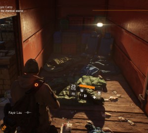
Lastly, let’s address the elephant in the room – graphically, it’s a beautiful game. While it might not have met the unworldly expectations set for itself during E3 2013 reveal, it has some of the best lighting and snow effects I have ever seen in a game. NYC looks great and, graphically, it is definitely a sight to see.

Tom Clancy's The Division™2016-3-10-21-12-50
Them light effects!

Final thoughts

I’m currently level 22 and have enjoyed the majority of my time with The Division. It is a game that does some things nicely, such as its RPG elements and shooting/combat mechanics. However, it is difficult to describe it as anything more than a blend of mechanics from older games of different genres and, unfortunately, these games typically execute said mechanics in a superior fashion. The Division, simply put, seems like an overly-ambitious game that spread itself too thin in order to appeal to a broad audience. You can’t revolutionize something without evolving an existing thing, which is where The Division ultimately falls short of its potential.

Mock data analysis with CEGE model

The Core Elements of the Gaming Experience (CEGE) is a comprehensive model that consists of different factors that, together, form the experience between a video game and its user.  The two main umbrella variables associated with the model are Video-Game and Puppetry. Video-Game is simply the game itself, which is broken into the latent (subjective/not measurable) variables of Evironment and Game-play. These latent variables are inferred and are categorized under observable variables; Environment includes graphics and sounds of the game, whereas Gameplay includes the scenario and rules of the game.

Puppetry is the interaction of the player with the video game and is comprised of three main, latent variables: Control, Ownership, and Facilitators. Control is simply “taking control” of the game by learning how to use and manipulate things within it and is comprised of three observable factors: small actions (basic actions the player can do in the game), goal (main objective of the game), and something-to-do (the player needs to feel that there is always something to do in the game). Ownership is when the player takes his action in the game as his own and is ultimately rewarded by the game for them. Ownership is comprised of four observable factors: big actions (strategies used by the player, comprised of many small actions), you-but-not-you (player can take part in actions that he would not necessarily do in real life), personal goals (something not important to winning the game but an action completed for a personal reason), and reward (the game needs to provide the player with rewards). Lastly, Facilitators are external factors that can affect the interaction process between a video game and user and is comprised of three observable factors: aesthetics (how the game looks to the player), time (the time the player is willing to dedicate to the game), and previous experience (previous experiences of the player can affect how long he is willing to play and actions he will take in the game). Ultimately, the observable variables get lumped into the umbrella variables (e.g., gameplay and environment) and, when these umbrella variables of Video-game and Puppetry are met, the ultimate player experience/enjoyment is achieved.

The CEGE model has been operationalized and made into a standardized 38-question questionnaire that touches upon all of the previously discussed factors. Each question is rated on a 1-7 Likert scale (1 = completely false, 7 = completely true for this demonstration). Here two examples from the questionnaire:

25. I knew how to manipulate the game to move forward (puppetry – control/ownership)

26. The graphics were appropriate for the type of game (video-game – environment)

With the CEGE model now briefly explained, we will look at a mock data set utilizing it. For the sake of this analysis, we will pretend that Company X is interested in testing the user experience of one of its games during multiple stages of development. Right from the beginning of the conceptual stage, they have planned to utilize the CEGE model to test during prototyping as well as both the alpha and beta stages of production. Company X will also implement other forms of usability testing that will help them incorporate necessary changes to the game during these development phases. They are hypothesizing that average CEGE scores will increase with each phase because they will be able to address player’s feedback from other usability tests in between stages before testing again. For this study, they recruited a total of 33 participants, 20 males and 13 females (average age of 18.606 years), and 11 different participants were tested during each stage. To test whether there was a change in CEGE scores over time, they used a one-way between-subjects ANOVA. The alpha level was .05 two-tailed. Here is what they found:

Results

Overall CEGE score 
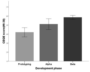
cege scores

The one-way between-subjects ANOVA revealed a significant effect of development phase on overall CEGE score, F(2, 30) = 12.303, p = .000, indicating that, on average, there were differences in CEGE scores during the testing phases. Post hoc comparisons using the Tukey HSD test indicated that the mean CEGE score for the prototyping phase (M = 4.203, SD = 8.502) was lower than the mean CEGE score during both alpha (M = 5.104, SD = .987; p = .030) and beta (M = 5.856, SD = .371; p = .000) phases; however, while CEGE scores during the alpha phase were lower than those during the beta phase, the difference only trended toward significance (p = .078). Taken together, these results indicate that CEGE scores did indeed improve with each successive testing phase, suggesting that Company X addressed issues encountered by players during earlier testing phases, ultimately producing better experiences.

  Enjoyment
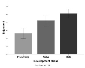
enjoyment

The pattern of results for Enjoyment scores is similar to that of the CEGE scores. There was a significant effect of development phase on Enjoyment scores, F(2, 30) = 16.240, p = .000, indicating that, on average, there were differences in scores on questions related to Enjoyment during the testing phases. Post hoc comparisons indicated that the mean Enjoyment score for the prototyping phase (M = 3.605, SD = 1.073) was lower than the mean Enjoyment score during both alpha (M = 5.211, SD = .1.118; p = .003) and beta (M = 6.090, SD = .9078; p = .000). However, Enjoyment scores during the alpha phase were not significantly lower than those during the beta phase (p = .133). Together, this suggests that changes made to the game following testing during prototyping had a positive effect on enjoyment scores; however Company X did not see that same improvement between alpha and beta testing.

Frustration
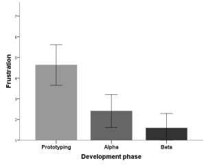
frustration

The opposite pattern of results was true for Frustration scores. There was a significant effect of development phase on Frustration scores, F(2, 30) = 14.291, p = .000, indicating that, on average, Frustration scores differed during the different testing phases. Post hoc comparisons indicated that the mean Frustration score for the prototyping phase (M = 4.636, SD = 1.629) was higher than the mean Frustration score during both alpha (M = 2.409, SD = 1.319; p = .002) and beta (M = 1.590, SD = .1.157; p = .000). However, Frustration scores during the alpha phase were not significantly higher than those during the beta phase (p = .360). Taken together, this suggests that changes made to the game following testing during prototyping made the game significantly less frustrating to players; however, the game was not any less frustrating to players following changes made between alpha and beta phases.

Puppetry (ownership)
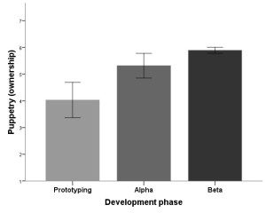
puppetry ownership

While there were no significant differences in Puppetry (control) scores between the three development phases, there was a significant effect of development phase on Puppetry (ownership) scores, F(2, 30) = 16.366, p = .000, indicating that, on average, there were differences in scores on questions related to Ownership during the testing phases. Post hoc comparisons indicated that the mean Ownership score for the prototyping phase (M = 4.029, SD = 1.100) was lower than the mean Ownership score during both alpha (M = 5.317, SD = .769; p = .002) and beta (M = 5.893, SD = .186; p = .000). However, Ownership scores during the alpha phase were not significantly lower than those during the beta phase (p = .212). Altogether, this indicates that changes made to the game following testing during prototyping had a positive effect on the players’ feeling of ownership of the game; however players’ feelings of ownership did not improve between alpha and beta testing.

Puppetry (control/ownership)
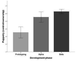
puppetry conrol ownership

Additionally, there was a significant effect of development phase on Puppetry (control/ownership) scores, F(2, 30) = 22.209, p = .000, indicating that, on average, there were differences in scores on questions related to Control/Ownership during the testing phases. Post hoc comparisons indicated that the mean Control/Ownership score for the prototyping phase (M = 3.545, SD = 1.213) was lower than the mean Control/Ownership score during both alpha (M = 5.545, SD = .1.128; p = .000) and beta (M = 6.272, SD = .467; p = .000). However, Control/Ownership scores during the alpha phase were not significantly lower than those during the beta phase (p = .216). Taken together, these results suggest that changes made to the game following testing during prototyping improved scores related to the players’ feelings of control and ownership of the game; however there was no change from alpha to beta phases.

Video-game (gameplay)
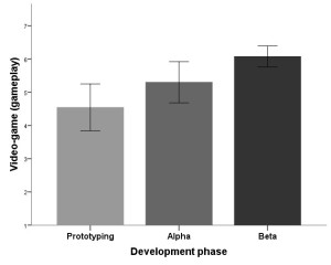
videogame gameplay

Although there were no differences between the three development phases on Video-game (environment) scores, there was a significant effect of development phase on Video-game (gameplay) scores, F(2, 30) = 7.165, p = .003, indicating that, on average, there were differences in scores on questions related to gameplay during the testing phases. Post hoc comparisons indicated that the mean gameplay score for the prototyping phase (M = 4.545, SD = 1.166) did not significantly differ from the gameplay score during alpha (M = 5.302, SD = 1.027; p = .164) testing; however, gameplay scores during prototyping were significantly lower than those during the beta (M = 6.075, SD = .529; p = .002) phase. Furthermore, gameplay scores were not significantly different between the alpha and beta phases (p = .153). Altogether, these results indicate that gameplay scores improved from prototyping to beta testing; however, there were no improvements in gameplay scores from prototyping to alpha and alpha to beta testing phases, suggesting that Company X had to wait until after beta testing to see significant increases in gameplay scores due to their changes throughout the development phases.

Discussion

Using the CEGE model and questionnaire, Company X was able to objectively reveal important information on factors related to different aspects of players’ experiences, such as video-game environment and gameplay, enjoyment, frustration, control, and ownership when playing their game. When combined with other forms of usability testing throughout the development process, the CEGE model can offer invaluable insights into how the usability changes implemented by Company X have ultimately affected player experience.

In the current study, some obvious patterns of results emerged from the data. Primarily, overall CEGE scores, which take into account questions 6-38 on the questionnaire, improved with each testing phase. This is an important finding because it encompasses many of the factors that influence player experience and, broadly, shows Company X that the changes they have made to their game, based on other usability tests, have improved overall player experience.

A secondary pattern that emerged was the improvement of scores from prototyping to alpha phase; however, there were no significant improvements in these scores between alpha and beta phases. Although the graphs show increases in the scores, and decreases when considering Frustration, from alpha to beta testing, these differences were not significant due to the variability in the data. This was true of all the other factors where there were differences between prototyping and alpha, including Enjoyment, Frustration, Puppetry (ownership, control/ownership), and Video-game gameplay. Overall, this indicates that changes implemented by Company X between prototyping and alpha produced improvements in these areas of player experience; however, changes made between alpha and beta did not result in improvements in enjoyment, frustration, ownership, control/ownership, and gameplay. This is likely less important to Company X because smaller-scale/less significant changes were likely made between alpha and beta, compared to prototyping and alpha phases. Importantly, players enjoyed the game significantly more from the initial testing (prototyping) to final testing (beta), which was the ultimate goal of Company X. Additionally, the frustration levels of players decreased between these phases, indicating that the changes implemented were positive in terms of player experience. Furthermore, players had an increased sense of ownership and control/ownership between prototyping and beta phases, suggesting that changes made by Company X allowed the players to feel like they were in better control of the game by having a better understanding of the basic controls, main goals, and always feeling that there was something to do. Similarly, players had an improved sense ownership, which included incorporating more strategy into their gaming, as well as completing actions based on personal goals and actions they would not perform in real life. This caused players to seek rewards for their actions in the game, ultimately allowing players to take ownership of their in-game actions. Lastly, there were no differences in Video-game environment, likely because Company X did not make any changes to the graphics or sound of the game during these three development phases. However, there were changes from prototyping to beta phase in regards to gameplay, indicating that Company X changed some aspects of the game’s general rules and scenario to cater to participants’ feedback, resulting in a better overall experience.

With this mock data analysis, an example of how a company can objectively measure variables that are related to the player experience using the CEGE model has been demonstrated. Along with other types of usability/user experience testing, this model can provide insightful information related to how a game can be modified in order to provide a better overall player experience.

For a more thorough review of the CEGE model, see Chapter 3 of Game User Experience Evaluation.

Guardians of Orion – some usability issues

Guardians of Orion is an Early Access Steam game where the player controls a class-based Guardian and fights against dinosaurs and robots either alone or in multiplayer modes. Guardians of Orion’s primary issue is its lack of explanation with some UI elements and basic gameplay.

Tutorial?

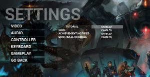
Under the gameplay tab in the settings menu, there is an option to enable/disable the tutorial, which is enabled by default; however, no tutorial is present during either single- or multiplayer modes. Perhaps this is a feature that they are planning to incorporate, but haven’t yet? It seems like something that should be present from the beginning if its absence results in basic usability issues.

407840_2016-03-05_00003.

To control or not to control?

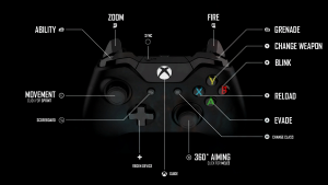
One usability issue in Guardians of Orion is based around how to control the game. Personally, I enjoy using controllers when playing PC games; however, it is not typically my initial guess that a PC game would base its usability on using a controller. This is the case in Guardians of Orion and it is never made obvious to the player, especially at first. Unless, of course, you’re perceptive enough to immediately take the only loading screen in the game as a gameplay hint…

407840_2016-03-05_00001

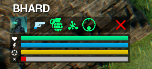
More evidence for design geared toward using a controller is present during actual gameplay. My first playthrough was with a mouse and keyboard and I was unable to figure out some of the controls, including some of the mechanics in the bottom-left-hand pane of the interface:

407840_2016-03-02_00001 (2)

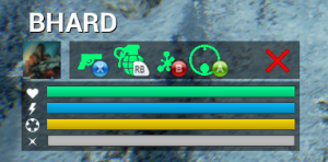
Instead of fumbling through the main menu and attempting to memorize the keyboard controls, I decided to attempt my next playthrough with a controller. Here is the bottom-left-hand pane of the interface when playing with a controller:

407840_2016-03-02_00003 (2)

To say the least, I performed much better during my second go. Nonetheless, the player should not have to fall flat on his face to figure out basic gameplay mechanics and usability. A fix for this would be consistency across controller types – incorporate the respective buttons for keyboard controls in the pane.

Low health-induced change blindness

Like many games, Guardians of Orion makes gameplay increasingly difficult as the player’s health diminishes. At a certain level of health, the glass in the player’s mask begins to break and worsens with diminishing health, resulting in clear cracks and ripples across the screen. Inherently, this is not an issue. However, a couple of the maps in Guardians of Orion (e.g. Goo-Summit and Goo-Whiteout) are full of snow, ice, and mountainous terrain that produces a light blue/whitish screen. Together, these result in a form of change blindness, primarily when the player is traversing/trying to evade enemies and prevent death. There were numerous times where the map terrain was confused for cracks in the player’s mask, which resulted in the player rolling directly into the terrain, immediately stopping movement, and dying instantly.

Final thoughts

Guardians of Orion is a fun game with lots of RPG elements that is even better with more people. Hopefully Trek Industries continues to work on the game; if they do, perhaps I’ll revisit this post in the future with updates! Until next time!