Company X is interested in how other games have incorporated timers into HUD and UI, perhaps to inform the design of an upcoming demo that will let players play for a specific amount of time. How have games conveyed this to players?
This post will examine some examples of how games have handled demo-specific timers, as well as timers in general, to convey this vital information and the advantages/disadvantages of each design. If you do not feel like reading through individual examples, there is a tl;dr version/summary at the end of the post.
Demo-specific timers
Just Cause 2

There is a prompt that appears in the middle of the screen notifying the player that the demo timer has begun, which then starts a countdown in the top-right of the screen before disappearing from the screen entirely. However, throughout the duration of the demo, this pane reappears in the top-right of the screen periodically to remind players how much time they have left.
Advantages:
- Initial presentation in the center of the screen effectively notifies the player that the timer has begun.
- Timer pane in the top-right corner is out of the player’s main gaze and flashes to grab the player’s attention.
- Periodic reappearance of the pane reminds players how much time is left in the demo.
Disadvantages:
- Disappearance of the timer pane results in no constant reference for time left; some players might not like not always knowing how much time is left
Mafia 2

Once the player enters the open-world portion of the demo, a countdown timer appears (in red) in the top-right of the screen.
Advantages:
- Timer does not impede the player’s vision/main gaze, which is likely centered around the avatar
Disadvantages:
- Font is small and a dark color that could clash repeatedly with the environment in a game with a brown/black-heavy color palette
- No indication that the demo timer has started
- Timer being constantly present could make the player feel rushed
Minecraft
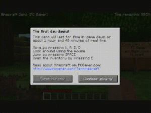
Minecraft provides an overlay notifying the player how long the demo will last. This information is then constantly present in the top-right of the screen.
Advantages:
- Upfront, player knows exactly how long the demo can be played
- If the initial message is skipped without being read, the player has the on-screen timer as a reference
- Basic, legible font and size
Disadvantages:
- Timer being constantly present could make the player feel rushed
Mission-related timers
Here are some examples of how timers are implemented into games for various reasons, such as indicating how much time is left to complete an objective or how much time is left in a match.
Just Cause 3
Just Cause 3 presents mission-objective-related timers in the top center of the screen.
Advantages:
- Basic, legible and large font
- Close to the center of the screen without interfering with other HUD/UI
Disadvantages:
- Could potentially interfere with something in the world since it is so close to the center of the screen and the player’s avatar
Paragon
Constant timer display is common in MOBAs because it is necessary information. Also, MOBAs contain some of the busiest screens in video games when it comes to HUD and UI. Paragon, the new MOBA from Epic, has permanent timer HUD to keep track of the length of the match in the top center of the screen.
Advantages:
- Basic, legible font and size that doesn’t stand out too much, yet is easily seen upon a glance
- Players can use the two white bars as reference points, allowing the timer itself to not be overly large
- Clutter with other HUD and UI elements is avoided since it is isolated at the top of the screen
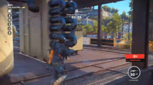
Grand Theft Auto 5
Grand Theft Auto 5 displays timers in the bottom-right of the screen for things like racing missions and timed objectives.
Advantages:
- Basic, legible font and size
Disadvantages:
- Far away from the player’s peripheral vision
- Too close in proximity to other text and timers, which causes the players to stray far from the center of the screen, where their gaze is likely fixated, and might cause the player to mix up the timers
Need for Speed: Rivals
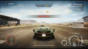
Need for Speed: Rivals displays timer information in the top-right of the screen.
Advantages:
- Basic, legible font and size
- Distanced/distinct enough from objective and target timer HUD to keep player from chunking them together/mixing them up
- The grayish shading prevents the white font from clashing with similar backgrounds, such as the clouds in the GIF above
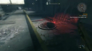
The Division
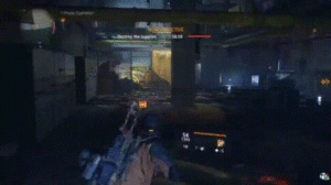
The Division flashes timer UI along with the new objective notification in the center of the screen. It then trails off to its permanent location in the top of the screen. Because it is a countdown, the timer is continuously flashing orange in order to be kept within the player’s attention.
Advantages:
- Initially brought into center of the screen near the player’s main gaze
- Flashing orange is consistent with the rest of The Division’s color scheme and brings the player’s attention to the vital information, which is the time.
- Trails off to its permanent location next to the mini map where it also shrinks in size, not to impede the player’s vision in the center of the screen
- Continues to flash so the player is constantly aware where he/she can go to see how much time is left
- This also encourages a sense of urgency, since it conveys something that needs to be done in a timely fashion.
Disadvantages:
- Once the timer is in its permanent position, the font is a bit small; however, the flashing orange prevents this from being an issue.
DOOM
For timed sections, there is a countdown timer in the top-center of the screen. Additionally, since these missions are based on killing enemies to replenish the timer, there is additional HUD with iconography and a circular countdown around it.
Advantages:
- Basic, legible font and size
- Top-center of the screen is far enough away from the center of the screen, where the player’s gaze is likely fixated, yet close/large enough that is within periphery/quick glance
- Iconography and circular visual timer in the center of the screen within the player’s main gaze, which is large enough to be seen easily, yet doesn’t impede the player’s vision.
- This makes it unlikely that the player would ever need to stray his/her gaze from the center of the screen, which is important in a high-tempo game like DOOM.
Disadvantages:
- Some players might prefer nothing be directly in their main gaze
TMNT: Mutants in Manhattan
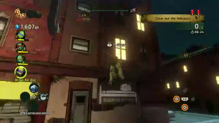
TMNT: Mutants in Manhattan places its mission-related timer near its objective HUD in the top-right of the screen along with relevant iconography.
Advantages:
- Basic, legible font
- Relevant iconography
Disadvantages:
- Player’s attention is never directed to the timer location
- Close in proximity to hideout indicator above it
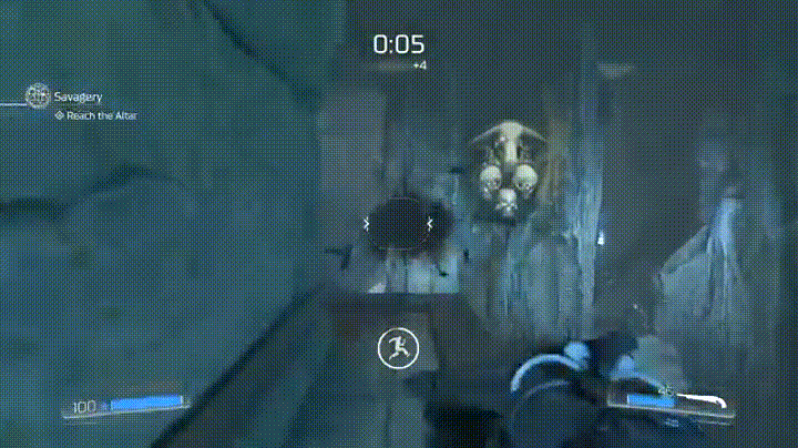
Alienation

Timer HUD appears and pulses in the top-right of the screen.
Advantages:
- Large and legible font
- Pulses as it counts down, which conveys a sense of urgency
- Far enough away from the player’s main gaze, yet large enough to be seen easily from player’s peripheral vision/quick glance
Dying Light
Mission-specific countdown timer with relevant iconography is under the mini map/objective HUD in the top-right of the screen.
Advantages:
- Timer is orange and a different color from other text
- Consistency – timer is located near objective text, which is where the player is used to looking
Disadvantages:
- Font is a bit small and not easily seen upon initial glance
Conclusion
Good practices for timer conveyance:
- Use basic/relevant-to-art-style fonts and legible sizes
- If designing a demo timer, provide clear notification to the player how long he/she has to play, as well as either a constant or periodic reference timer
- Once the timer appears, the player’s attention should initially be directed to it
- If possible, present the timer in the player’s main gaze initially and then transition it to its permanent position
- Include iconography as supplemental conveyance of time when possible
- Timers represent vital information, so make them stand out from other text/UI/HUD
- different colors
- flashing/pulsing
- avoid placing too close in proximity to other text/UI/HUD