Mock data analysis with CEGE model

The Core Elements of the Gaming Experience (CEGE) is a comprehensive model that consists of different factors that, together, form the experience between a video game and its user.  The two main umbrella variables associated with the model are Video-Game and Puppetry. Video-Game is simply the game itself, which is broken into the latent (subjective/not measurable) variables of Evironment and Game-play. These latent variables are inferred and are categorized under observable variables; Environment includes graphics and sounds of the game, whereas Gameplay includes the scenario and rules of the game.

Puppetry is the interaction of the player with the video game and is comprised of three main, latent variables: Control, Ownership, and Facilitators. Control is simply “taking control” of the game by learning how to use and manipulate things within it and is comprised of three observable factors: small actions (basic actions the player can do in the game), goal (main objective of the game), and something-to-do (the player needs to feel that there is always something to do in the game). Ownership is when the player takes his action in the game as his own and is ultimately rewarded by the game for them. Ownership is comprised of four observable factors: big actions (strategies used by the player, comprised of many small actions), you-but-not-you (player can take part in actions that he would not necessarily do in real life), personal goals (something not important to winning the game but an action completed for a personal reason), and reward (the game needs to provide the player with rewards). Lastly, Facilitators are external factors that can affect the interaction process between a video game and user and is comprised of three observable factors: aesthetics (how the game looks to the player), time (the time the player is willing to dedicate to the game), and previous experience (previous experiences of the player can affect how long he is willing to play and actions he will take in the game). Ultimately, the observable variables get lumped into the umbrella variables (e.g., gameplay and environment) and, when these umbrella variables of Video-game and Puppetry are met, the ultimate player experience/enjoyment is achieved.

The CEGE model has been operationalized and made into a standardized 38-question questionnaire that touches upon all of the previously discussed factors. Each question is rated on a 1-7 Likert scale (1 = completely false, 7 = completely true for this demonstration). Here two examples from the questionnaire:

25. I knew how to manipulate the game to move forward (puppetry – control/ownership)

26. The graphics were appropriate for the type of game (video-game – environment)

With the CEGE model now briefly explained, we will look at a mock data set utilizing it. For the sake of this analysis, we will pretend that Company X is interested in testing the user experience of one of its games during multiple stages of development. Right from the beginning of the conceptual stage, they have planned to utilize the CEGE model to test during prototyping as well as both the alpha and beta stages of production. Company X will also implement other forms of usability testing that will help them incorporate necessary changes to the game during these development phases. They are hypothesizing that average CEGE scores will increase with each phase because they will be able to address player’s feedback from other usability tests in between stages before testing again. For this study, they recruited a total of 33 participants, 20 males and 13 females (average age of 18.606 years), and 11 different participants were tested during each stage. To test whether there was a change in CEGE scores over time, they used a one-way between-subjects ANOVA. The alpha level was .05 two-tailed. Here is what they found:

Results

Overall CEGE score 

cege scores

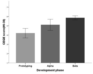
The one-way between-subjects ANOVA revealed a significant effect of development phase on overall CEGE score, F(2, 30) = 12.303, p = .000, indicating that, on average, there were differences in CEGE scores during the testing phases. Post hoc comparisons using the Tukey HSD test indicated that the mean CEGE score for the prototyping phase (M = 4.203, SD = 8.502) was lower than the mean CEGE score during both alpha (M = 5.104, SD = .987; p = .030) and beta (M = 5.856, SD = .371; p = .000) phases; however, while CEGE scores during the alpha phase were lower than those during the beta phase, the difference only trended toward significance (p = .078). Taken together, these results indicate that CEGE scores did indeed improve with each successive testing phase, suggesting that Company X addressed issues encountered by players during earlier testing phases, ultimately producing better experiences.

  Enjoyment

enjoyment

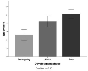
The pattern of results for Enjoyment scores is similar to that of the CEGE scores. There was a significant effect of development phase on Enjoyment scores, F(2, 30) = 16.240, p = .000, indicating that, on average, there were differences in scores on questions related to Enjoyment during the testing phases. Post hoc comparisons indicated that the mean Enjoyment score for the prototyping phase (M = 3.605, SD = 1.073) was lower than the mean Enjoyment score during both alpha (M = 5.211, SD = .1.118; p = .003) and beta (M = 6.090, SD = .9078; p = .000). However, Enjoyment scores during the alpha phase were not significantly lower than those during the beta phase (p = .133). Together, this suggests that changes made to the game following testing during prototyping had a positive effect on enjoyment scores; however Company X did not see that same improvement between alpha and beta testing.

Frustration

frustration

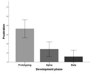
The opposite pattern of results was true for Frustration scores. There was a significant effect of development phase on Frustration scores, F(2, 30) = 14.291, p = .000, indicating that, on average, Frustration scores differed during the different testing phases. Post hoc comparisons indicated that the mean Frustration score for the prototyping phase (M = 4.636, SD = 1.629) was higher than the mean Frustration score during both alpha (M = 2.409, SD = 1.319; p = .002) and beta (M = 1.590, SD = .1.157; p = .000). However, Frustration scores during the alpha phase were not significantly higher than those during the beta phase (p = .360). Taken together, this suggests that changes made to the game following testing during prototyping made the game significantly less frustrating to players; however, the game was not any less frustrating to players following changes made between alpha and beta phases.

Puppetry (ownership)

puppetry ownership

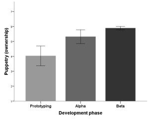
While there were no significant differences in Puppetry (control) scores between the three development phases, there was a significant effect of development phase on Puppetry (ownership) scores, F(2, 30) = 16.366, p = .000, indicating that, on average, there were differences in scores on questions related to Ownership during the testing phases. Post hoc comparisons indicated that the mean Ownership score for the prototyping phase (M = 4.029, SD = 1.100) was lower than the mean Ownership score during both alpha (M = 5.317, SD = .769; p = .002) and beta (M = 5.893, SD = .186; p = .000). However, Ownership scores during the alpha phase were not significantly lower than those during the beta phase (p = .212). Altogether, this indicates that changes made to the game following testing during prototyping had a positive effect on the players’ feeling of ownership of the game; however players’ feelings of ownership did not improve between alpha and beta testing.

Puppetry (control/ownership)

puppetry conrol ownership

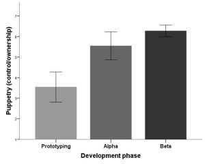
Additionally, there was a significant effect of development phase on Puppetry (control/ownership) scores, F(2, 30) = 22.209, p = .000, indicating that, on average, there were differences in scores on questions related to Control/Ownership during the testing phases. Post hoc comparisons indicated that the mean Control/Ownership score for the prototyping phase (M = 3.545, SD = 1.213) was lower than the mean Control/Ownership score during both alpha (M = 5.545, SD = .1.128; p = .000) and beta (M = 6.272, SD = .467; p = .000). However, Control/Ownership scores during the alpha phase were not significantly lower than those during the beta phase (p = .216). Taken together, these results suggest that changes made to the game following testing during prototyping improved scores related to the players’ feelings of control and ownership of the game; however there was no change from alpha to beta phases.

Video-game (gameplay)

videogame gameplay

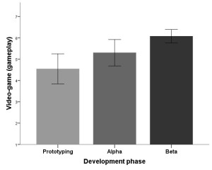
Although there were no differences between the three development phases on Video-game (environment) scores, there was a significant effect of development phase on Video-game (gameplay) scores, F(2, 30) = 7.165, p = .003, indicating that, on average, there were differences in scores on questions related to gameplay during the testing phases. Post hoc comparisons indicated that the mean gameplay score for the prototyping phase (M = 4.545, SD = 1.166) did not significantly differ from the gameplay score during alpha (M = 5.302, SD = 1.027; p = .164) testing; however, gameplay scores during prototyping were significantly lower than those during the beta (M = 6.075, SD = .529; p = .002) phase. Furthermore, gameplay scores were not significantly different between the alpha and beta phases (p = .153). Altogether, these results indicate that gameplay scores improved from prototyping to beta testing; however, there were no improvements in gameplay scores from prototyping to alpha and alpha to beta testing phases, suggesting that Company X had to wait until after beta testing to see significant increases in gameplay scores due to their changes throughout the development phases.

Discussion

Using the CEGE model and questionnaire, Company X was able to objectively reveal important information on factors related to different aspects of players’ experiences, such as video-game environment and gameplay, enjoyment, frustration, control, and ownership when playing their game. When combined with other forms of usability testing throughout the development process, the CEGE model can offer invaluable insights into how the usability changes implemented by Company X have ultimately affected player experience.

In the current study, some obvious patterns of results emerged from the data. Primarily, overall CEGE scores, which take into account questions 6-38 on the questionnaire, improved with each testing phase. This is an important finding because it encompasses many of the factors that influence player experience and, broadly, shows Company X that the changes they have made to their game, based on other usability tests, have improved overall player experience.

A secondary pattern that emerged was the improvement of scores from prototyping to alpha phase; however, there were no significant improvements in these scores between alpha and beta phases. Although the graphs show increases in the scores, and decreases when considering Frustration, from alpha to beta testing, these differences were not significant due to the variability in the data. This was true of all the other factors where there were differences between prototyping and alpha, including Enjoyment, Frustration, Puppetry (ownership, control/ownership), and Video-game gameplay. Overall, this indicates that changes implemented by Company X between prototyping and alpha produced improvements in these areas of player experience; however, changes made between alpha and beta did not result in improvements in enjoyment, frustration, ownership, control/ownership, and gameplay. This is likely less important to Company X because smaller-scale/less significant changes were likely made between alpha and beta, compared to prototyping and alpha phases. Importantly, players enjoyed the game significantly more from the initial testing (prototyping) to final testing (beta), which was the ultimate goal of Company X. Additionally, the frustration levels of players decreased between these phases, indicating that the changes implemented were positive in terms of player experience. Furthermore, players had an increased sense of ownership and control/ownership between prototyping and beta phases, suggesting that changes made by Company X allowed the players to feel like they were in better control of the game by having a better understanding of the basic controls, main goals, and always feeling that there was something to do. Similarly, players had an improved sense ownership, which included incorporating more strategy into their gaming, as well as completing actions based on personal goals and actions they would not perform in real life. This caused players to seek rewards for their actions in the game, ultimately allowing players to take ownership of their in-game actions. Lastly, there were no differences in Video-game environment, likely because Company X did not make any changes to the graphics or sound of the game during these three development phases. However, there were changes from prototyping to beta phase in regards to gameplay, indicating that Company X changed some aspects of the game’s general rules and scenario to cater to participants’ feedback, resulting in a better overall experience.

With this mock data analysis, an example of how a company can objectively measure variables that are related to the player experience using the CEGE model has been demonstrated. Along with other types of usability/user experience testing, this model can provide insightful information related to how a game can be modified in order to provide a better overall player experience.

For a more thorough review of the CEGE model, see Chapter 3 of Game User Experience Evaluation.

Guardians of Orion – some usability issues

Guardians of Orion is an Early Access Steam game where the player controls a class-based Guardian and fights against dinosaurs and robots either alone or in multiplayer modes. Guardians of Orion’s primary issue is its lack of explanation with some UI elements and basic gameplay.

Tutorial?

Under the gameplay tab in the settings menu, there is an option to enable/disable the tutorial, which is enabled by default; however, no tutorial is present during either single- or multiplayer modes. Perhaps this is a feature that they are planning to incorporate, but haven’t yet? It seems like something that should be present from the beginning if its absence results in basic usability issues.

407840_2016-03-05_00003.

To control or not to control?

One usability issue in Guardians of Orion is based around how to control the game. Personally, I enjoy using controllers when playing PC games; however, it is not typically my initial guess that a PC game would base its usability on using a controller. This is the case in Guardians of Orion and it is never made obvious to the player, especially at first. Unless, of course, you’re perceptive enough to immediately take the only loading screen in the game as a gameplay hint…

407840_2016-03-05_00001

More evidence for design geared toward using a controller is present during actual gameplay. My first playthrough was with a mouse and keyboard and I was unable to figure out some of the controls, including some of the mechanics in the bottom-left-hand pane of the interface:

407840_2016-03-02_00001 (2)

Instead of fumbling through the main menu and attempting to memorize the keyboard controls, I decided to attempt my next playthrough with a controller. Here is the bottom-left-hand pane of the interface when playing with a controller:

407840_2016-03-02_00003 (2)

To say the least, I performed much better during my second go. Nonetheless, the player should not have to fall flat on his face to figure out basic gameplay mechanics and usability. A fix for this would be consistency across controller types – incorporate the respective buttons for keyboard controls in the pane.

Low health-induced change blindness

Like many games, Guardians of Orion makes gameplay increasingly difficult as the player’s health diminishes. At a certain level of health, the glass in the player’s mask begins to break and worsens with diminishing health, resulting in clear cracks and ripples across the screen. Inherently, this is not an issue. However, a couple of the maps in Guardians of Orion (e.g. Goo-Summit and Goo-Whiteout) are full of snow, ice, and mountainous terrain that produces a light blue/whitish screen. Together, these result in a form of change blindness, primarily when the player is traversing/trying to evade enemies and prevent death. There were numerous times where the map terrain was confused for cracks in the player’s mask, which resulted in the player rolling directly into the terrain, immediately stopping movement, and dying instantly.

Final thoughts

Guardians of Orion is a fun game with lots of RPG elements that is even better with more people. Hopefully Trek Industries continues to work on the game; if they do, perhaps I’ll revisit this post in the future with updates! Until next time!

Evidence for lack of progression in usability – a Magic: The Gathering example

Recently, I have had a strong urge to revisit Magic: The Gathering. I played almost every day in high school, dabbled in college, and ultimately got sucked into Magic Online in 2009. Since then, however, I gradually parted ways with Magic and was now curious to see where the digital state of Magic currently resides. So, I downloaded Magic Duels from Steam (free to play, released July, 2015) and Magic 2015 for android (free, released July, 2014; however, the PC version is $9.99). Although I have not played the PC version, I included the price for comparison’s sake because the features I will be discussing are similar in both versions.

magic duels   VERSUS   magic 2015

Tutorials/skill quests in Magic Duels

Both games have intuitive and comprehensive tutorials at the beginning, which is entirely understandable because Magic can be an incredibly complex and strategic game.

However, there is one usability issue worth noting in Magic Duels; there are skill quests that arise during certain scenarios during tutorial duels, which present themselves as pop ups in the middle of the duel. There are many different skill quests and each pop up contains information regarding what can be learned by completing it. There is the option to “X” out of the skill quest, indicating that it is optional; however, it is never clarified if the player can resume the duel in progress if the skill quest is pursued. Additionally, it is never stated if the player will have the option to complete the skill quest in the future if the skill quest is not completed at that moment (after some time searching through the menus, the skill quests can indeed be played at any time). With that being said, it took a few moments to weigh all of these possible scenarios when I encountered the first skill quest. Ultimately, I proceeded with the quest and, fortunately, was able to resume the duel in progress. It would have been a much more streamlined process if there was information of this presented prior to this decision being made. On the other hand, there are no such skill quests in Magic 2015, so this issue is avoided altogether.

User interface differences

In addition to some differences in available quests, there are also significant interface differences in Magic Duels and Magic 2015.

Magic Duels offers helpful visual cues, which direct your attention to the relevant portion of the game board at that moment; this is a helpful feature because, as previously mentioned, Magic can get complicated, and is a series seemingly seeking to broaden its reach to new players, as evidenced, primarily, by its user-friendly tutorial system. Examples of these cues include the borders of playable cards being lit up, indicating that they are playable at that specific moment, as well as flashes to avatars when damage is dealt. Also, there is an eye-level bar in the middle of the screen (see picture below) which incorporates both visual and verbal cues to the player, indicating whose turn it is, as well as what the current phase is. Also, this can be extremely helpful to newer players since the phases can be completed very quickly, making it easy to lose track.

316010_2016-02-24_00011
Look straight ahead to see the turn and current phase.

In Magic 2015, there is a different UI that indicates player turn and phase. There are small diamonds next to each player’s avatar, which light up during specific phases, as well as a mini loading-bar style indicator and verbal cue. Again, with how quickly the game of Magic can move, this much-more subtle system can make it harder to track player turn and phase, which is critical information to be aware of.

20160224_212546
Note the small purple bar in the top-right avatar, indicating the transition to a different phase.

Card collection UI 

Adding new cards to your collection and assembling new decks are probably two of, if not the, most fun aspects of Magic. If you aren’t working with a physical deck of cards and don’t have the freedom to follow your own strategy, it is imperative that the interface to arrange digital cards be intuitive and user-friendly.

Magic 2015 has a slick UI for card collection. On the top of the screen, there is a minimizable box with numerous filtering options. As one can imagine, an avid Magic player can build quite the collection of cards. The amount and variety of cards demands an abundance of options in order to sort through your collection and find what you’re looking for efficiently. Magic 2015 allows you to sort by card type, rarity, cost, and color. Card type is represented by rectangular boxes, while card rarity, cost, and color are represented by diamonds. When considering this UI menu in terms of Gestalt principles of perception, the representation of card by rectangular boxes adheres nicely to the law of similarity. However, upon first glance of card rarity, cost, and color, it can be a bit difficult to differentiate where each category begins and ends because they are all represented as diamonds (see picture below). Ideally, these three categories would be represented by different shapes. However, the addition of relevant symbols within the diamonds as well as the categorical text above them certainly helps resolve this issue. These symbols and text ultimately help the organization of the card rarity, cost, and color categories, but additional space between the three would be beneficial to see them as three separate entities (and to abide by the law of proximity) rather than one long snake-like row of diamonds, ultimately making it much more effortless to comprehend, especially for new players who might not know what the symbols inside the diamonds represent.

magic 2015 sc1
Magic 2015 card collection UI

Magic Duels does not offer the same options when it comes to filtering options in the card collection. While Magic 2015 presents everything on the screen at once, Magic Duels presents an overlay with minimal filtering options (see picture below). Card color and set are the only options available for filtering, with no way to search for by card type, cost, or rarity. Additionally, to submit filtering options from this screen, you have to press the “X” in the top right hand corner, which many players might associate with “exit” and not necessarily “save and exit.” This lack of options makes sorting through your collection an absolute chore.

316010_2016-02-24_00001
Magic Duels card collection UI

Deck builder UI

Similar to the card collection menu in Magic 2015, the deck builder contains a minimizable box that contains pertinent information such as the breakdown of spells in your deck, color distribution, mana curve, and ratings on important traits of your deck such as speed, strength, control, and synergy. This is all available without fumbling through any additional menus, whereas, in Magic Duels, the deck builder only provides information on the color of the cards in your deck and a breakdown by mana cost. For any other information you might want to know about the deck you just built, such as speed, strength, control, and synergy, you have to go back to the main menu for the deck builder. The have-it-all-accessible-on-one-screen layout of Magic 2015 made building a deck a pleasure compared to Magic Duels, where most time seems to be spent cycling through menu screens.

magic 2015 sc2
Magic 2015 deck builder menu

Conclusion

Gameplay-wise, there seems to be a significant pay-to-play philosophy inherent in Magic 2015 because you can only play the tutorial as well as a few single-player campaign matches, whereas everything else you have to pay for. In contrast, Magic Duels has significantly more to do without forking over real money; however, it leaves much to be desired in terms of usability, whereas Magic 2015 has, for the most part, slick, intuitive UI with no shortage of filtering options within its menus. While I realize the experience of the UI in Magic 2015 might be more intuitive on mobile (where I played it) compared to PC, and some might consider this comparing apples to oranges, usability features and design should be catered to the format in which it is going to be played. Ultimately, if the UI for Magic 2015 isn’t nearly as functional/intuitive on PC as it is on mobile, that is a major oversight on the developer’s part, and not all usability/UI features should just be ported.

With that being said, let me remind you that Magic Duels was released a year after Magic 2015, so the UI layout of Magic 2015 has been around and is not new to the digital world of Magic. If the UI of Magic 2015 is indeed not as functional/intuitive on PC as it is on mobile, especially since both games are by Stainless Games, why couldn’t a better system (intuitive for PC use), incorporating some of the positive elements of Magic 2015’s UI, such as the card collection and deck builder menus (or something similar), have been implemented into Magic Duels? Is it because it is a free-to-play game and therefore certain features, like intuitive usability, get overlooked? Or, is it because developers need to start taking usability/user experience more seriously? More attention allotted to the usability of fundamental aspects of Magic: The Gathering, such as building decks and collecting cards, would have made Magic Duels a more complete experience and, ultimately, a progression in the right direction for the series rather than stagnation.

Dying Light – initial thoughts

Dying_Light_cover

Dying Light was easily one of my favorite games of 2015. With the new DLC, The Following, and the Enhanced Edition recently being released, I figured it was the perfect time to dive back into Harran. Now about 10 hours in, I figured I would share The Following (sorry, I had to) initial thoughts on usability and user experience.

HUD appears when relevant

This is a nice feature that doesn’t seem to be all that common in games; the HUD appears as it is used/explained. For example, during the prologue, the health bar in the upper left-hand corner appeared as the player is directed to pick up a crowbar, which was a solid secondary indicator that a combat scenario was looming. This simple feature keeps from unnecessary UI clutter in the beginning and lets more of the game be taken in from the outset, ultimately resulting in better immersion. 

Directional reticle to show height/depth

From a design perspective, the sense of scale in Harran is one of the most impressive aspects of Dying Light. It is exhilarating to reach the top of the tower, for example, and overlook Harran while hearing and feeling the wind blowing you around. With such scale, the inclusion of a directional reticle that shows height and depth of objects on the map is incredibly useful; it saves a lot of time that would otherwise be spent wandering areas around the current destination. This is EXACTLY what was needed in Far Cry 3: Blood Dragon to avoid turning jeeps into water rafts.

Productive loading screens

This isn’t exactly mind-blowing in terms of novelty, but, at least to me, productive load screens are always a welcomed addition. Dying Light provides a quick recap, both verbally and through text, of your current objective, which is a nice way to get the player re-immersed in the world prior to diving back in and prevents the need to fumble through menus to figure out where you left off last.

Poorly-timed directional pop ups

However, one demerit for usability can be attributed to poorly-timed directional pop ups. During the free-running tutorial portion of the prologue, there is a section where the player must jump from one piece of scaffolding to another. It is a fairly sizable gap, so I took it upon myself to get a running start; however, I’m not sure Techland anticipated players taking this (incredibly logical) approach to clearing the gap. As the main character, Kyle Crane, was midair between the two scaffolding, a pop up informs the player that the jump button must be held throughout the jump. By this point, the jump button has already been released, which results in a very unfortunate plummet to death for Crane (where are those piles of trash when you really need them?). While this issue only occurred this one time, it could have been easily rectified by changing the timing of the pop up.

Conclusion

As I said, Dying Light was easily one of my favorite games of last year. Although the story leaves something to be desired, the gameplay is incredibly engrossing. Especially because, at the beginning, you feel like a pathetic wimp who easily becomes overwhelmed when encountering anything more than one biter; however, the sense of progression is very much clear through the gameplay, as you feel progressively more powerful with each upgrade, which makes revisiting familiar as well as new (e.g., being daring enough to take on Volatiles at night) situations an absolute blast.

While I’m not advocating making games easier, I try to take into account issues someone who has never played a similar game might run in to. Dying Light, similar to loads of other games, has many examples where it leaves you to figure things out, such as basic character movement and combat. While most games are tailored to target specific audiences and typically expect a certain level of prior knowledge, the topic of “hand-holding” in games versus deliberate usability/user experience design is an exciting one I will visit in the future.

I will update this post as I progress through Harran and play through The Following – so stay tuned! In the meantime, check out another nice usability feature in Dying Light. Until then, remember, kids, all you need to survive the apocalypse is some gauze and alcohol (not necessarily in that order).

Ryse: Son of Rome

Ryse_box_art

This usability/user experience review is for the single-player campaign of Ryse: Son of Rome on PC (played with a controller). For what it’s worth, I paid the equivalent of the number of hours it took to complete the campaign ($6, Steam sale FTW).

Perk system

What stood out to me as an excellent usability feature is the perk system assigned to the d-pad. This mechanic allows you to choose between perks, which include gaining health, xp, focus, or damage bonuses from performing executions; each one is assigned to one of the directions on the d-pad. As you progress through the early stages of the story, you unlock each of these perks. Not being an overly-difficult game, I felt no need to experiment with the perks until I had them all at my disposal. Each time you switch between perks, a directional pad highlighting the perk you’ve chosen briefly flashes in the middle of the screen and is simultaneously reiterated with text under the health/focus bar in the top left corner of the screen. This was a welcomed addition because I hardly had the directions for each one memorized once I attained them all and it was very helpful when changing perks on the fly in between executions.

Tutorial blunders

Other aspects of Ryse: Son of Rome were not as functionally appealing. Notably, there are multiple scenarios throughout the game where there is a text-box pop up that pauses gameplay to give you relevant information or directions. This is inherently fine if it is a new situation and you wouldn’t be able to figure out what to do next; however, these text boxes do not offer a button-press prompt to continue. Instead, any button pressed dismisses the text. Countless times, while exploring for collectibles in the environment and simply changing the direction of main character Marius’ movement, I found myself accidentally dismissing the text without having the chance to read it.  This issue could easily be rectified with the addition of a simple “Press A to continue,” which is a system used in almost every game ever!

Where is the advertised variability in the executions? 

A famous quote by Julius Caesar is “which death is preferably to every other? ‘The unexpected.'” It is quite the contrary in Ryse: Son of Rome; the expected becomes quite boring. The game allows you to spend valor or gold (unlocked via single-player and multiplayer, respectively) to level up skills, such as health and focus, and unlock new executions. By the end of the campaign, I had almost every single and double execution unlocked. From the menu, it seemed that unlocking these would allow Marius to perform many different variations of executions, potentially based on different button combinations or enemy encounters, but that did not appear to be the case. While there were many unlockable double executions, I only recall performing around three throughout the entire campaign, so not only is the lack of variation an issue, but also the number of times double executions were actually completed during a combat scenario. There was no clear way to perform them even though there were countless scenarios where Marius was surrounded by enemies. Why was I bothering to spend valor on unlocking all of these in the first place?

Focus mode change blindness

During focus mode, where Marius can slow down time and perform flurries of attacks on completely vulnerable enemies, the screen would turn a shade of yellow. Being that the whole execution system is predicated on quick-time events where you must be able to react to colored cues (i.e., blue yellow, green) on your enemy, I’m assuming you can guess where this is going. This makes it incredibly difficult to determine when your enemy is lit yellow prompting you to continue with your execution resulting in many poorly-timed, or completely missed, executions. A simple fix to this would be changing the color of focus mode since the colors for the execution logically correspond to buttons on the controller. Similar issues with the camera occurred a handful of times, where it would get stuck behind something in the environment, such as a pillar, during an execution resulting in enemies becoming hidden from view, ultimately resulting in pressing the wrong button or poor timing for the ensuing execution.

Immersion killers

The remaining points are more user experience issues rather than usability issues. Ryse: Son of Rome is a pretty game to feast your eyes on and, in such a game, I want to be immersed with visually-stunning sights. As with many games so visually-appealing, it is also a linear game where it is rarely a head-scratcher to figure out where to go next. Throughout, the visual cue/indicator for where to proceed are items such as blue blankets and flags. For me, personally, when a game utilizes a cue that is unnatural to the world it is trying to build, it is quite the immersion killer; it was just plain odd to be climbing up two random blue blankets on a ledge in the forest.

Lastly, during sequences where you’re against enemy archers, an arrowhead in a circle appears in the middle of the screen indicating when you could either evade or deflect incoming arrows. This was fine by design; however, there was one scene, following a battle, where the indicator remained on the screen even though I was all alone wandering down a dark path. Again, not a usability issue, but certainly an immersion killer.

Conclusion

Execution – lather, rinse, repeat. Ryse: Son of Rome is quick visually-appealing romp through Rome with a surprisingly entertaining story and, albeit repetitive, combat (very much a watered-down version of the Batman Arkham series). While it does some things nicely in terms of usability, it is not without its issues.


Far Cry 3: Blood Dragon

FC3_Blood_Dragon_Cover

With Far Cry: Primal coming soon, I figured now was a better time than any to dive into Blood Dragon (we all know the backlog struggle is real). While I knew it was generally well-reviewed, I never got around to playing it between Far Cry 3 and 4. Although I only spent two nights and a handful of hours with it, I think it was time well spent. The humor is excellent and it is a great blend of 80s stereotypes and over-the-top action (See Far Cry series, The). It reminded me of Kung Fury, which, if you haven’t watched yet, I highly recommend. Blood Dragon does a lot of things nicely, but here are some of my thoughts on the not-so-good:

Barrage of tutorial pop-ups

Now I realize this is probably intentional and part of the ridiculous humor that is the core of Blood Dragon, but the barrage of tutorial pop-ups at the end of the tutorial was incredibly annoying. Instead of following their initial pattern of 1) tutorial message, 2) let the player execute the action, 3) rinse and repeat, they throw one after the other, expecting you to memorize multiple controls instantly. While I had no issue with this, having played Far Cry 3, someone who did not might feel overwhelmed with that barrage of pop-ups right before their first combat scenario. Hopefully, most found it funny and didn’t mind the lack of hand-holding, which I’m sure was Ubisoft’s intention.

Directional reticle

There were a handful of times I had to traverse half-way across the map to get to my next objective. While this wasn’t an issue, the directional reticle was atrocious at times. It would give me a distance of how far away I was, however, it gave no indication of whether that was a higher or lower portion of the map. Now I’m not the safest driver in games, but a simple up/down arrow would have prevented me from plummeting my jeep into the water because I was simply following the reticle. I realize this is not a mechanic used in many games but perhaps the addition of something like a compass that displays directionality in relation to heights and depths of the map would be beneficial, primarily in open-world games that require quite a bit of traversal.

Leveling system 

Blood Dragon’s leveling system deviates from Far Cry 3’s skill trees, which allowed you to level up in accordance to your playing style. Now I know this is a “spin-off,” but I feel like the leveling system in Blood dragon was not explained very well. Giving me an on-screen message that I have leveled up but subsequently giving me no information about what this entails was frustrating. I don’t recall any prompts to visit the menu to see how the predetermined leveling system was laid out. Until I was level 10, I thought it was just a completely arbitrary leveling system based on the accumulation of combat points.

Additionally, I know Rex is a cyber-commando with unique preset skills, but this system gives you no freedom to choose your play style. I never felt the need to do anything but blast my way through garrisons, as my character had no special stealth skills, which was one of the most fun and fulfilling aspects of liberating outposts in Far Cry 3.

Conclusion

With all of that being said, I still recommend checking Blood Dragon out if you haven’t already and giving it a few hours of your time. Once I realized the garrisons provided a predator mission and rescue mission, I quickly realized this re-skinned Far Cry 3 would get repetitive very quickly and proceeded to only complete the seven main missions. It is a fun game, and a welcomed deviation from your normal game setting, that throws in lots of funny moments and 80s nostalgia; however, there are some usability issues that could have been addressed to make the experience even better.

Feel free to post your thoughts about the game in the comments below!