Special abilities are obtained throughout gameplay and typically give the player some sort of advantage or enhanced/diversified gameplay experience. They can be unlocked over time, via certain in-game actions, or by meeting certain criteria. Also, they can range from all sorts of things, such as being “on fire” in NBA Jam, to invincibility in Sonic the Hedgehog, to kill streaks in Call of Duty, to bad-ass superhero powers. This post will look at how different action games notify the player that he/she has an ability ready to be used, as well as the advantages and disadvantages of each design from a UX perspective. Scroll to the end of the post for the TL;DR version/conclusion.
Titanfall
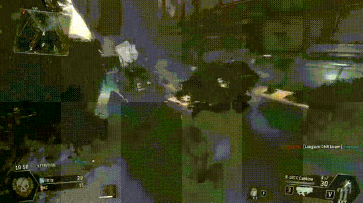
In Titanfall, a first-person shooter, the player can summon mech-style “Titans”. There is special ability mech suit HUD/UI in the bottom-right corner, which is represented by relevant iconography, and both a numerical timer and a progression-style timer that fills in the gray suit, indicating when the ability is ready to be used. Additionally, the icon changes from a standing position to a kneeling position, further indicating when the mech suit can be summoned. All of this is coupled with a “Titan Ready” pop up in the middle of the screen and a button prompt for how to activate it.
Advantages:
- Player is informed through multiple means
- Pop up is in the center of the screen and in the player’s main gaze
- large, legible font
- contains direction how to activate ability
- Relevant icongraphy as supplemental conveyance
- positioned in the corner of the screen out of the player’s main gaze, yet is easily accessible as a reference
- provides on-screen reference for player if the ability is not used immediately
- multiple visual cues
- mech suit
- numerical timer
- countdown progression timer
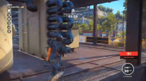
Call of Duty Modern Warfare 2
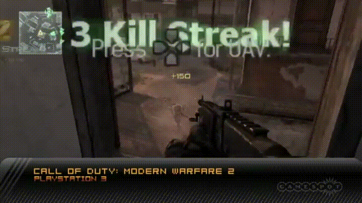
In Call of Duty multiplayer, when a player achieves a kill streak, he/she is rewarded a specific special ability depending on how long of a kill streak has been achieved. This is conveyed via pop-up text in the center of the screen, which is coupled with the appropriate button to press in order to activate the ability. Additionally, above the text, there is an icon that conveys which ability is ready; this specific scenario presents a parachute and satellite dish to represent airdrop and UAV, respectively.
Advantages:
- Notification is presented in the center of the screen near the player’s main gaze
- Relevant iconography as supplemental conveyance
- Direction/button prompt how to activate ability
- Numbers also presented to help the player keep track of his/her kill streak
Disadvantages:
- If the ability is not used right away, there is no on-screen reference to notify/remind the player
Dishonored

There are many different abilities that can be used in Dishonored, a first-person action game. In the upper-left corner, there is HUD for this specific ability, which is a blink/teleport ability that helps the player traverse the environment. Along with a progress bar, there is a relevant icon (arrow) that changes, as a visual indicator to the player, when it is ready to be used (white arrow, black background), currently being held (black arrow, white background), or depleted (grayed out).
Advantages:
- Doing more with less – minimalist, yet stylistic, approach
- one icon represents three different states: ready to be used, in progress, and depleted
- this is important in first-person games, as players might want less HUD/UI on-screen in order to feel more immersed
- Black/white contrast is visible to the player’s periphery while looking at the center of the screen
- Button prompt to “Cancel Blink” appears under HUD once activated by the player
Disadvantages:
- Some of the HUD/UI can clash with the color palette of the game’s environment, which might present contrast/visibility issues for some players
Gears of War series
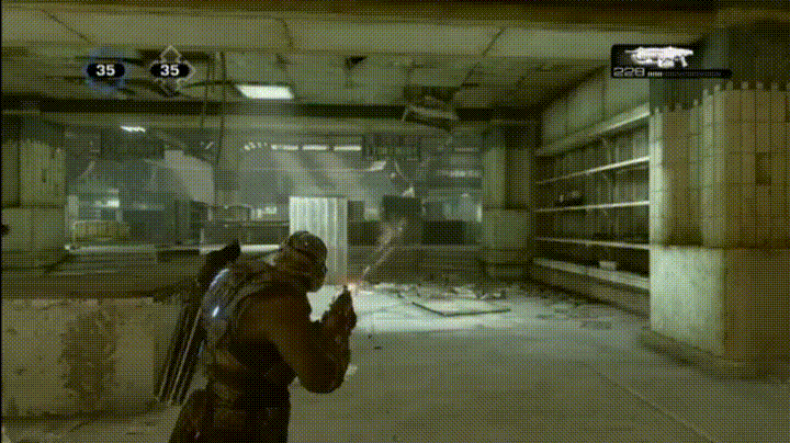
The HUD for the player’s current weapon and ammo is in the top-right corner. There is a “perfect reload” mechanic where, if the player can time the reload of his/her weapon perfectly, he/she receives an increased-damage buff for a limited time. This is indicated by the reloaded portion of ammo flashing briefly (as well as the gun), which receives an increased-damage buff for a short period. Conversely, if the player mistimes the reload, the UI will turn red, indicating failure and the gun will jam briefly.
Advantages:
- Doing more with less – minimalist approach
- conveyance is integrated into weapon HUD
- the player knows where to look for all weapon-related information
- Black/white contrast is visible to the player’s periphery while looking at the center of the screen
- this is enhanced because not only does the ammo that is buffed flash, but also the weapon as well
Disadvantages:
- As Gears of War is (primarily) an Xbox game, the player is likely to be playing farther away from the screen than when playing either PC, handheld, mobile, etc.
- although the contrast of the flashing is helpful, some players might have difficulty seeing the HUD from certain distances
The Division
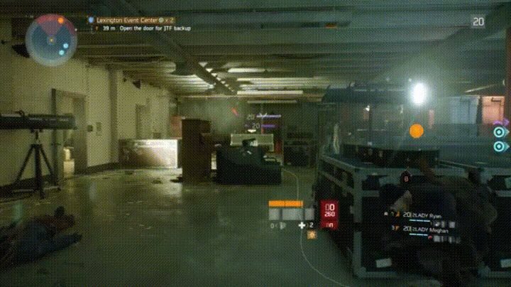
In The Division, the player has customizable skill slots, which have cool downs, and are located on the HUD in the center of the screen near the player’s avatar. As these skills are regenerating, the skill-specific spot turns into a whitish-gray pulsing progress bar. Once complete, the icon for the skill is restored.
Advantages:
- Location of the HUD/UI is based on the center of the screen and the player’s main gaze
- player does not need to divert attention
- This HUD/UI moves intuitively with the player’s avatar as he/she traverses throughout the game world
- Pulsing progress bars are visible when aiming with reticle
- player is able to constantly track the progress of the cool down
- Relevant iconography makes it easy to identify which skill is ready to be used
Disadvantages:
- Some players might not like too much information constantly within their main gaze
DOOM

Similar to The Division, the HUD/UI for cool down/regeneration of accessories (bottom right) shows a loading progress bar that culminates in a flash and restoration of the specific icon as a visual cue for the player.
Advantages:
- Close to player’s main gaze, yet not directly in the center of the screen
- flash can be seen from peripheral vision
- easily seen upon quick glance
- Relevant iconography makes it easy to identify what item is ready
Disadvantages:
- Depending on distance from/size of the screen, some players might have difficulty seeing this
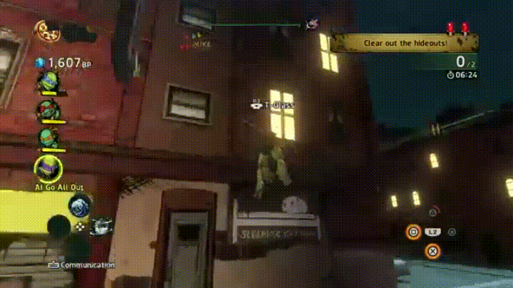
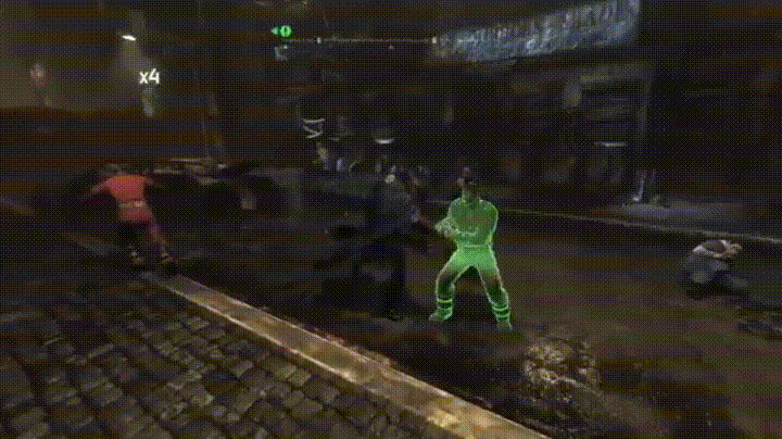
TMNT: Mutants in Manhattan
In TMNT: Mutants in Manhattan, the special-ability regeneration is not a transient pop-up, but is one the player can access at any time. By holding down the L2/LT, the player can see a circular regeneration progress bar in the middle of the screen for their four ninjitsu specials. Ready-to-use ones are bright orange, whereas currently regenerating ones are grayed out. However, there is no cue to notify the player when these are ready to use; the player must actively seek that information.
Advantages:
- Accessible at any time
- Contrast – bright orange for ready, grayed out/loading bar to convey cooling down
- Name labels and associated buttons for each of the four moves
Disadvantages:
- No cue to the player when these abilities have regenerated and are ready to be used
- Having to manually bring up this information could be inconvenient/ruin the flow of a high-paced game such as TMNT: Mutants in Manhattan
Batman: Arkham City
During combat, there is a multiplier in the upper-left corner that tracks the players’ successful hits. Certain upgraded abilities require the player to reach a certain number on the multiplier to be triggered; when this number is reached, it flashes and turns yellow, offering a visual cue to the player indicating that the specific move is ready to be used. Additionally, button prompts and ability name appears in the center of the screen.
Advantages:
- Minimalist, yet effective
- Flash is easily seen from player’s peripheral vision, regardless of screen size/distance from
- contrasts the dark environment of the game
- Button prompts and name labels to remind player which ability can be used
- this is very helpful in notifying the player in a game with a deep combat system
Disadvantages:
- Button prompt may be difficult to see from a distance/smaller screen; however, additional conveyance through color (red for B and yellow for Y on an Xbox controller) should help with this potential issue
Mad Max
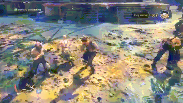
Similar to the Batman: Arkham series, there is a combat multiplier in the upper-right corner that pulses and increases with each successive hit. Additionally, there is a Fury Meter next to it that fills up/pulses with each hit and turns red and pulsates once it is ready to be used, as well as a brief slow-down in the action once the meter is full.
Advantages:
- Progress is always visible to the player
- Numbers and fury meter used to convey progress
- Full Fury Meter can be seen from peripheral vision and is conveyed by pulsating and a brief screen pause
Disadvantages:
- Multiplier is close in proximity/color to Fury Meter, which can make them difficult to differentiate without diverting full attention
- Multiplier and Fury Meter are yellow and can clash with the environment (i.e., post-apocalyptic wasteland with a yellow-heavy color palette)
Conclusion
Good practices for special-ability conveyance:
- Use basic/relevant-to-art-style fonts and legible sizes
- Convey information in multiple ways (e.g., color, text, iconography) when possible
- do more with less approach
- Flashing/pulsating is an effective way to make HUD/UI visible without requiring the player to glance away from his/her main gaze (important during high-paced action games)
- Make information constantly available to the player as a reference to give the option to track progress
- When possible, include button-prompt pop ups if there are many abilities that can be used in the game
- Knowing when a special ability is ready to be used is vital information, so make it stand out from other text/UI/HUD
- different colors
- flashing/pulsing
- avoid placing too close in proximity to other text/UI/HUD
- contrast from primary environmental colors