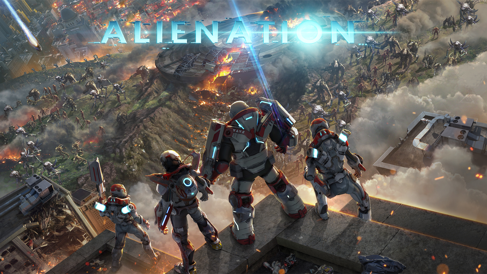
Having spent countless hours playing Dead Nation and Resogun, Housemarque’s next title, Alienation, has been on my radar for quite a while. It is definitely a worthy spiritual successor to Dead Nation, adding three different playable classes, deeper RPG elements, and four-player multiplayer. I’m currently about 7 hours into the campaign with the Saboteur; I’ve played solo as well as with 1-3 additional teammates. Both play styles are fun in their own way and, while the four-player multiplayer can, at times, be too hectic to know what’s happening, it’s an amusing type of chaos. However, I noticed a usability issue before even playing the first real mission.
Non-intuitive tutorial access
The main mission-select screen for Alienation can be seen below. It is an intuitive design because you complete missions that take place all over the world, many times multiple in the same location, and makes navigating easy.
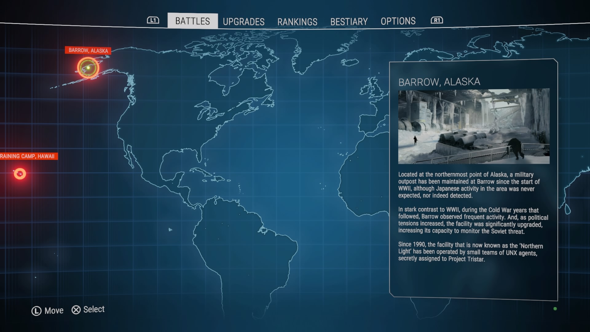
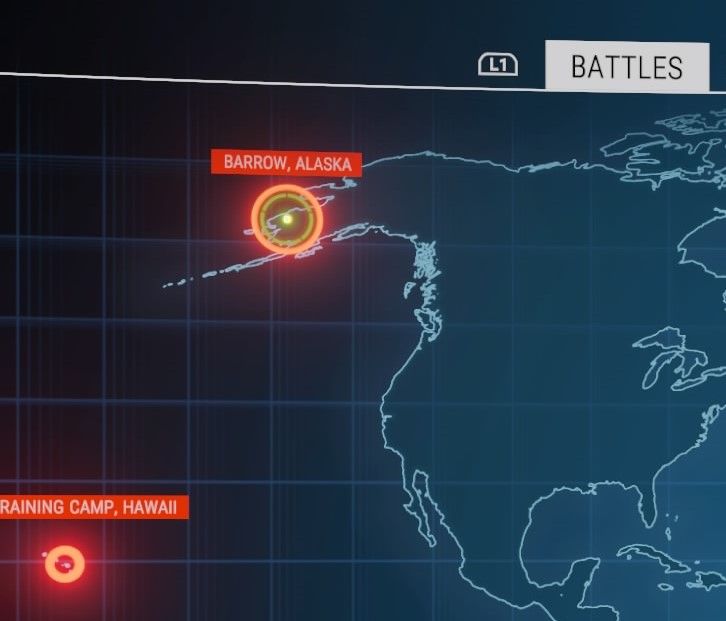
However, below is a zoomed-in screenshot of what is important on this screen and, although it is an overall intuitive design, two issues are present here. The cursor the player uses to navigate the map is a green circle, which can be seen in the left-hand screen shot below, under “Barrow, Alaska.” This is where the cursor is located by default, although “Barrow, Alaska” is actually the first real mission and not the tutorial. The tutorial is “Raining Camp, Hawaii,” which is the second issue. The “T” in training is presumably cut off by the screen here, which could induce even more confusion by the player. They might assume that “Raining Camp, Hawaii” is the second mission, based on its displayed name and how the cursor is on “Barrow, Alaska” by default. The option to skip the tutorial is a nice addition for veteran players of Housemarque or twin-stick shooter games; however, how that option is presented in Alienation is not clear. This lack of clarity might also result in new players skipping the tutorial completely before entering the first mission and missing the introduction to the controls might induce frustration.
Reloading visual cues – a hindsight proposal
Alienation has a “perfect reload” mechanic similar to the Gears of War series. Briefly, a real-time progress bar is presented to the player and they need to press a button (here, it’s R3) at the right time (here, indicated in green on the bar). Mistiming the reload will result in the green turning to red and the player having to wait longer for their character to reload. This bar is presented in two places: above the gun interface in the bottom-left-hand portion of the screen and right below the character; however, there is one main difference in these presentations. Besides being obviously larger, the bar above the gun interface presents an “R3” cue when the bar reaches the green, essentially reminding the player what button to press and when. The GIF below demonstrates both reloading bars in action.
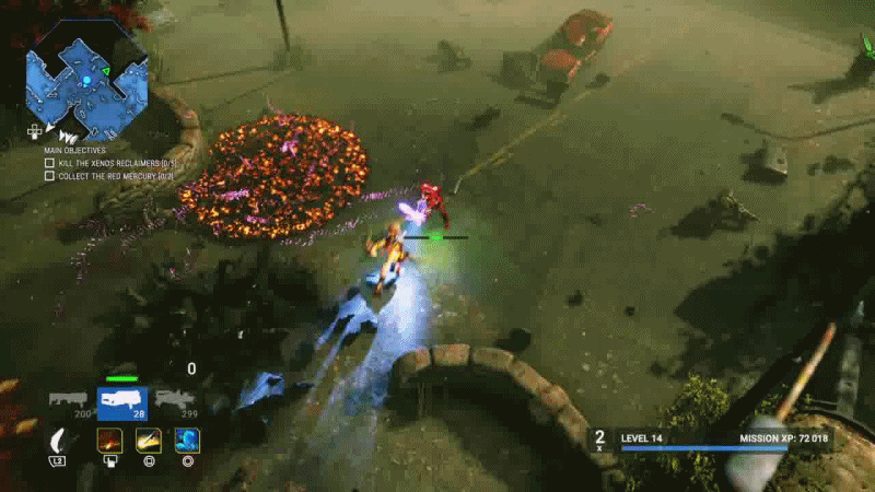
This dual presentation made me wonder if both are actually necessary. Personally, from a line-of-sight perspective, I rarely look away from the character when playing unless I know I’m completely alone; there are just too many situations where there are an overwhelming amount of enemies swarming the character, and that split second it takes to look over to the bottom-left to reload could mean the difference between life and death. Additionally, if the player is fixated on the character, the R3 pop up could be mistaken as an enemy coming from the periphery. While I am ignorant to whether Housemarque conducts external usability tests for their games or not, I would imagine a handful of tests would have brought this matter to the forefront. Regardless, in hindsight, I would propose this to Housemarque – would playtests categorize this extra bar as unnecessary and/or distracting? Furthermore, I know that conducting eye-tracking usability studies can be out of budget’s reach for many companies, but I wonder if that, combined with direct observation and self-report testing, would have shone light on this topic.
Pierre Chalfoun, the biometrics project manager at Ubisoft Montreal, gave an excellent talk about eye tracking and line of sight at GDC 2016. While I highly recommend watching the whole video, I would like to direct your attention to 28:05 – 32:15 in the video below, where he discusses a mixed-methods case study they conducted with eye tracking in Assassin’s Creed Unity to help inform UI design based on player’s actions. He makes a great point that players can have difficulty self-reporting in-game reactions, such as where on the screen they would look when completing certain actions, which is where the quantitative method of eye tracking can be very useful.
For Alienation, I would go out on a limb and hypothesize that most players would not use the reload UI on the left of the screen, making it superfluous to an already busy lower quadrant of the screen. If this did happen to be the case, perhaps an “R3” cue under the character, in addition to the bar, would be beneficial, similar to how Ubisoft integrated stealth UI elements in Assassin’s Creed Unity based on the results of their study.
In the end, this is pure speculation and we can only guess how such a study would conclude. While this question could be answered with traditional usability tests, eye tracking does contribute a quantitative component, which is ultimately more trustworthy than a player’s self-report recollection about such a UI design/feature and its usability.